How to define a circle shape in an Android XML drawable file?
AndroidAndroid DrawableShapesAndroid Problem Overview
I have some problems finding the documentation of the definitions of shapes in XML for Android. I would like to define a simple circle filled with a solid color in an XML File to include it into my layout files.
Sadly the Documentation on android.com does not cover the XML attributes of the Shape classes. I think I should use an ArcShape to draw a circle but there is no explanation on how to set the size, the color, or the angle needed to make a circle out of an Arc.
Android Solutions
Solution 1 - Android
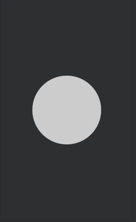
This is a simple circle as a drawable in Android.
<?xml version="1.0" encoding="utf-8"?>
<shape
    xmlns:android="http://schemas.android.com/apk/res/android"
    android:shape="oval">

   <solid
       android:color="#666666"/>

   <size
       android:width="120dp"
        android:height="120dp"/>
</shape>
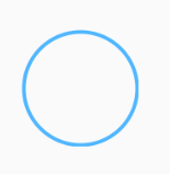
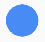
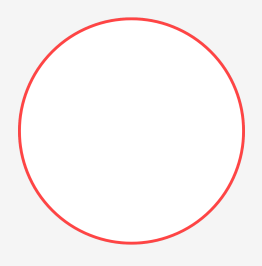
Solution 2 - Android
Set this as your view background
<shape xmlns:android="http://schemas.android.com/apk/res/android"
    android:shape="oval">
    <stroke
        android:width="1dp"
        android:color="#78d9ff"/>
</shape>
For solid circle use:
<shape xmlns:android="http://schemas.android.com/apk/res/android"
    android:shape="oval">
    <solid
        android:color="#48b3ff"/>
</shape>
Solid with stroke:
<shape xmlns:android="http://schemas.android.com/apk/res/android"
    android:shape="oval">
    <solid android:color="#199fff"/>
    <stroke
        android:width="2dp"
        android:color="#444444"/>
</shape>
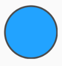
Note: To make the oval shape appear as a circle, in these examples, either your view that you are using this shape as its background should be a square or you have to set the height and width properties of the shape tag to an equal value.
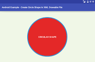
Solution 3 - Android
Code for Simple circle
<?xml version="1.0" encoding="utf-8"?>
<shape xmlns:android="http://schemas.android.com/apk/res/android" android:shape="oval">
        <solid android:color="#9F2200"/>
        <stroke android:width="2dp" android:color="#fff" />
        <size android:width="80dp" android:height="80dp"/>
</shape>
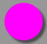
Solution 4 - Android
You can use VectorDrawable as below :
<?xml version="1.0" encoding="utf-8"?>
<vector xmlns:android="http://schemas.android.com/apk/res/android"
    android:width="200dp"
    android:height="200dp"
    android:viewportHeight="64"
    android:viewportWidth="64">

    <path
        android:fillColor="#ff00ff"
        android:pathData="M22,32
        A10,10 0 1,1 42,32
        A10,10 0 1,1 22,32 Z" />
</vector>
The above xml renders as :
Solution 5 - Android
Look in the Android SDK samples. There are several examples in the ApiDemos project:
- black_box.xml
- shape_5.xml
- etc
It will look something like this for a circle with a gradient fill:
<?xml version="1.0" encoding="utf-8"?>
<shape xmlns:android="http://schemas.android.com/apk/res/android" android:shape="oval" >
<gradient android:startColor="#FFFF0000" android:endColor="#80FF00FF"
android:angle="270"/>
</shape>
Solution 6 - Android
If you want a circle like this
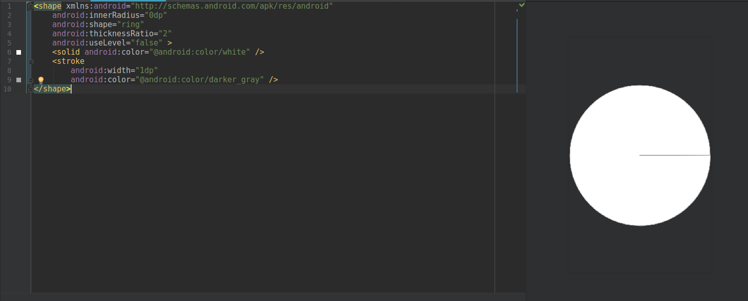
Try using the code below:
<shape xmlns:android="http://schemas.android.com/apk/res/android"
    android:innerRadius="0dp"
    android:shape="ring"
    android:thicknessRatio="2"
    android:useLevel="false" >
    <solid android:color="@android:color/white" />
    <stroke
        android:width="1dp"
        android:color="@android:color/darker_gray" />
</shape>
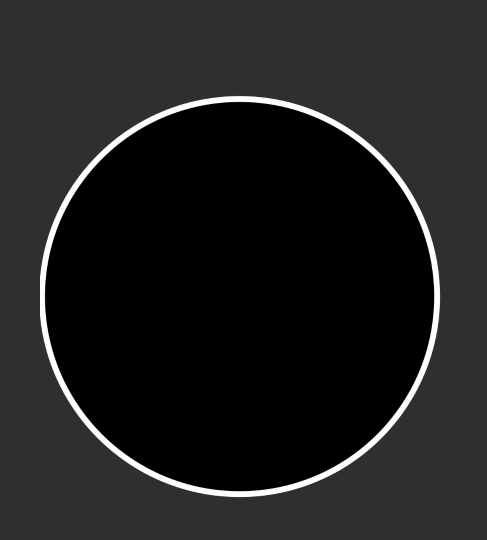
Solution 7 - Android
<?xml version="1.0" encoding="utf-8"?>
<shape
    xmlns:android="http://schemas.android.com/apk/res/android"
    android:shape="oval">

    <!-- fill color -->
    <solid android:color="@color/white" />

    <!-- radius -->
    <stroke
        android:width="1dp"
        android:color="@color/white" />

    <!-- corners -->
    <corners
        android:radius="2dp"/>
</shape>
Solution 8 - Android
Here's a simple circle_background.xml for pre-material:
<?xml version="1.0" encoding="utf-8"?>
<selector xmlns:android="http://schemas.android.com/apk/res/android">
    <item android:state_pressed="true">
        <shape android:shape="oval">
            <solid android:color="@color/color_accent_dark" />
        </shape>
    </item>
    <item>
        <shape android:shape="oval">
            <solid android:color="@color/color_accent" />
        </shape>
    </item>
</selector>
You can use with the attribute 'android:background="@drawable/circle_background" in your button's layout definition
Solution 9 - Android
res/drawble/circle_shape.xml
<?xml version="1.0" encoding="utf-8"?>
<selector xmlns:android="http://schemas.android.com/apk/res/android">
    <item>

        <shape android:shape="oval">
            <solid android:color="#e42828"/>
            <stroke android:color="#3b91d7" android:width="5dp"/>
            <!-- Set the same value for both width and height to get a circular shape -->
            <size android:width="250dp" android:height="250dp"/>
        </shape>
    </item>
</selector>
Solution 10 - Android
> a circle shape in an Android XML drawable file
<?xml version="1.0" encoding="utf-8"?>
<shape xmlns:android="http://schemas.android.com/apk/res/android"
    android:shape="oval">
    <solid android:color="@android:color/white" />
    <stroke
        android:width="1.5dp"
        android:color="@android:color/holo_red_light" />
    <size
        android:width="120dp"
        android:height="120dp" />
</shape>
> Screenshot
Solution 11 - Android
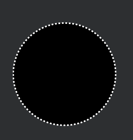
Try below code with dash:
<?xml version="1.0" encoding="utf-8"?><shape xmlns:android="http://schemas.android.com/apk/res/android"
android:shape="oval">
<size
    android:width="@dimen/_60sdp"
    android:height="@dimen/_60sdp" />

<solid android:color="@color/black" />

<stroke
    android:width="@dimen/_1sdp"
    android:color="@color/white"
    android:dashWidth="@dimen/_1sdp"
    android:dashGap="@dimen/_1sdp" />
Try code without dash
<?xml version="1.0" encoding="utf-8"?><shape xmlns:android="http://schemas.android.com/apk/res/android"
android:shape="oval">

<size
    android:width="@dimen/_60sdp"
    android:height="@dimen/_60sdp" />

<solid android:color="@color/black" />

<stroke
    android:width="@dimen/_1sdp"
    android:color="@color/white"
     />
Solution 12 - Android
<?xml version="1.0" encoding="utf-8"?>
<shape
    xmlns:android="http://schemas.android.com/apk/res/android"
    android:shape="oval">

    <stroke
        android:width="10dp"
        android:color="@color/white"/>

    <gradient
        android:startColor="@color/red"
        android:centerColor="@color/red"
        android:endColor="@color/red"
        android:angle="270"/>

    <size
        android:width="250dp"
        android:height="250dp"/>
</shape>
Solution 13 - Android
You can try this -
<?xml version="1.0" encoding="utf-8"?>
<shape
    xmlns:android="http://schemas.android.com/apk/res/android"
    android:shape="ring"
    android:innerRadiusRatio="700"
    android:thickness="100dp"
    android:useLevel="false">

    <solid android:color="#CCC" />

</shape>
Also, you can adjust the radius of the circle by adjusting android:thickness.
Solution 14 - Android
You can try to use this
<?xml version="1.0" encoding="utf-8"?>
<layer-list xmlns:android="http://schemas.android.com/apk/res/android" >

<item>
    <shape
        android:innerRadius="0dp"
        android:shape="ring"
        android:thicknessRatio="2"
        android:useLevel="false" >
        <solid android:color="@color/button_blue_two" />
    </shape>
</item>
and you don't have to bother the width and height aspect ratio if you are using this for a textview
Solution 15 - Android
I couldn't draw a circle inside my ConstraintLayout for some reason, I just couldn't use any of the answers above.
What did work perfectly is a simple TextView with the text that comes out, when you press "Alt+7":
 <TextView
            android:layout_width="wrap_content"
            android:layout_height="wrap_content"
            android:textColor="#0075bc"
            android:textSize="40dp"
            android:text="•"></TextView>
Solution 16 - Android
You can create a custom drawable to change color and radius of the circle dynamically
import android.graphics.Canvas;
import android.graphics.ColorFilter;
import android.graphics.Paint;
import android.graphics.PixelFormat;
import android.graphics.drawable.Drawable;

import androidx.annotation.NonNull;
import androidx.annotation.Nullable;

public class CircleDrawable extends Drawable {

    private Paint circlePaint;
    private int fillColor;
    private int strokeColor;
    private float radius;

    public CircleDrawable(int fillColor, int strokeColor, float radius) {
        this.fillColor = fillColor;
        this.strokeColor = strokeColor;
        this.radius = radius;
        circlePaint=new Paint(Paint.ANTI_ALIAS_FLAG);
    }

    @Override
    public void draw(@NonNull Canvas canvas) {
        int x=getBounds().centerX();
        int y=getBounds().centerY();
        //draw fill color circle
        circlePaint.setStyle(Paint.Style.FILL);
        circlePaint.setColor(fillColor);
        canvas.drawCircle(x,y,radius,circlePaint);
        // draw stroke circle
        circlePaint.setStyle(Paint.Style.STROKE);
        circlePaint.setColor(strokeColor);
        circlePaint.setStrokeWidth(5);
        canvas.drawCircle(x,y,radius,circlePaint);
    }

    @Override
    public void setAlpha(int alpha) {
        circlePaint.setAlpha(alpha);
    }

    @Override
    public void setColorFilter(@Nullable ColorFilter colorFilter) {
         circlePaint.setColorFilter(colorFilter);
    }

    @Override
    public int getOpacity() {
        return PixelFormat.TRANSLUCENT;
    }
}
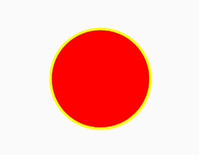
Set this from UI to get the circle shape
imageView.setImageDrawable(new CircleDrawable(Color.RED,Color.YELLOW,100));
The Output Will be like this
Solution 17 - Android
First Create Drawable Resource file
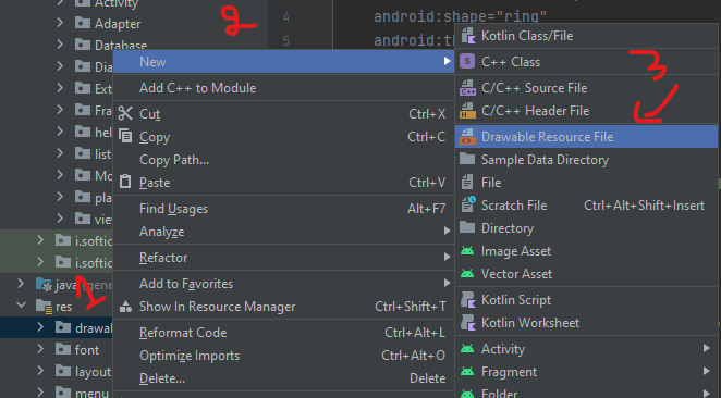
Then Add this Code to the file
 <?xml version="1.0" encoding="utf-8"?>
<shape
    xmlns:android="http://schemas.android.com/apk/res/android"
       // here define the shape
    android:shape="oval">

   <solid
        // here define your color
       android:color="#666666"/>

   <size
        // here define your shape size
       android:width="120dp"
        android:height="120dp"/>
</shape>
Solution 18 - Android
<?xml version="1.0" encoding="utf-8"?>
<selector xmlns:android="http://schemas.android.com/apk/res/android">
    <item>
        <shape android:shape="oval">
            <solid android:color="@color/text_color_green"/>
            <!-- Set the same value for both width and height to get a circular shape -->
            <size android:width="250dp" android:height="250dp"/>
        </shape>
    </item>
</selector>
Solution 19 - Android
Just use
ShapeDrawable circle = new ShapeDrawable( new OvalShape() );