How to create Ripple effect on Click - Material Design
JavascriptJqueryHtmlCssJavascript Problem Overview
I'm new to CSS animations and I've been trying to make their animation work for the last hours by looking at their code, but I can't make it work for now.
I'm talking about this effect: https://angular.io/ (menu effect). Basically, it's an animation on click that spreads a circle from the mouse cursor.
Seems it comes down to these 2 lines:
transition: box-shadow .4s cubic-bezier(.25,.8,.25,1),background-color .4s cubic-bezier(.25,.8,.25,1),-webkit-transform .4s cubic-bezier(.25,.8,.25,1);
transition: box-shadow .4s cubic-bezier(.25,.8,.25,1),background-color .4s cubic-bezier(.25,.8,.25,1),transform .4s cubic-bezier(.25,.8,.25,1);
PS: Maybe there's some jQuery I didn't see.
Javascript Solutions
Solution 1 - Javascript
Ripple effect in Material Design using jQuery and CSS3
To create a UX Ripple effect basically you need to:
- append to any element an
oveflow:hiddenelement to contain the ripple circle (you don't want to alter your original element overflow, neither see the ripple effect go outside of a desired container) - append to the overflow container the ripple wave translucent radial element
- get the click coordinates and CSS3 animate the scaling and opacity of the ripple element
- Listen for the
animationendevent and destroy the ripple container.
The basic code:
Basically add data-ripple (default as white ripple) or data-ripple="#000" to a desired element:
<a data-ripple> EDIT </a>
<div data-ripple="rgba(0,0,0, 0.3)">Lorem ipsum</div>
CSS:
/* MAD-RIPPLE EFFECT */
.ripple{
  position: absolute;
  top:0; left:0; bottom:0; right:0;
  overflow: hidden;
  -webkit-transform: translateZ(0); /* to contain zoomed ripple */
  transform: translateZ(0);
  border-radius: inherit; /* inherit from parent (rounded buttons etc) */
  pointer-events: none; /* allow user interaction */
          animation: ripple-shadow 0.4s forwards;
  -webkit-animation: ripple-shadow 0.4s forwards;
}
.rippleWave{
  backface-visibility: hidden;
  position: absolute;
  border-radius: 50%;
  transform: scale(0.7); -webkit-transform: scale(0.7);
  background: rgba(255,255,255, 1);
  opacity: 0.45;
          animation: ripple 2s forwards;
  -webkit-animation: ripple 2s forwards;
}
@keyframes ripple-shadow {
  0%   {box-shadow: 0 0 0 rgba(0,0,0,0.0);}
  20%  {box-shadow: 0 4px 16px rgba(0,0,0,0.3);}
  100% {box-shadow: 0 0 0 rgba(0,0,0,0.0);}
}
@-webkit-keyframes ripple-shadow {
  0%   {box-shadow: 0 0 0 rgba(0,0,0,0.0);}
  20%  {box-shadow: 0 4px 16px rgba(0,0,0,0.3);}
  100% {box-shadow: 0 0 0 rgba(0,0,0,0.0);}
}
@keyframes ripple {
  to {transform: scale(24); opacity:0;}
}
@-webkit-keyframes ripple {
  to {-webkit-transform: scale(24); opacity:0;}
}
jQuery
jQuery(function($) {

  // MAD-RIPPLE // (jQ+CSS)
  $(document).on("mousedown", "[data-ripple]", function(e) {

    var $self = $(this);

    if($self.is(".btn-disabled")) {
      return;
    }
    if($self.closest("[data-ripple]")) {
      e.stopPropagation();
    }

    var initPos = $self.css("position"),
        offs = $self.offset(),
        x = e.pageX - offs.left,
        y = e.pageY - offs.top,
        dia = Math.min(this.offsetHeight, this.offsetWidth, 100), // start diameter
        $ripple = $('<div/>', {class : "ripple",appendTo : $self });

    if(!initPos || initPos==="static") {
      $self.css({position:"relative"});
    }

    $('<div/>', {
      class : "rippleWave",
      css : {
        background: $self.data("ripple"),
        width: dia,
        height: dia,
        left: x - (dia/2),
        top: y - (dia/2),
      },
      appendTo : $ripple,
      one : {
        animationend : function(){
          $ripple.remove();
        }
      }
    });
  });

});
Here's a full-featured demo:
jQuery(function($) {

  // MAD-RIPPLE // (jQ+CSS)
  $(document).on("mousedown", "[data-ripple]", function(e) {

    var $self = $(this);

    if($self.is(".btn-disabled")) {
      return;
    }
    if($self.closest("[data-ripple]")) {
      e.stopPropagation();
    }

    var initPos = $self.css("position"),
        offs = $self.offset(),
        x = e.pageX - offs.left,
        y = e.pageY - offs.top,
        dia = Math.min(this.offsetHeight, this.offsetWidth, 100), // start diameter
        $ripple = $('<div/>', {class : "ripple",appendTo : $self });

    if(!initPos || initPos==="static") {
      $self.css({position:"relative"});
    }

    $('<div/>', {
      class : "rippleWave",
      css : {
        background: $self.data("ripple"),
        width: dia,
        height: dia,
        left: x - (dia/2),
        top: y - (dia/2),
      },
      appendTo : $ripple,
      one : {
        animationend : function(){
          $ripple.remove();
        }
      }
    });
  });

});
*{box-sizing:border-box; -webkit-box-sizing:border-box;}
html, body{height:100%; margin:0;}
body{background:#f5f5f5; font: 14px/20px Roboto, sans-serif;}
h1, h2{font-weight: 300;}


/* MAD-RIPPLE EFFECT */
.ripple{
  position: absolute;
  top:0; left:0; bottom:0; right:0;
  overflow: hidden;
  -webkit-transform: translateZ(0); /* to contain zoomed ripple */
  transform: translateZ(0);
  border-radius: inherit; /* inherit from parent (rounded buttons etc) */
  pointer-events: none; /* allow user interaction */
          animation: ripple-shadow 0.4s forwards;
  -webkit-animation: ripple-shadow 0.4s forwards;
}
.rippleWave{
  backface-visibility: hidden;
  position: absolute;
  border-radius: 50%;
  transform: scale(0.7); -webkit-transform: scale(0.7);
  background: rgba(255,255,255, 1);
  opacity: 0.45;
          animation: ripple 2s forwards;
  -webkit-animation: ripple 2s forwards;
}
@keyframes ripple-shadow {
  0%   {box-shadow: 0 0 0 rgba(0,0,0,0.0);}
  20%  {box-shadow: 0 4px 16px rgba(0,0,0,0.3);}
  100% {box-shadow: 0 0 0 rgba(0,0,0,0.0);}
}
@-webkit-keyframes ripple-shadow {
  0%   {box-shadow: 0 0 0 rgba(0,0,0,0.0);}
  20%  {box-shadow: 0 4px 16px rgba(0,0,0,0.3);}
  100% {box-shadow: 0 0 0 rgba(0,0,0,0.0);}
}
@keyframes ripple {
  to {transform: scale(24); opacity:0;}
}
@-webkit-keyframes ripple {
  to {-webkit-transform: scale(24); opacity:0;}
}


/* MAD-BUTTONS (demo) */
[class*=mad-button-]{
  display:inline-block;
  text-align:center;
  position: relative;
  margin: 0;
  white-space: nowrap;
  vertical-align: middle;
  font-family: "Roboto", sans-serif;
  font-size: 14px;
  font-weight: 500;
  text-transform: uppercase;
  text-decoration: none;
  border: 0; outline: 0;
  background: none;
  transition: 0.3s;
  cursor: pointer;
  color: rgba(0,0,0, 0.82);
}
[class*=mad-button-] i.material-icons{
  vertical-align:middle;
  padding:0;
}
.mad-button-raised{
  height: 36px;
  padding: 0px 16px;
  line-height: 36px;
  border-radius: 2px;
  box-shadow: /*amb*/ 0 0   2px rgba(0,0,0,0.15),
    /*key*/ 0 1px 3px rgba(0,0,0,0.25);
}.mad-button-raised:hover{
  box-shadow: /*amb*/ 0 0   2px rgba(0,0,0,0.13),
    /*key*/ 0 2px 4px rgba(0,0,0,0.2);
}
.mad-button-action{
  width: 56px; height:56px;
  padding: 16px 0;
  border-radius: 32px;
  box-shadow: /*amb*/ 0 0   2px rgba(0,0,0,0.13),
    /*key*/ 0 5px 7px rgba(0,0,0,0.2);
}.mad-button-action:hover{
  box-shadow: /*amb*/ 0 0   2px rgba(0,0,0,0.11),
    /*key*/ 0 6px 9px rgba(0,0,0,0.18);
}
[class*=mad-button-].mad-ico-left  i.material-icons{ margin: 0 8px 0 -4px; }
[class*=mad-button-].mad-ico-right i.material-icons{ margin: 0 -4px 0 8px; }

/* MAD-COLORS */
.bg-primary-darker{background:#1976D2; color:#fff;}
.bg-primary{ background:#2196F3; color:#fff; }
.bg-primary.lighter{ background: #BBDEFB; color: rgba(0,0,0,0.82);}
.bg-accented{ background:#FF4081; color:#fff; }

/* MAD-CELL */
.cell{padding: 8px 16px; overflow:auto;}
<link href='https://fonts.googleapis.com/css?family=Roboto:500,400,300&subset=latin,latin-ext' rel='stylesheet' type='text/css'>
<link href="https://fonts.googleapis.com/icon?family=Material+Icons" rel="stylesheet">
<script src="https://code.jquery.com/jquery-2.1.4.js"></script>
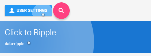
<div class="cell">
<button data-ripple class="mad-button-raised mad-ico-left bg-primary"><i class="material-icons">person</i>User settings</button>
<a data-ripple href="#" class="mad-button-action bg-accented"><i class="material-icons">search</i></a>
</div>
<div data-ripple class="cell bg-primary-darker">
<h1>Click to Ripple</h1>
<p>data-ripple</p>
</div>
<div data-ripple="rgba(0,0,0, 0.4)" class="cell bg-primary">
<p>data-ripple="rgba(0,0,0, 0.4)"</p>
<p> Lorem ipsum dolor sit amet, consectetur adipisicing elit, sed do eiusmod tempor incididunt ut labore....</p>
<p><a data-ripple class="mad-button-raised mad-ico-right bg-accented">Edit<i class="material-icons">edit</i></a></p>
</div>
Solution 2 - Javascript
I have used this sort of code before on a few of my projects.
Using jQuery we can position the effect to its not just static and then we add the span element onclick. I have added comments so it makes it easier to follow.
jQuery
$("div").click(function (e) {

  // Remove any old one
  $(".ripple").remove();

  // Setup
  var posX = $(this).offset().left,
      posY = $(this).offset().top,
      buttonWidth = $(this).width(),
      buttonHeight =  $(this).height();

  // Add the element
  $(this).prepend("<span class='ripple'></span>");


 // Make it round!
  if(buttonWidth >= buttonHeight) {
    buttonHeight = buttonWidth;
  } else {
    buttonWidth = buttonHeight;
  }

  // Get the center of the element
  var x = e.pageX - posX - buttonWidth / 2;
  var y = e.pageY - posY - buttonHeight / 2;


  // Add the ripples CSS and start the animation
  $(".ripple").css({
    width: buttonWidth,
    height: buttonHeight,
    top: y + 'px',
    left: x + 'px'
  }).addClass("rippleEffect");
});
CSS
.ripple {
  width: 0;
  height: 0;
  border-radius: 50%;
  background: rgba(255, 255, 255, 0.4);
  transform: scale(0);
  position: absolute;
  opacity: 1;
}
.rippleEffect {
    animation: rippleDrop .6s linear;
}

@keyframes rippleDrop {
  100% {
    transform: scale(2);
    opacity: 0;
  }
}
Solution 3 - Javascript
This can be achieved with box-shadows. The positioning of the circle origin under the mouse when clicked will need JS.
li{
    font-size:2em;
    background:rgba(51, 51, 254, 0.8);
    list-style-type:none;
    display:inline-block;
    line-height:2em;
    width:6em;
    text-align:center;
    color:#fff;
    position:relative;
    overflow:hidden;
}
a{color:#fff;}
a:after{
    content:'';
    position:absolute;
    border-radius:50%;
    height:10em; width:10em;
    top: -4em; left:-2em;
    box-shadow: inset 0 0 0 5em rgba(255,255,255,0.2);
    transition: box-shadow 0.8s;
}
a:focus:after{
    box-shadow: inset 0 0 0 0em rgba(255,255,255,0.2);
}
<ul>
    <li><a href="#">button</a></li>
</ul>
Solution 4 - Javascript
Here is a CSS - only implementation i.e. no javascript required.
Source: https://ghinda.net/article/css-ripple-material-design/
body {
  background: #fff;
}

button {
  position: relative;
  overflow: hidden;
  padding: 16px 32px;
}

button:after {
  content: '';
  display: block;
  position: absolute;
  left: 50%;
  top: 50%;
  width: 120px;
  height: 120px;
  margin-left: -60px;
  margin-top: -60px;
  background: #3f51b5;
  border-radius: 100%;
  opacity: .6;

  transform: scale(0);
}

@keyframes ripple {
  0% {
    transform: scale(0);
  }
  20% {
    transform: scale(1);
  }
  100% {
    opacity: 0;
    transform: scale(1);
  }
}

button:not(:active):after {
  animation: ripple 1s ease-out;
}

/* fixes initial animation run, without user input, on page load.
 */
button:after {
  visibility: hidden;
}

button:focus:after {
  visibility: visible;
}
<button>
  Button
</button>
Solution 5 - Javascript
You could use http://mladenplavsic.github.io/css-ripple-effect/ (note: I'm the author of that product)
Pure CSS solution
<link href="https://cdn.rawgit.com/mladenplavsic/css-ripple-effect/35c35541/dist/ripple.min.css" rel="stylesheet"/>

<button class="ripple">Click me</button>
Solution 6 - Javascript
You can get the same effect with the help of Materialize css, making it with that is quite easy. All you have to do is just add a class to where you want the effect.
<a href="#" class="btn waves-effect waves-light">Submit</a>
If you want to go with pure CSS check this codepen it : Ripple effect
Solution 7 - Javascript
Here is Material Design button component "The wave effect" Done Using pure CSS3 and JavaScript no libraries no framework Material Design button component "The wave effect"
https://codepen.io/Mahmoud-Zakaria/pen/NvbORQ
HTML
<div class="md" >Click</div>
CSS
@keyframes glow-out {
  30%,80% {
   transform: scale(7);
 }
  100% {
   opacity: 0;
 }
}

.md {
 --y: 0;
 --x: 0;
display: inline-block;
padding: 20px 70px;
text-align: center;
background-color: lightcoral;
margin: 5em;
position: relative;
overflow: hidden;
cursor: pointer;
border-radius: 4px;
color: white;
}


.is-clicked {
  content: '';
  position: absolute;
  top: calc(var(--y) * 1px);
  left: calc(var(--x) * 1px);
  width: 100px;
  height:100px;
  background: rgba(255, 255, 255, .3);
  border-radius: 50%;
  animation: glow-out 1s ease-in-out forwards;
  transform: translate(-50%, -50%);
 }
JS
// Material Design button Module
 let md_module = (function() {

 let btn = document.querySelectorAll(".md");
 let md_btn = Array.prototype.slice.call(btn);

  md_btn.forEach(eachCB)

 function eachCB (item, index, array){

  function md(e) {
     let offsetX = e.clientX - item.offsetLeft;
     let offsetY = e.clientY - item.offsetTop;
     item.style.setProperty("--x", offsetX);
     item.style.setProperty("--y", offsetY);
     item.innerHTML += '<div class="is-clicked"></div>';
   }

function rm() {
  let state = item.querySelectorAll(".is-clicked");
  console.log(state)
  for (let i = 0; i < state.length; i++) {
    if (state[i].className === "is-clicked") {
      state[i].remove();
    }
  }
}

item.addEventListener("click", md);
item.addEventListener("animationend", rm);
}

 })();
Solution 8 - Javascript
CSS Paint API (introduced in 2018)
The new CSS Paint API (part of the CSS "Houdini" draft) allows to write JavaScript functions to be used in CSS. Quote of the linked document:
> CSS Paint API allows you to programmatically generate an image whenever a CSS property expects an image. Properties like background-image or border-image are usually used with url() to load an image file or with CSS built-in functions like linear-gradient(). Instead of using those, you can now use paint(myPainter) to reference a paint worklet.
This means you can implement a paint function in JavaScript and use it inside your CSS.
Browser support (May 2019)
Currently, only Chrome and Opera support the Paint API of the Houdini draft. Firefox has signaled "intent to implement". See ishoudinireadyyet.com or caniuse.com for more information.
Code sample
There is a working "ripple" example implemented by the Houdini task force available here. I extracted the "core" from the example below. It implements the custom paint function, adds custom CSS properties like --ripple-color and uses a JavaScript function to implement the animation and to start and stop the effect.
Note, that it adds the custom paint function like this:
CSS.paintWorklet.addModule('https://googlechromelabs.github.io/houdini-samples/paint-worklet/ripple/paintworklet.js');
If you want to use the effect on your website, I recommend you download the file and reference it locally.
.ripple {
  font-size: 5em;
  background-color: rgb(0, 169, 244);

  /* custom property */
  --ripple-color: rgba(255, 255, 255, 0.54);
}

.ripple.animating {
  /* usage of the custom "ripple" paint function */
  background-image: paint(ripple);
}
// Adds the custom paint function
CSS.paintWorklet.addModule('https://googlechromelabs.github.io/houdini-samples/paint-worklet/ripple/paintworklet.js');

// the actual animation of the ripple effect
function rippleEffect(element) {
  let start, x, y;
  element.addEventListener('click', function (evt) {
    this.classList.add('animating');
    [x, y] = [evt.offsetX, evt.offsetY];
    start = performance.now();
    const raf = (now) => {
      const tick = Math.floor(now - start);
      this.style.cssText = `--ripple-x: ${x}; --ripple-y: ${y}; --animation-tick: ${tick};`;
      if (tick > 1000) {
        this.classList.remove('animating');
        this.style.cssText = `--animation-tick: 0`;
        return;
      }
      requestAnimationFrame(raf);
    };
    requestAnimationFrame(raf);
  });
}

rippleEffect(document.querySelector('.ripple'));
<button class="ripple">Click me!</button>
Solution 9 - Javascript
Realization javascript + babel -
javascript -
class ImpulseStyleFactory {
    static ANIMATION_DEFAULT_DURATION = 1;
    static ANIMATION_DEFAULT_SIZE = 300;
    static ANIMATION_RATIO = ImpulseStyleFactory.ANIMATION_DEFAULT_DURATION / ImpulseStyleFactory.ANIMATION_DEFAULT_SIZE;

    static circleImpulseStyle( x, y, size, color = `#fff`, duration = 1 ){
        return {
            width: `${ size }px`,
            height: `${ size }px`,

            background: color,

            borderRadius: `50%`,

            display: `inline-block`,

            pointerEvents: `none`,

            position: `absolute`,

            top: `${ y - size / 2 }px`,
            left: `${ x - size / 2 }px`,

            animation: `impulse ${ duration }s`,
        };
    }
}


class Impulse {
    static service = new Impulse();


    static install( container ) {
        Impulse.service.containerRegister( container );
    }
    static destroy( container ){
        Impulse.service.containerUnregister( container );
    }

    static applyToElement( {x, y}, container ){
        Impulse.service.createImpulse( x, y, container );
    }

    constructor(){
        this.impulse_clickHandler = this.impulse_clickHandler.bind(this);
        this.impulse_animationEndHandler = this.impulse_animationEndHandler.bind(this);

        this.actives = new Map();
    }

    containerRegister( container ){
        container.addEventListener('click', this.impulse_clickHandler);
    }
    containerUnregister( container ){
        container.removeEventListener('click', this.impulse_clickHandler);
    }

    createImpulse( x, y, container ){
        let { clientWidth, clientHeight } = container;

        let impulse = document.createElement('div');
        impulse.addEventListener('animationend', this.impulse_animationEndHandler);

        let size = Math.max( clientWidth, clientHeight ) * 2;
        let color = container.dataset.color;

        Object.assign(impulse.style, ImpulseStyleFactory.circleImpulseStyle(
            x, y, size, color
        ));

        if( this.actives.has( container ) ){
            this.actives.get( container )
                        .add( impulse );
        }else{
            this.actives.set( container, new Set( [ impulse ] ) );
        }

        container.dataset.active = true;

        container.appendChild( impulse );
    }


    impulse_clickHandler({ layerX, layerY, currentTarget: container }){
        this.createImpulse( layerX, layerY, container );
    }

    impulse_animationEndHandler( {currentTarget: impulse} ){
        let { parentNode: container  } = impulse;

        this.actives.get( container )
                    .delete( impulse );

        if( ! this.actives.get( container ).size ){
            this.actives.delete( container );

            container.dataset.active = false;
        }

        container.removeChild(impulse);
    }
}
css -
@keyframes impulse {
    from {
        opacity: .3;

        transform: scale(0);
    }
    to {
        opacity: 0;

        transform: scale(1);
    }
}
to use so -
html -
<div class="impulse" data-color="#3f1dcb" data-active="false">
    <div class="panel"></div>
</div>
javascript -
let impulses = document.querySelectorAll('.impulse');
let impulseAll = Array.from( impulses );

impulseAll.forEach( Impulse.install );
Life example Impulse.install ( impulse create in coords of click, add handler event click ) -
class ImpulseStyleFactory {
    static ANIMATION_DEFAULT_DURATION = 1;
    static ANIMATION_DEFAULT_SIZE = 300;
    static ANIMATION_RATIO = ImpulseStyleFactory.ANIMATION_DEFAULT_DURATION / ImpulseStyleFactory.ANIMATION_DEFAULT_SIZE;

    static circleImpulseStyle( x, y, size, color = `#fff`, duration = 1 ){
        return {
            width: `${ size }px`,
            height: `${ size }px`,

            background: color,

            borderRadius: `50%`,

            display: `inline-block`,

            pointerEvents: `none`,

            position: `absolute`,

            top: `${ y - size / 2 }px`,
            left: `${ x - size / 2 }px`,

            animation: `impulse ${ duration }s`,
        };
    }
}


class Impulse {
    static service = new Impulse();


    static install( container ) {
        Impulse.service.containerRegister( container );
    }
    static destroy( container ){
        Impulse.service.containerUnregister( container );
    }

    static applyToElement( {x, y}, container ){
        Impulse.service.createImpulse( x, y, container );
    }

    constructor(){
        this.impulse_clickHandler = this.impulse_clickHandler.bind(this);
        this.impulse_animationEndHandler = this.impulse_animationEndHandler.bind(this);

        this.actives = new Map();
    }

    containerRegister( container ){
        container.addEventListener('click', this.impulse_clickHandler);
    }
    containerUnregister( container ){
        container.removeEventListener('click', this.impulse_clickHandler);
    }

    createImpulse( x, y, container ){
        let { clientWidth, clientHeight } = container;

        let impulse = document.createElement('div');
        impulse.addEventListener('animationend', this.impulse_animationEndHandler);

        let size = Math.max( clientWidth, clientHeight ) * 2;
        let color = container.dataset.color;

        Object.assign(impulse.style, ImpulseStyleFactory.circleImpulseStyle(
            x, y, size, color
        ));

        if( this.actives.has( container ) ){
            this.actives.get( container )
                .add( impulse );
        }else{
            this.actives.set( container, new Set( [ impulse ] ) );
        }

        container.dataset.active = true;

        container.appendChild( impulse );
    }


    impulse_clickHandler({ layerX, layerY, currentTarget: container }){
        this.createImpulse( layerX, layerY, container );
    }

    impulse_animationEndHandler( {currentTarget: impulse} ){
        let { parentNode: container  } = impulse;

        this.actives.get( container )
            .delete( impulse );

        if( ! this.actives.get( container ).size ){
            this.actives.delete( container );

            container.dataset.active = false;
        }

        container.removeChild(impulse);
    }
}


let impulses = document.querySelectorAll('.impulse');
let impulseAll = Array.from( impulses );

impulseAll.forEach( Impulse.install );
@import "https://cdnjs.cloudflare.com/ajax/libs/normalize/6.0.0/normalize.min.css";
/*@import url('https://fonts.googleapis.com/css?family=Roboto+Mono');*/

* {
    box-sizing: border-box;
}

html {
    font-family: 'Roboto Mono', monospace;
}

body {
    width: 100%;
    height: 100%;

    margin: 0;

    position: absolute;


}

main {
    width: 100%;
    height: 100%;

    overflow: hidden;

    position: relative;
}


.container {
    position: absolute;

    top: 0;
    left: 0;
}

.centred {
    display: flex;

    justify-content: center;

    align-items: center;
}

.shadow-xs {
    box-shadow: rgba(0, 0, 0, 0.117647) 0px 1px 6px, rgba(0, 0, 0, 0.117647) 0px 1px 4px;
}
.sample-impulse {
    transition: all .5s;

    overflow: hidden;

    position: relative;
}
.sample-impulse[data-active="true"] {
    box-shadow: rgba(0, 0, 0, 0.156863) 0px 3px 10px, rgba(0, 0, 0, 0.227451) 0px 3px 10px;
}


.panel {
    width: 300px;
    height: 100px;

    background: #fff;
}


.panel__hidden-label {
    color: #fff;

    font-size: 2rem;
    font-weight: bold;

    pointer-events: none;

    z-index: 1;

    position: absolute;
}
.panel__default-label {
    pointer-events: none;

    z-index: 2;

    position: absolute;
}

.sample-impulse[data-active="true"] .panel__default-label {
    display: none;
}


@keyframes impulse {
    from {
        opacity: .3;

        transform: scale(0);
    }
    to {
        opacity: 0;

        transform: scale(1);
    }
}
<main class="centred">
    <div class="sample-impulse impulse centred shadow-xs" data-color="#3f1dcb" data-active="false">
        <div class="group centred">
            <div class="panel"></div>
            <span class="panel__hidden-label">StackOverflow</span>
            <span class="panel__default-label">click me</span>
        </div>
    </div>
</main>
Life example Impulse.applyToElement ( impulse coords setby user, not add handler event click ) -
class ImpulseStyleFactory {
    static ANIMATION_DEFAULT_DURATION = 1;
    static ANIMATION_DEFAULT_SIZE = 300;
    static ANIMATION_RATIO = ImpulseStyleFactory.ANIMATION_DEFAULT_DURATION / ImpulseStyleFactory.ANIMATION_DEFAULT_SIZE;

    static circleImpulseStyle( x, y, size, color = `#fff`, duration = 1 ){
        return {
            width: `${ size }px`,
            height: `${ size }px`,

            background: color,

            borderRadius: `50%`,

            display: `inline-block`,

            pointerEvents: `none`,

            position: `absolute`,

            top: `${ y - size / 2 }px`,
            left: `${ x - size / 2 }px`,

            animation: `impulse ${ duration }s`,
        };
    }
}


class Impulse {
    static service = new Impulse();


    static install( container ) {
        Impulse.service.containerRegister( container );
    }
    static destroy( container ){
        Impulse.service.containerUnregister( container );
    }

    static applyToElement( {x, y}, container ){
        Impulse.service.createImpulse( x, y, container );
    }

    constructor(){
        this.impulse_clickHandler = this.impulse_clickHandler.bind(this);
        this.impulse_animationEndHandler = this.impulse_animationEndHandler.bind(this);

        this.actives = new Map();
    }

    containerRegister( container ){
        container.addEventListener('click', this.impulse_clickHandler);
    }
    containerUnregister( container ){
        container.removeEventListener('click', this.impulse_clickHandler);
    }

    createImpulse( x, y, container ){
        let { clientWidth, clientHeight } = container;

        let impulse = document.createElement('div');
        impulse.addEventListener('animationend', this.impulse_animationEndHandler);

        let size = Math.max( clientWidth, clientHeight ) * 2;
        let color = container.dataset.color;

        Object.assign(impulse.style, ImpulseStyleFactory.circleImpulseStyle(
            x, y, size, color
        ));

        if( this.actives.has( container ) ){
            this.actives.get( container )
                .add( impulse );
        }else{
            this.actives.set( container, new Set( [ impulse ] ) );
        }

        container.dataset.active = true;

        container.appendChild( impulse );
    }


    impulse_clickHandler({ layerX, layerY, currentTarget: container }){
        this.createImpulse( layerX, layerY, container );
    }

    impulse_animationEndHandler( {currentTarget: impulse} ){
        let { parentNode: container  } = impulse;

        this.actives.get( container )
            .delete( impulse );

        if( ! this.actives.get( container ).size ){
            this.actives.delete( container );

            container.dataset.active = false;
        }

        container.removeChild(impulse);
    }
}


const generateRandomPointByRectdAll = ( { width, height }, length = 1 ) => {
    let result = [];

    while( length-- ){
        result.push( {
            x: Math.round( Math.random() * width ),
            y: Math.round( Math.random() * height )
        } );
    }

    return result;
};

const delayTask = ( task, delay ) => new Promise( ( resolve, reject ) => {
    let timeoutID = setTimeout( () => task( ), delay )
} );

document.addEventListener( 'click', () => {
    const MAX_IMPULSE_DELAY_TIME = 5000;

    let container = document.querySelector('.custom-impulse');
    let pointAll = generateRandomPointByRectdAll( {
        width: container.clientWidth,
        height: container.clientHeight
    }, 5 );
    let taskAll = pointAll.map( point => () => Impulse.applyToElement( point, container ) );
    let delayTaskAll = taskAll.map( task => delayTask( task, Math.round( Math.random() * MAX_IMPULSE_DELAY_TIME ) ) );
} );
@import "https://cdnjs.cloudflare.com/ajax/libs/normalize/6.0.0/normalize.min.css";
/*@import url('https://fonts.googleapis.com/css?family=Roboto+Mono');*/

* {
    box-sizing: border-box;
}

html {
    font-family: 'Roboto Mono', monospace;
}

body {
    width: 100%;
    height: 100%;

    margin: 0;

    position: absolute;


}

main {
    width: 100%;
    height: 100%;

    overflow: hidden;

    position: relative;
}

.container-fill {
    width: 100%;
    height: 100%;
}

.container {
    position: absolute;

    top: 0;
    left: 0;
}

.centred {
    display: flex;

    justify-content: center;

    align-items: center;
}


.custom-impulse {
    will-change: transform, opasity;

    position: absolute;
}


@keyframes impulse {
    from {
        opacity: .3;

        transform: scale(0);
    }
    to {
        opacity: 0;

        transform: scale(1);
    }
}
<main class="centred">
    <div class="custom-impulse container-fill centred" data-color="#3f1dcb" data-active="false">
        <span>click me</span>
    </div>
</main>
Solution 10 - Javascript
You can use Tronic247 Material framework to make the ripple effect.
<!doctype html>
<html lang="en">
<head>
  <meta charset="utf-8">
  <meta name="viewport" content="width=device-width, initial-scale=1">
  <title>A Basic HTML5 Template</title>
  <link href="https://fonts.googleapis.com/css?family=Material+Icons|Material+Icons+Outlined|Material+Icons+Two+Tone|Material+Icons+Round|Material+Icons+Sharp" rel="stylesheet">
  <link href="https://cdn.jsdelivr.net/gh/tronic247/material/dist/css/material.min.css" rel="stylesheet" />
</head>
<body class="container">

    <div class="background-light-grey elevation-4 ripple-e dark-ripple" style="height: 200px;width: 200px;"></div>

<script src="https://code.jquery.com/jquery-3.6.0.slim.min.js" integrity="sha256-u7e5khyithlIdTpu22PHhENmPcRdFiHRjhAuHcs05RI=" crossorigin="anonymous"></script>
<script src="https://cdn.jsdelivr.net/gh/tronic247/material/dist/js/material.min.js"></script>
</body>
</html>