How to create a sticky footer that plays well with Bootstrap 3
CssTwitter BootstrapTwitter Bootstrap-3Sticky FooterCss Problem Overview
With or without a top nav, it is very common for sites to have a sticky footer. Bootstrap has a facility to easily create fixed footers, but no such facility for creating sticky footers - there is a big difference.
Googling this question will reveal that hundreds if not thousands of developers have the same question but with no good answer.
Ironically, the Bootstrap documentation page itself has a sticky footer alongside bootstrap styling and a fixed top navbar. It's all custom css though, and not part of the framework. So an obvious route is to take and refactor their custom styling, since it obviously plays well within the Bootstrap framework, but that seems more painful than it ought to be.
See this plunkr for an example page with a Bootstrap top navbar, and an undesirable, non-sticky footer.
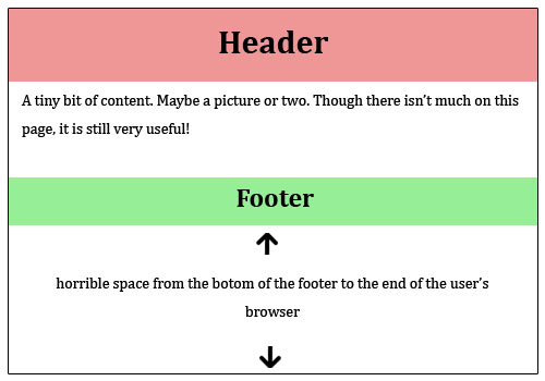
Problem:
(Thanks Softlayer - for the graphics)
Desired Solution:
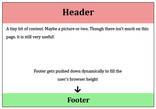
Of course the footer should be responsive and cross-browser friendly as well...
Css Solutions
Solution 1 - Css
The answer, as Schmalzy points out, can be found here in the examples section of the getbootstrap site.
But that example does not include a top nav. For fixed top nav with sticky footer, see this plnkr, or code below.
Style CSS:
/* Styles go here */

/* Sticky footer styles
-------------------------------------------------- */

html,
body {
  height: 100%;
  /* The html and body elements cannot have any padding or margin. */
}

/* Wrapper for page content to push down footer */
#wrap {
  min-height: 100%;
  height: auto;
  /* Negative indent footer by its height */
  margin: 0 auto -60px;
  /* Pad bottom by footer height */
  padding: 0 0 60px;
}

/* Set the fixed height of the footer here */
#footer {
  height: 60px;
  background-color: #f5f5f5;
}


/* Custom page CSS
-------------------------------------------------- */
/* Not required for template or sticky footer method. */

.container {
  width: auto;
  max-width: 680px;
  padding: 0 15px;
}
.container .credit {
  margin: 20px 0;
}
Index.html:
<!DOCTYPE html>
<html lang="en">
  <head>
    <meta charset="utf-8">
    <meta http-equiv="X-UA-Compatible" content="IE=edge">
    <meta name="viewport" content="width=device-width, initial-scale=1.0">
    <meta name="description" content="">
    <meta name="author" content="">
    <link rel="shortcut icon" href="../../docs-assets/ico/favicon.png">

    <title>Sticky Footer Template for Bootstrap</title>

    <!-- Bootstrap core CSS -->
    <link href="//netdna.bootstrapcdn.com/bootstrap/3.0.1/css/bootstrap.min.css" rel="stylesheet">

    <!-- Custom styles for this template -->
    <link href="style.css" rel="stylesheet">

    <!-- Just for debugging purposes. Don't actually copy this line! -->
    <!--[if lt IE 9]><script src="../../docs-assets/js/ie8-responsive-file-warning.js"></script><![endif]-->

    <!-- HTML5 shim and Respond.js IE8 support of HTML5 elements and media queries -->
    <!--[if lt IE 9]>
      <script src="https://oss.maxcdn.com/libs/html5shiv/3.7.0/html5shiv.js"></script>
      <script src="https://oss.maxcdn.com/libs/respond.js/1.3.0/respond.min.js"></script>
    <![endif]-->
  </head>

  <body>

    <!-- Wrap all page content here -->
    <div id="wrap">

<nav class="navbar navbar-default" role="navigation">
  <!-- Brand and toggle get grouped for better mobile display -->
  <div class="navbar-header">
    <button type="button" class="navbar-toggle" data-toggle="collapse" data-target="#bs-example-navbar-collapse-1">
      <span class="sr-only">Toggle navigation</span>
      <span class="icon-bar"></span>
      <span class="icon-bar"></span>
      <span class="icon-bar"></span>
    </button>
    <a class="navbar-brand" href="#">Brand</a>
  </div>

  <!-- Collect the nav links, forms, and other content for toggling -->
  <div class="collapse navbar-collapse" id="bs-example-navbar-collapse-1">
    <ul class="nav navbar-nav">
      <li class="active"><a href="#">Link</a></li>
      <li><a href="#">Link</a></li>
      <li class="dropdown">
        <a href="#" class="dropdown-toggle" data-toggle="dropdown">Dropdown <b class="caret"></b></a>
        <ul class="dropdown-menu">
          <li><a href="#">Action</a></li>
          <li><a href="#">Another action</a></li>
          <li><a href="#">Something else here</a></li>
          <li class="divider"></li>
          <li><a href="#">Separated link</a></li>
          <li class="divider"></li>
          <li><a href="#">One more separated link</a></li>
        </ul>
      </li>
    </ul>
    <form class="navbar-form navbar-left" role="search">
      <div class="form-group">
        <input type="text" class="form-control" placeholder="Search">
      </div>
      <button type="submit" class="btn btn-default">Submit</button>
    </form>
    <ul class="nav navbar-nav navbar-right">
      <li><a href="#">Link</a></li>
      <li class="dropdown">
        <a href="#" class="dropdown-toggle" data-toggle="dropdown">Dropdown <b class="caret"></b></a>
        <ul class="dropdown-menu">
          <li><a href="#">Action</a></li>
          <li><a href="#">Another action</a></li>
          <li><a href="#">Something else here</a></li>
          <li class="divider"></li>
          <li><a href="#">Separated link</a></li>
        </ul>
      </li>
    </ul>
  </div><!-- /.navbar-collapse -->
</nav>

      <!-- Begin page content -->
      <div class="container">

        <div class="page-header">
          <h1>Sticky footer</h1>
        </div>
        <p class="lead">Pin a fixed-height footer to the bottom of the viewport in desktop browsers with this custom HTML and CSS.</p>
        <p>Use <a href="../sticky-footer-navbar">the sticky footer with a fixed navbar</a> if need be, too.</p>
      </div>
    </div><!-- Wrap Div end -->

    <div id="footer">
      <div class="container">
        <p class="text-muted credit">Example courtesy <a href="http://martinbean.co.uk">Martin Bean</a> and <a href="http://ryanfait.com/sticky-footer/">Ryan Fait</a>.</p>
      </div>
    </div>


    <!-- Bootstrap core JavaScript
    ================================================== -->
    <!-- Placed at the end of the document so the pages load faster -->
  </body>
</html>
Solution 2 - Css
Sticky footer solutions that rely upon fixed-height footers are falling out of favour in with responsive approaches (where the height of the footer often changes at different break points). The simplest responsive sticky footer solution I've seen involves using display: table on a top-level container, e.g.:
http://galengidman.com/2014/03/25/responsive-flexible-height-sticky-footers-in-css/
http://timothy-long.com/responsive-sticky-footer/
http://www.visualdecree.co.uk/posts/2013/12/17/responsive-sticky-footers/
Solution 3 - Css
The best way is to do the following:
HTML:Sticky Footer
CSS: CSS for Sticky Footer
HTML Code Sample:
<div class="container">
  <div class="page-header">
    <h1>Sticky footer</h1>
  </div>
  <p class="lead">Pin a fixed-height footer to the bottom of the viewport in desktop browsers with this custom HTML and CSS.</p>
  <p>Use <a href="../sticky-footer-navbar">the sticky footer with a fixed navbar</a> if need be, too.</p>
</div>

<footer class="footer">
  <div class="container">
    <p class="text-muted">Place sticky footer content here.</p>
  </div>
</footer>
CSS Code Sample:
    html {
  position: relative;
  min-height: 100%;
}
body {
  /* Margin bottom by footer height */
  margin-bottom: 60px;
}
.footer {
  position: absolute;
  bottom: 0;
  width: 100%;
  /* Set the fixed height of the footer here */
  height: 60px;
  background-color: #f5f5f5;
}
Another little tweak might make it more perfect (depends on your project), so it will not affect footer on mobile views.
@media (max-width:768px){ .footer{position:absolute;width:100%;} }
@media (min-width:768px){ .footer{position:absolute;bottom:0;height:60px;width:100%;}}
Solution 4 - Css
I've been searching for a simple way to make the sticky footer works.
I just applied a class="navbar-fixed-bottom" and it worked instantly
Only thing to keep in mind it's to adjust the settings of the footer for mobile devices.
Cheers!
Solution 5 - Css
For those who are searching for a light answer, you can get a simple working example from here:
html {
    position: relative;
    min-height: 100%;
}
body {
    margin-bottom: 60px /* Height of the footer */
}
footer {
    position: absolute;
    bottom: 0;
    width: 100%;
    height: 60px /* Example value */
}
Just play with the body's margin-bottom for adding space between the content and footer.
Solution 6 - Css
I will elaborate on what robodo said in one of the comments above, a really quick and good looking and what is more important, responsive (not fixed height) approach that does not involve any hacks is to use flexbox. If you're not limited by browsers support it's a great solution.
HTML
<body>
  <div class="site-content">
    Site content
  </div>
  <footer class="footer">
    Footer content
  </footer>
</body>
CSS
html {
  height: 100%;
}
body {
  min-height: 100%;
  display: flex;
  flex-direction: column;
}
.site-content {
  flex: 1;
}
Browser support can be checked here: http://caniuse.com/#feat=flexbox
More common problem solutions using flexbox: https://github.com/philipwalton/solved-by-flexbox
Solution 7 - Css
Not sure what you have tried so far, but its pretty simple. Just do this: http://plnkr.co/edit/kmEWh7?p=preview
html, body {
  height: 100%;
}

footer {
  position: absolute;
  bottom: 0;
}
Solution 8 - Css
Since it's in bootstrap 3, the site will be using jQuery. So the solution could also be the following, instead of trying to play with complex CSS:
<!DOCTYPE html>
<html xmlns="http://www.w3.org/1999/xhtml">
<head>
    <title></title>
    <link href="css/bootstrap.min.css" rel="stylesheet" />
    <style>
        .my-footer {
            border-radius : 0px;
            margin : 0px; /* pesky margin below .navbar */
            position : absolute;
            width : 100%;
        }
    </style>
</head>
<body>
    <div class="container-fluid">
        <div class="row">
			<!-- Content of any length -->
            asdfasdfasdfasdfs <br />
            asdfasdfasdfasdfs <br />
            asdfasdfasdfasdfs <br />
        </div>
    </div>

    <div class="navbar navbar-inverse my-footer">
        <div class="container-fluid">
            <div class="row">
                <p class="navbar-text">My footer content goes here...</p>
            </div>
        </div>
    </div>

    <script src="js/jquery-1.11.0.min.js"></script>
    <script src="js/bootstrap.min.js"></script>

    <script type="text/javascript">
    	$(document).ready(function () {
            var $docH = $(document).height();
			// The document height will grow as the content on the page grows.
            $('.my-footer').css({
            	/*
				The default height of .navbar is 50px with a 1px border,
				change this 52 if you change the height of your footer.
				*/
            	top: ($docH - 52) + 'px'
            });
        });
    </script>
</body>
</html>
A different take on it, hope it helps.
Kind regards.
Solution 9 - Css
easily set
position:absolute;
bottom:0;
width:100%;
to your .footer
just do it
Solution 10 - Css
In case your html has the (rough) structure:
<div class="wrapper">
   <div>....</div>
   ...
   <div>....</div>
</div>
<div class="footer">
   ...
</div>
then the simplest css that fixes footer to the bottom of your screen is
html, body {
    height: 100%;
}
.wrapper {
  min-height: calc(100vh - 80px);
}
.footer {
   height: 80px;
}
... where the height of the footer is 80px. calc calculates the height of the wrapper to be equal to the window's height minus the height of the footer (80px) which is out of the .wrapper
Solution 11 - Css
What worked for me was adding the position relative to the html tag.
html {
  min-height:100%;
  position:relative;
}
body {
  margin-bottom:60px;
}
footer {
  position:absolute;
  bottom:0;
  height:60px;
}
Solution 12 - Css
   <style type="text/css">

     /* Sticky footer styles
     -------------------------------------------------- */

     html,
     body {
       height: 100%;
       /* The html and body elements cannot have any padding or margin. */
     }

     /* Wrapper for page content to push down footer */
     #wrap {
       min-height: 100%;
       height: auto !important;
       height: 100%;
       /* Negative indent footer by it's height */
       margin: 0 auto -60px;
     }

     /* Set the fixed height of the footer here */
     #push,
     #footer {
       height: 60px;
     }
     #footer {
       background-color: #f5f5f5;
     }

     /* Lastly, apply responsive CSS fixes as necessary */
     @media (max-width: 767px) {
       #footer {
         margin-left: -20px;
         margin-right: -20px;
         padding-left: 20px;
         padding-right: 20px;
       }
     }


     /* Custom page CSS
     -------------------------------------------------- */
     /* Not required for template or sticky footer method. */

     .container {
       width: auto;
       max-width: 680px;
     }
     .container .credit {
       margin: 20px 0;
     }

   </style>


<div id="wrap">

  <!-- Begin page content -->
  <div class="container">
    <div class="page-header">
      <h1>Sticky footer</h1>
    </div>
    <p class="lead">Pin a fixed-height footer to the bottom of the viewport in desktop browsers with this custom HTML and CSS.</p>
    <p>Use <a href="./sticky-footer-navbar.html">the sticky footer</a> with a fixed navbar if need be, too.</p>
  </div>

  <div id="push"></div>
</div>

<div id="footer">
  <div class="container">
    <p class="muted credit">Example courtesy <a href="http://martinbean.co.uk">Martin Bean</a> and <a href="http://ryanfait.com/sticky-footer/">Ryan Fait</a>.</p>
  </div>
</div>