How to create a simple divider in the new NavigationView?
AndroidNavigation DrawerAndroid Support-LibraryAndroid Design-LibraryNavigationviewAndroid Problem Overview
Google introduced the NavigationView in the Design Support Library version 22.2.0 with which you can create a drawer very easily using a menu resource.
How can I create a simple divider line between two items? Grouping the items didn't work. Creating a sub items section does create a divider line, but it requires a title, which I don't want.
Any help would be appreciated.
Android Solutions
Solution 1 - Android
All you need to do is define a group with an unique ID, I have checked the implementation if group has different id's it will create a divider.
Example menu, creating the separator:
<menu xmlns:android="http://schemas.android.com/apk/res/android"
    xmlns:app="http://schemas.android.com/apk/res-auto"
    xmlns:tools="http://schemas.android.com/tools"
    tools:context=".MainActivity">

    <group android:id="@+id/grp1" android:checkableBehavior="single" >
        <item
            android:id="@+id/navigation_item_1"
            android:checked="true"
            android:icon="@drawable/ic_home"
            android:title="@string/navigation_item_1" />
    </group>

    <group android:id="@+id/grp2" android:checkableBehavior="single" >
        <item
            android:id="@+id/navigation_item_2"
            android:icon="@drawable/ic_home"
            android:title="@string/navigation_item_2" />
    </group>
</menu>
Solution 2 - Android
create a drawable drawer_item_bg.xml like this,
    <layer-list xmlns:android="http://schemas.android.com/apk/res/android">

    <item>
        <shape android:shape="rectangle" >
            <solid android:color="#F4F4F4" />
        </shape>
    </item>

    <item android:top="-2dp" android:right="-2dp" android:left="-2dp">
        <shape>
            <solid android:color="@android:color/transparent" />
            <stroke
                android:width="1dp"
                android:color="#EAEAEA" />
        </shape>
        <!--
        android:dashGap="10px"
                android:dashWidth="10px"
                -->
    </item>

</layer-list>
and add it to NavigationView as app:itemBackground="@drawable/drawer_item_bg"
<android.support.design.widget.NavigationView
        android:id="@+id/nav_view"
        android:layout_width="wrap_content"
        android:layout_height="match_parent"
        android:background="#F4F4F4"
        android:layout_gravity="start"
        android:fitsSystemWindows="false"
        app:menu="@menu/activity_main_drawer"
        app:itemBackground="@drawable/drawer_item_bg"/>
and here we go...
Solution 3 - Android
You can add dividers easily by setting Menu Item Background via XML using app:itemBackground
<android.support.design.widget.NavigationView
    android:id="@id/drawer_navigation_view"
    android:layout_width="wrap_content"
    android:layout_height="match_parent"
    android:layout_gravity="start"
    android:fitsSystemWindows="true"
    app:menu="@menu/all_navigation_menu"
    app:itemIconTint="@color/colorPrimary"
    app:itemBackground="@drawable/bg_drawer_item"
    android:background="@color/default_background"/>
And use LayerDrawable as the background. It preserves material design ripple overlay for clicks.
<?xml version="1.0" encoding="utf-8"?>
<layer-list xmlns:android="http://schemas.android.com/apk/res/android">
    <item>
        <shape android:shape="rectangle">
            <solid android:color="@color/white"/>
        </shape>
    </item>
    <item android:left="@dimen/activity_horizontal_margin">
        <shape android:shape="rectangle">
            <solid android:color="@color/divider"/>
        </shape>
    </item>
    <item android:bottom="1dp">
        <shape android:shape="rectangle">
            <solid android:color="@color/white"/>
        </shape>
    </item>
</layer-list>
The result:

Solution 4 - Android
Simple add DeviderItemDecoration :
NavigationView navigationView = (NavigationView) findViewById(R.id.navigation);
NavigationMenuView navMenuView = (NavigationMenuView) navigationView.getChildAt(0);
navMenuView.addItemDecoration(new DividerItemDecoration(MainActivity.this,DividerItemDecoration.VERTICAL));
It look like this :
Solution 5 - Android
I think I have an even better solution for the problem of multiple checked items. Using my way you don't have to worry about changing your code when adding new sections to your menu. My menu looks just like the accepted solution written by Jared, with the difference of using andoid:checkableBehavior="all" on the groups:
<?xml version="1.0" encoding="utf-8"?>
<menu xmlns:android="http://schemas.android.com/apk/res/android">
    <group android:id="@+id/first_section" android:checkableBehavior="all">
        <item
            android:id="@+id/frontpage"
            android:icon="@drawable/ic_action_home_24dp_light_blue"
            android:title="@string/drawer_frontpage" />
        <item
            android:id="@+id/search"
            android:icon="@drawable/ic_search"
            android:title="@string/drawer_search" />
    </group>
    <group android:id="@+id/second_section" android:checkableBehavior="all">
        <item
            android:id="@+id/events"
            android:icon="@drawable/ic_maps_local_movies_24dp_light_blue"
            android:title="@string/drawer_events" />
    </group>
</menu>
The checkableBehavior of 'all' makes it possible to check/uncheck single items at will, independently from which group they belong to. You just have to store the last checked menuitem. The java-code looks like this:
private MenuItem activeMenuItem;

@Override
public boolean onNavigationItemSelected(MenuItem menuItem) {
    // Update selected/deselected MenuItems
    if (activeMenuItem != null)
        activeMenuItem.setChecked(false);
    activeMenuItem = menuItem;
    menuItem.setChecked(true);

    drawerLayout.closeDrawers();
    return true;
}
Solution 6 - Android
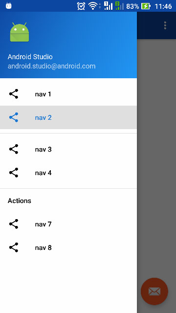
I'm not sure if this is fixed in API 26 (Android 8) or it was possible all the time. I'm still a noob in Android programming. However I added parent groups as below. Testing on Android 6 physical phone,
- I have the divider
- Selecting any item from either
nav_g1ornav_g2will deselect other items. - No extra padding added due to nested groups.
- I didn't add any
Javacode to listeners
Menu Code
<?xml version="1.0" encoding="utf-8"?>
<menu xmlns:android="http://schemas.android.com/apk/res/android">
    <group android:checkableBehavior="single">
        <group
            android:id="@+id/nav_g1"
            android:checkableBehavior="single">
            <item
                android:id="@+id/nav_1"
                android:icon="@drawable/ic_menu_share"
                android:title="@string/nav_1"/>
            <item
                android:id="@+id/nav_2"
                android:icon="@drawable/ic_menu_share"
                android:title="@string/nav_2"/>
        </group>
        <group
            android:id="@+id/nav_g2"
            android:checkableBehavior="single">
            <item
                android:id="@+id/nav_3"
                android:icon="@drawable/ic_menu_share"
                android:title="@string/nav_3"/>
            <item
                android:id="@+id/nav_4"
                android:icon="@drawable/ic_menu_share"
                android:title="@string/nav_4"/>
        </group>
    </group>
    <item android:title="Actions">
        <menu>
            <item
                android:id="@+id/nav_7"
                android:icon="@drawable/ic_menu_share"
                android:title="@string/nav_7"/>
            <item
                android:id="@+id/nav_8"
                android:icon="@drawable/ic_menu_share"
                android:title="@string/nav_8"/>
        </menu>
    </item>
</menu>
Notes
- As mentioned in this answer each group need to have a unique Id to show the divider.
- As per this answer spaces are matching the google material design specs.
- Having
android:checkableBehavior="single"for parent group is required so the problem of multiple selected menu items in this answer (mentioned in comments by hungryghost) does not happen
And here is the screenshot
Solution 7 - Android
Making different groups like Nilesh's answer does make a divider in between But creates the problem of two checked items in the nav drawer.
A simple way how I handled this was:
    public boolean onNavigationItemSelected(final MenuItem menuItem) {

    //if an item from extras group is clicked,refresh NAV_ITEMS_MAIN to remove previously checked item
    if (menuItem.getGroupId() == NAV_ITEMS_EXTRA) {


        navigationView.getMenu().setGroupCheckable(NAV_ITEMS_MAIN, false, true);
        navigationView.getMenu().setGroupCheckable(NAV_ITEMS_EXTRA, true, true);
       }else{

        navigationView.getMenu().setGroupCheckable(NAV_ITEMS_MAIN, true, true);
        navigationView.getMenu().setGroupCheckable(NAV_ITEMS_EXTRA, false, true);


    }
    //Update highlighted item in the navigation menu
    menuItem.setChecked(true);
}
Solution 8 - Android
I wanted dividers above the first item and after the last item. Using @Nilesh solution I had to add dummy menu items and set enabled to false which felt really dirty. Plus what if I want to do other cool stuff in my menu?
I noticed the NavigationView extends FrameLayout so you can put your own content into it just like you would for a FrameLayout. I then set an empty menu xml so that it only shows my custom layout. I understand that this probably goes against the path Google wants us to take but if you want a truly custom menu this is an easy way to do it.
<!--Note: NavigationView extends FrameLayout so we can put whatever we want in it.-->
<!--I don't set headerLayout since we can now put that in our custom content view-->
<android.support.design.widget.NavigationView
    android:layout_width="wrap_content"
    android:layout_height="match_parent"
    android:layout_gravity="start"
    android:fitsSystemWindows="true"
    app:menu="@menu/empty_menu">

    <!--CUSTOM CONTENT-->
    <RelativeLayout
        android:layout_width="match_parent"
        android:layout_height="match_parent">

        <!-- CUSTOM HEADER -->
        <include
            android:id="@+id/vNavigationViewHeader"
            layout="@layout/navigation_view_header"/>

        <!--CUSTOM MENU-->
        <LinearLayout
            android:layout_width="match_parent"
            android:layout_height="wrap_content"
            android:orientation="vertical"
            android:layout_below="@+id/vNavigationViewHeader">

            <View style="@style/NavigationViewLineSeperator"/>

            <Button android:text="Option 1"/>

            <View style="@style/NavigationViewLineSeperator"/>

            <Button android:text="Option 2"/>

            <View style="@style/NavigationViewLineSeperator"/>

        </LinearLayout>
    </RelativeLayout>
</android.support.design.widget.NavigationView>
Here is the style
<style name="NavigationViewLineSeperator">
        <item name="android:background">@drawable/line_seperator</item>
        <item name="android:layout_width">match_parent</item>
        <item name="android:layout_height">1dp</item>
</style>
And drawable
<?xml version="1.0" encoding="utf-8"?>
<shape xmlns:android="http://schemas.android.com/apk/res/android"
    android:shape="rectangle">

    <solid android:color="@color/white"/>
    <size android:width="100sp"
          android:height="1sp" />
</shape>
And the menu
<?xml version="1.0" encoding="utf-8"?>
<menu xmlns:android="http://schemas.android.com/apk/res/android">
</menu>
edit:
Instead of Buttons you can use TextView with drawable which mimics the original menu items look:
 <TextView
     android:layout_width="match_parent"
     android:layout_height="match_parent"
     android:text="@string/menu_support"
     android:drawableLeft="@drawable/menu_icon_support"
     style="@style/MainMenuText" />

// style.xml
<style name="MainMenuText">
    <item name="android:drawablePadding">12dp</item>
    <item name="android:padding">10dp</item>
    <item name="android:gravity">center_vertical</item>
    <item name="android:textColor">#fff</item>
</style>
Solution 9 - Android
Credit should go to Zorawar for the solution, Sorry for duplicating the answer but could not add so much formatted text within a comment.
Zorawar's solution works, the code could be improved as such :
public void onNavigationItemSelected(int groupId) {

    //if an item from extras group is clicked,refresh NAV_ITEMS_MAIN to remove previously checked item
    navigationView.getMenu().setGroupCheckable(NAV_ITEMS_MAIN, (groupId == NAV_ITEMS_MAIN), true);
    navigationView.getMenu().setGroupCheckable(NAV_ITEMS_EXTRA, (groupId == NAV_ITEMS_EXTRA), true);


    //Update highlighted item in the navigation menu
    menuItem.setChecked(true);
}
Solution 10 - Android
Call requires API level 28 :
just use
menu?.setGroupDividerEnabled(true)
in onCreateOptionsMenu function
Example :
override fun onCreateOptionsMenu(menu: Menu?): Boolean {

        menuInflater.inflate(R.menu.main_menu, menu)

        if (android.os.Build.VERSION.SDK_INT >= android.os.Build.VERSION_CODES.P) {
            menu?.setGroupDividerEnabled(true)
        }

        return super.onCreateOptionsMenu(menu)


    }
Solution 11 - Android
Nileh's Answer is right , Except it has one flaw of double checking.
<?xml version="1.0" encoding="utf-8"?>
<menu xmlns:android="http://schemas.android.com/apk/res/android">

    <group android:checkableBehavior="single" android:id="@+id/grp1">
        <item
            android:id="@+id/nav_register_customer"
            android:icon="@drawable/ic_menu_camera"
            android:checkableBehavior="none"
            android:title="Register Customer" />
    </group>
    <group  android:id="@+id/grp2"
        android:checkableBehavior="single"  >
        <item
            android:id="@+id/nav_slideshow"
            android:icon="@drawable/ic_menu_slideshow"
            android:checkableBehavior="none"
            android:title="Slideshow" />
    </group>
</menu>
So using
> android:checkableBehavior="single"
with unique id shall solve the problem
Solution 12 - Android
If you want to add divider dynamically, you can just add an empty SubMenu like this:
Menu menu = navigationView.getMenu();
menu.addSubMenu(" ").add(" ");
this will add a divider.
just be sure to pass in the right index when using menu.getItem(int index)
Solution 13 - Android
In addition to previous answers if you do want decorative separators but don't want to create multiple groups because of "checkable behavior" problems - you can assign the same group id to all your groups.
Example:
<?xml version="1.0" encoding="utf-8"?>
<menu xmlns:android="http://schemas.android.com/apk/res/android">
<group
    android:id="@+id/group_nav_common" <!-- New group id-->
    android:checkableBehavior="single">

    <item
        android:id="@+id/menu_item_nav_home"
        android:icon="@drawable/ic_home_black_24dp"
        android:title="@string/nav_menu_main" />
    <item
        android:id="@+id/menu_item_nav_articles"
        android:icon="@drawable/ic_art_track_black_24dp"
        android:title="@string/latest_news" />

    <item
        android:id="@+id/menu_item_nav_group_categories"
        android:title="@string/nav_menu_sections">
        <menu>
            <group
                android:id="@id/group_nav_common" <!-- Existing group id -->
                android:checkableBehavior="single">
                <!-- Programmatically populated section -->
            </group>
        </menu>
    </item>

    <item
        android:id="@+id/menu_item_nav_group_sites"
        android:title="@string/nav_menu_sites">
        <menu>
            <group
                android:id="@id/group_nav_common" <!-- Existing group id -->
                android:checkableBehavior="single">
                <item
                    android:id="@+id/menu_item_nav_select_site"
                    android:icon="@drawable/ic_account_balance_black_24dp"
                    android:title="@string/nav_menu_select_site" />
            </group>
        </menu>
    </item>
</group>
Solution 14 - Android
If the selected answer not work for you, you may want to try adding this to onCreateOptionsMenu in addition to give the unique group id:
if (Build.VERSION.SDK_INT >= 28) {
    menu.setGroupDividerEnabled(true)
}