How to create a drop shadow only on one side of an element?
CssCss Problem Overview
Is there a way to drop the shadow only on the bottom?. I have a menu with 2 images next to each other. I don't want a right shadow because it overlaps the right image. I don't like to use images for this so is there a way to drop it only on the bottom like:
box-shadow-bottom: 10px #FFF; or similar?
-moz-box-shadow: 0px 3px 3px #000;
-webkit-box-shadow: 0px 3px 3px #000;
box-shadow-bottom: 5px #000;
/* For IE 8 */
-ms-filter: "progid:DXImageTransform.Microsoft.Shadow(Strength=4, Direction=180, Color='#000000')";
/* For IE 5.5 - 7 */
filter: progid:DXImageTransform.Microsoft.Shadow(Strength=4, Direction=180, Color='#000000');
Css Solutions
Solution 1 - Css
UPDATE 4
Same as update 3 but with modern css (=fewer rules) so that no special positioning on the pseudo element is required.
#box {
    background-color: #3D6AA2;
    width: 160px;
    height: 90px;
    position: absolute;
    top: calc(10% - 10px);
    left: calc(50% - 80px);
}

.box-shadow:after {
    content:"";
    position:absolute;
    width:100%;
    bottom:1px;
    z-index:-1;
    transform:scale(.9);
    box-shadow: 0px 0px 8px 2px #000000;
}
<div id="box" class="box-shadow"></div>
UPDATE 3
All my previous answers have been using extra markup to get create this effect, which is not necessarily needed. I think this is a much cleaner solution... the only trick is playing around with the values to get the right positioning of the shadow as well as the right strength/opacity of the shadow. Here's a new fiddle, using pseudo-elements:
http://jsfiddle.net/UnsungHero97/ARRRZ/2/
HTML
<div id="box" class="box-shadow"></div>
CSS
#box {
    background-color: #3D6AA2;
    width: 160px;
    height: 90px;
    margin-top: -45px;
    margin-left: -80px;
    position: absolute;
    top: 50%;
    left: 50%;
}

.box-shadow:after {
    content: "";
    width: 150px;
    height: 1px;
    margin-top: 88px;
    margin-left: -75px;
    display: block;
    position: absolute;
    left: 50%;
    z-index: -1;
    -webkit-box-shadow: 0px 0px 8px 2px #000000;
       -moz-box-shadow: 0px 0px 8px 2px #000000;
            box-shadow: 0px 0px 8px 2px #000000;
}
UPDATE 2
Apparently, you can do this with just an extra parameter to the box-shadow CSS as everyone else just pointed out. Here's the demo:
http://jsfiddle.net/K88H9/821/
CSS
-webkit-box-shadow: 0 4px 4px -2px #000000;
   -moz-box-shadow: 0 4px 4px -2px #000000;
        box-shadow: 0 4px 4px -2px #000000;
This would be a better solution. The extra parameter that is added is described as:
> The fourth length is a spread > distance. Positive values cause the > shadow shape to expand in all > directions by the specified radius. > Negative values cause the shadow shape > to contract.
UPDATE
Check out the demo at jsFiddle: http://jsfiddle.net/K88H9/4/
What I did was to create a "shadow element" that would hide behind the actual element that you would want to have a shadow. I made the width of the "shadow element" to be exactly less wide than the actual element by 2 times the shadow you specify; then I aligned it properly.
HTML
<div id="wrapper">
    <div id="element"></div>
    <div id="shadow"></div>
</div>
CSS
#wrapper {
    width: 84px;
    position: relative;
}
#element {
    background-color: #3D668F;
    height: 54px;
    width: 100%;
    position: relative;
    z-index: 10;
}
#shadow {
    background-color: #3D668F;
    height: 8px;
    width: 80px;
    margin-left: -40px;
    position: absolute;
    bottom: 0px;
    left: 50%;
    z-index: 5;
    -webkit-box-shadow: 0px 2px 4px #000000;
       -moz-box-shadow: 0px 2px 4px #000000;
            box-shadow: 0px 2px 4px #000000;
}
Original Answer
Yes, you can do this with the same syntax you have provided. The first value controls the horizontal positioning and the second value controls the vertical positioning. So just set the first value to 0px and the second to whatever offset you'd like as follows:
-webkit-box-shadow: 0px 5px #000000;
   -moz-box-shadow: 0px 5px #000000;
        box-shadow: 0px 5px #000000;
For more info on box shadows, check out these:
- http://www.css3.info/preview/box-shadow/
- https://developer.mozilla.org/en/css/-moz-box-shadow#Browser_compatibility
- http://www.w3.org/TR/css3-background/#the-box-shadow
I hope this helps.
Solution 2 - Css
Just use the spread parameter to make the shadow smaller:
.shadow {
  -webkit-box-shadow: 0 6px 4px -4px black;
  -moz-box-shadow: 0 6px 4px -4px black;
  box-shadow: 0 6px 4px -4px black;
}
<div class="shadow">Some content</div>
Live demo: http://dabblet.com/gist/a8f8ba527f5cff607327
To not see any shadow on the sides, the (absolute value of the) spread radius (4th parameter) needs to be the same as the blur radius (3rd parameter).
Solution 3 - Css
If you have a fixed color on the background, you can hide the side-shadow effect with two masking shadows having the same color of the background and blur = 0, example:
box-shadow:
    -6px 0 white,         /*Left masking shadow*/
    6px 0 white,          /*Right masking shadow*/
    0 7px 4px -3px black; /*The real (slim) shadow*/
Note that the black shadow must be the last, and has a negative spread (-3px) in order to prevent it from extendig beyond the corners.
Here the fiddle (change the color of the masking shadows to see how it really works).
div{ width: 100px; height: 100px; border: 1px solid pink; box-shadow: -6px 0 white, 6px 0 white, 0 7px 5px -2px black; }
<div></div>
Solution 4 - Css
You could also use clip-path to clip (hide) all overflowing edges but the one you want to show:
.shadow {
  box-shadow: 0 4px 4px black;
  clip-path: polygon(0 0, 100% 0, 100% 200%, 0 200%);
}
See clip-path (MDN). The arguments to polygon are the top-left point, the top-right point, the bottom-right point, and the bottom-left point. By setting the bottom edge to 200% (or whatever number bigger than 100%) you constrain your overflow to only the bottom edge.
Examples:
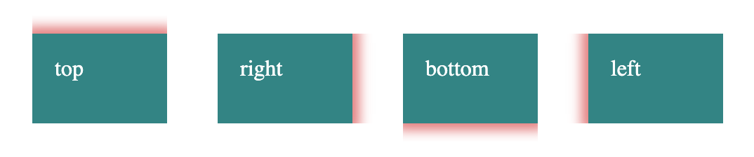
.shadow {
  box-shadow: 0 0 8px 5px rgba(200, 0, 0, 0.5);
}
.shadow-top {
  clip-path: polygon(0% -20%, 100% -20%, 100% 100%, 0% 100%);
}
.shadow-right {
  clip-path: polygon(0% 0%, 120% 0%, 120% 100%, 0% 100%);
}
.shadow-bottom {
  clip-path: polygon(0% 0%, 100% 0%, 100% 120%, 0% 120%);
}
.shadow-left {
  clip-path: polygon(-20% 0%, 100% 0%, 100% 100%, -20% 100%);
}

.shadow-bottom-right {
  clip-path: polygon(0% 0%, 120% 0%, 120% 120%, 0% 120%);
}

/* layout for example */
.box {
  display: inline-block;
  vertical-align: top;
  background: #338484;
  color: #fff;
  width: 4em;
  height: 2em;
  margin: 1em;
  padding: 1em;
}
<div class="box">none</div>
<div class="box shadow shadow-all">all</div>
<div class="box shadow shadow-top">top</div>
<div class="box shadow shadow-right">right</div>
<div class="box shadow shadow-bottom">bottom</div>
<div class="box shadow shadow-left">left</div>
<div class="box shadow shadow-bottom-right">bottom right</div>
Solution 5 - Css
I think this is what you're after?
.shadow {
  -webkit-box-shadow: 0 0 0 4px white, 0 6px 4px black;
  -moz-box-shadow: 0 0 0 4px white, 0 6px 4px black;
  box-shadow: 0 0 0 4px white, 0 6px 4px black;
}
<div class="shadow">wefwefwef</div>
Solution 6 - Css
Another idea based on the answer of @theengineear where I will use inset instead of polygon. It's easier since it works the same way as margin or padding. I will also rely on CSS variable to easily define all the different cases.
.shadow {
  box-shadow: 0 0 8px 5px rgba(200, 0, 0, 0.5);
  clip-path:inset(var(--t,0) var(--r,0) var(--b,0) var(--l,0))
}

.top { --t:-100%; }
.right { --r:-100%;}
.bottom { --b:-100%; }
.left { --l:-100%;}


/* layout for example */

.box {
  display: inline-block;
  vertical-align: top;
  background: #338484;
  color: #fff;
  width: 4em;
  height: 2em;
  margin: 1em;
  padding: 1em;
}
<div class="box">none</div>
<div class="box shadow top right left bottom">all</div>
<div class="box shadow top">top</div>
<div class="box shadow right">right</div>
<div class="box shadow bottom">bottom</div>
<div class="box shadow left">left</div>
<div class="box shadow bottom right">bottom right</div>
<div class="box shadow bottom top">top bottom</div>
<div class="box shadow left top right">top left right</div>
<div class="box shadow left right"> left right</div>
Solution 7 - Css
It's always better to read the specs. There is no box-shadow-bottom property, and as Lea points out you should always place the un-prefixed property at the bottom, after the prefixed ones.
So it's:
.shadow {
  -webkit-box-shadow: 0px 2px 4px #000000;
  -moz-box-shadow: 0px 2px 4px #000000;
  box-shadow: 0px 2px 4px #000000;
}
<div class="shadow">Some content</div>
Solution 8 - Css
How about just using a containing div which has overflow set to hidden and some padding at the bottom? This seems like much the simplest solution.
Sorry to say I didn't think of this myself but saw it somewhere else.
>Using an element to wrap the element getting the box-shadow and a overflow: hidden on the wrapper you could make the extra box-shadow disappear and still have a usable border. This also fixes the problem where the element is smaller as it seems, because of the spread.
> Like this:
> #wrapper { padding-bottom: 10px; overflow: hidden; } > #elem { box-shadow: 0 0 10px black; }
>Content goes here
>Still a clever solution when it has to be done in pure CSS!
As said by Jorgen Evens.
Solution 9 - Css
I also needed a shadow but only under an image and set in slightly left and right. This worked for me:
.box-shadow {
   -webkit-box-shadow: 5px 35px 30px -25px #888888;
      -moz-box-shadow: 5px 35px 30px -25px #888888;
           box-shadow: 5px 35px 30px -25px #888888;
}
The element this is applied to is a page-wide image (980px x 300px).
If it helps when fiddling with the settings, they run as follows:
horizontal shadow, vertical shadow, blur distance, spread (i.e. shadow size), and color.
Solution 10 - Css
It is better to look up shadow:
.header{
    -webkit-box-shadow: 0 -8px 73px 0 rgba(0,0,0,0.2);
    -moz-box-shadow: 0 -8px 73px 0 rgba(0,0,0,0.2);
    box-shadow: 0 -8px 73px 0 rgba(0,0,0,0.2);
}
this code is currently using on stackoverflow web.
Solution 11 - Css
If your background is solid (or you can reproduce it using CSS), you can use linear gradient that way:
div {
  background-image: linear-gradient(to top, rgba(0, 0, 0, 0) 0%, rgba(0, 0, 0, 0.3) 5px, #fff 5px, #fff 100%)
}
<div>
<p>Foobar</p>
<p>test</p>
</div>
This will generate a 5px gradient at the bottom of the element, from black at 30% opacity to completely transparent. The rest of the element has white background. Of course, changing the last 2 color stops of the linear gradient, you could make the background completely transparent.
Solution 12 - Css
This code pen (not by me) demonstrates a super simple way of doing this and the other sides by themselves quite nicely:
box-shadow: 0 5px 5px -5px #333;
Solution 13 - Css
You could also just do a gradient on the bottom - this was helpful for me because the shadow I wanted was on an element that was already semi-transparent, so I didn't have to worry about any clipping:
&:after {
      content:"";
      width:100%;
      height: 8px;
      position: absolute;
      bottom: -8px;
      left: 0;
      background: linear-gradient(to bottom, rgba(0,0,0,0.65) 0%,rgba(0,0,0,0) 100%);
    }
Just make the "bottom" and "height" properties match and set your rgba values to whatever you want them to be at the top / bottom of the shadow
Solution 14 - Css
You can do that like this:
General syntax:
selector {
   box-shadow: topBoxShadow, bottomBoxShadow, rightBoxShadow, leftBoxShadow
}
Example: we want to make only a bottom box shadow with red color,
so to do that we have to set all the sides options where we have to set the bottom box shadow options and set all the others as empty as follow:
.box {
     -moz-box-shadow: 0 0 0 transparent ,0 0 10px red, 0 0 0 transparent, 0 0 0 transparent
     -o-box-shadow: 0 0 0 transparent ,0 0 10px red, 0 0 0 transparent, 0 0 0 transparent
     -webkit-box-shadow: 0 0 0 transparent ,0 0 10px red, 0 0 0 transparent, 0 0 0 transparent
     box-shadow: 0 0 0 transparent ,0 0 10px red, 0 0 0 transparent, 0 0 0 transparent
}
Solution 15 - Css
update on someone else his answer transparant sides instead of white so it works on other color backgrounds too.
body {
  background: url(http://s1.picswalls.com/wallpapers/2016/03/29/beautiful-nature-backgrounds_042320876_304.jpg)
}

div {
  background: url(https://www.w3schools.com/w3css/img_avatar3.png) center center;
  background-size: contain;
  width: 100px;
  height: 100px;
  margin: 50px;
  border: 5px solid white;
  box-shadow: 0px 0 rgba(0, 0, 0, 0), 0px 0 rgba(0, 0, 0, 0), 0 7px 7px -5px black;
}
<div>
</div>
Solution 16 - Css
inner shadow
 .shadow {
   -webkit-box-shadow: inset 0 0 9px #000;
   -moz-box-shadow: inset 0 0 9px #000;
   box-shadow: inset 0 0 9px #000;
 }
<div class="shadow">wefwefwef</div>