How to create a circle icon button in Flutter?
FlutterFlutter LayoutFlutter Problem Overview
How can I create something similar to a FloatingActionButton?
Flutter Solutions
Solution 1 - Flutter
RawMaterialButton is better suited I think.
RawMaterialButton(
  onPressed: () {},
  elevation: 2.0,
  fillColor: Colors.white,
  child: Icon(
    Icons.pause,
    size: 35.0,
  ),
  padding: EdgeInsets.all(15.0),
  shape: CircleBorder(),
)
Solution 2 - Flutter
Update (use new ElevatedButton)
-
ElevatedButton(with less customizations)ElevatedButton( onPressed: () {}, child: Icon(Icons.menu, color: Colors.white), style: ElevatedButton.styleFrom( shape: CircleBorder(), padding: EdgeInsets.all(20), primary: Colors.blue, // <-- Button color onPrimary: Colors.red, // <-- Splash color ), ) -
ElevatedButton(with more customizations)ElevatedButton( onPressed: () {}, child: Icon(Icons.menu), style: ButtonStyle( shape: MaterialStateProperty.all(CircleBorder()), padding: MaterialStateProperty.all(EdgeInsets.all(20)), backgroundColor: MaterialStateProperty.all(Colors.blue), // <-- Button color overlayColor: MaterialStateProperty.resolveWith<Color?>((states) { if (states.contains(MaterialState.pressed)) return Colors.red; // <-- Splash color }), ), ) -
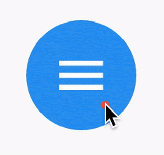
Using
InkWellClipOval( child: Material( color: Colors.blue, // Button color child: InkWell( splashColor: Colors.red, // Splash color onTap: () {}, child: SizedBox(width: 56, height: 56, child: Icon(Icons.menu)), ), ), )
Output (same for the last two):
Solution 3 - Flutter
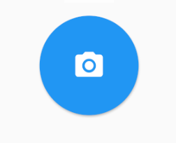
You just need to use the shape: CircleBorder()
MaterialButton(
  onPressed: () {},
  color: Colors.blue,
  textColor: Colors.white,
  child: Icon(
    Icons.camera_alt,
    size: 24,
  ),
  padding: EdgeInsets.all(16),
  shape: CircleBorder(),
)
Solution 4 - Flutter
You can use InkWell to do that:
> A rectangular area of a Material that responds to touch.
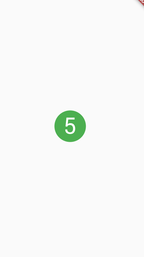
Below example demonstrate how to use InkWell. Notice: you don't need StatefulWidget to do that. I used it to change the state of the count.
Example:
import 'package:flutter/material.dart';

class SettingPage extends StatefulWidget {
  @override
  _SettingPageState createState() => new _SettingPageState();
}

class _SettingPageState extends State<SettingPage> {
  int _count = 0;
  @override
  Widget build(BuildContext context) {
    return new Scaffold(
      body: new Center(
        child: new InkWell(// this is the one you are looking for..........
        onTap: () => setState(() => _count++),
        child: new Container(
          //width: 50.0,
          //height: 50.0,
          padding: const EdgeInsets.all(20.0),//I used some padding without fixed width and height
          decoration: new BoxDecoration(
            shape: BoxShape.circle,// You can use like this way or like the below line
            //borderRadius: new BorderRadius.circular(30.0),
            color: Colors.green,
          ),
          child: new Text(_count.toString(), style: new TextStyle(color: Colors.white, fontSize: 50.0)),// You can add a Icon instead of text also, like below.
          //child: new Icon(Icons.arrow_forward, size: 50.0, color: Colors.black38)),
        ),//............
      ),
      ),
    );
  }
}
If you want to get benefit of splashColor, highlightColor, wrap InkWell widget using a Material widget with material type circle. And then remove decoration in Container widget.
Outcome:
Solution 5 - Flutter
If you need a background image, you can use CircleAvatar with IconButton. Set the backgroundImage property.
CircleAvatar(
  backgroundImage: NetworkImage(userAvatarUrl),
)
Example with button:
        CircleAvatar(
          backgroundColor: Colors.blue,
          radius: 20,
          child: IconButton(
            padding: EdgeInsets.zero,
            icon: Icon(Icons.add),
            color: Colors.white,
            onPressed: () {},
          ),
        ),

Solution 6 - Flutter
You can easily do the following:
FlatButton(
      onPressed: () {

       },
      child: new Icon(
        Icons.arrow_forward,
        color: Colors.white,
        size: 20.0,
      ),
      shape: new CircleBorder(),
      color: Colors.black12,
    )
The result is
Solution 7 - Flutter
RawMaterialButton(
  onPressed: () {},
  constraints: BoxConstraints(),
  elevation: 2.0,
  fillColor: Colors.white,
  child: Icon(
    Icons.pause,
    size: 35.0,
  ),
  padding: EdgeInsets.all(15.0),
  shape: CircleBorder(),
)
note down constraints: BoxConstraints(), it's for not allowing padding in left.
Happy fluttering!!
Solution 8 - Flutter
RaisedButton is depricated, now you can create this by ElevatedButton.
ElevatedButton(
      onPressed: () {},
      child: Icon(Icons.add, color: Colors.white),
      style: ElevatedButton.styleFrom(
        shape: CircleBorder(),
        padding: EdgeInsets.all(20),
        primary: Colors.blue,
        onPrimary: Colors.black,
      ),
    )

Solution 9 - Flutter
Using ElevatedButton:
          ElevatedButton(
            onPressed: () {},
            child: Icon(
              Icons.add,
              color: Colors.white,
              size: 60.0,
            ),
            style: ElevatedButton.styleFrom(
                shape: CircleBorder(), primary: Colors.green),
          )

Solution 10 - Flutter
I created a version with correct clipping, elevation and border. Feel free to customize it.
Material(
	elevation: 2.0,
	clipBehavior: Clip.hardEdge,
	borderRadius: BorderRadius.circular(50),
	color: Colors.white,
	child: InkWell(
		onTap: () => null,
		child: Container(
     		padding: EdgeInsets.all(9.0),
    		decoration: BoxDecoration(
    			shape: BoxShape.circle,
	        	border: Border.all(color: Colors.blue, width: 1.4)),
	       child: Icon(
     			Icons.menu,
    			size: 22,
    			color: Colors.red,
     		),
		),
	),
)),
Solution 11 - Flutter
There actually is an example how to create a circle IconButton similar to the FloatingActionButton.
Ink(
    decoration: const ShapeDecoration(
        color: Colors.lightBlue,
        shape: CircleBorder(),
    ),
    child: IconButton(
        icon: Icon(Icons.home),
        onPressed: () {},
    ),
)
To create a local project with this code sample, run:
flutter create --sample=material.IconButton.2 mysample
Solution 12 - Flutter
I used this one because I like the customisation of the border-radius and size.
  Material( // pause button (round)
    borderRadius: BorderRadius.circular(50), // change radius size
    color: Colors.blue, //button colour
    child: InkWell(
      splashColor: Colors.blue[900], // inkwell onPress colour
      child: SizedBox(
        width: 35,height: 35, //customisable size of 'button'
        child: Icon(Icons.pause,color: Colors.white,size: 16,),
      ),
      onTap: () {}, // or use onPressed: () {}
    ),
  ),

  Material( // eye button (customised radius)
    borderRadius: BorderRadius.only(
        topRight: Radius.circular(10.0),
        bottomLeft: Radius.circular(50.0),),
    color: Colors.blue,
    child: InkWell(
      splashColor: Colors.blue[900], // inkwell onPress colour
      child: SizedBox(
        width: 40, height: 40, //customisable size of 'button'
        child: Icon(Icons.remove_red_eye,color: Colors.white,size: 16,),),
      onTap: () {}, // or use onPressed: () {}
    ),
  ),

Solution 13 - Flutter
2021
If you need it flat (no elevation) as FlatButton is now deprecated.
TextButton(
      onPressed: (){},
      child: Icon(Icons.arrow_back),
      style: ButtonStyle(
          backgroundColor: MaterialStateProperty.all(Colors.black26),
          shape: MaterialStateProperty.all(const CircleBorder())),
    );
Solution 14 - Flutter
My contribution:
import 'package:flutter/material.dart';

///
/// Create a circle button with an icon.
///
/// The [icon] argument must not be null.
///
class CircleButton extends StatelessWidget {
  const CircleButton({
    Key key,
    @required this.icon,
    this.padding = const EdgeInsets.all(8.0),
    this.color,
    this.onPressed,
    this.splashColor,
  })  : assert(icon != null),
        super(key: key);

  /// The [Icon] contained ny the circle button.
  final Icon icon;

  /// Empty space to inscribe inside the circle button. The [icon] is
  /// placed inside this padding.
  final EdgeInsetsGeometry padding;

  /// The color to fill in the background of the circle button.
  ///
  /// The [color] is drawn under the [icon].
  final Color color;

  /// The callback that is called when the button is tapped or otherwise activated.
  ///
  /// If this callback is null, then the button will be disabled.
  final void Function() onPressed;

  /// The splash color of the button's [InkWell].
  ///
  /// The ink splash indicates that the button has been touched. It
  /// appears on top of the button's child and spreads in an expanding
  /// circle beginning where the touch occurred.
  ///
  /// The default splash color is the current theme's splash color,
  /// [ThemeData.splashColor].
  final Color splashColor;

  @override
  Widget build(BuildContext context) {
    final ThemeData theme = Theme.of(context);

    return ClipOval(
      child: Material(
        type: MaterialType.button,
        color: color ?? theme.buttonColor,
        child: InkWell(
          splashColor: splashColor ?? theme.splashColor,
          child: Padding(
            padding: padding,
            child: icon,
          ),
          onTap: onPressed,
        ),
      ),
    );
  }
}
Solution 15 - Flutter
This code will help you to add button without any unwanted padding,
RawMaterialButton(
      elevation: 0.0,
      child: Icon(Icons.add),
      onPressed: (){},
      constraints: BoxConstraints.tightFor(
        width: 56.0,
        height: 56.0,
      ),
      shape: CircleBorder(),
      fillColor: Color(0xFF4C4F5E),
    ),
Solution 16 - Flutter
Not Material solution:
final double floatingButtonSize = 60;
final IconData floatingButtonIcon;

TouchableOpacity(
  onTap: () {
     /// Do something...
  },
  activeOpacity: 0.7,
  child: Container(
    height: floatingButtonSize,
    width: floatingButtonSize,
    decoration: BoxDecoration(
      borderRadius: BorderRadius.circular(floatingButtonSize / 2),
      color: Theme.of(context).primaryColor,
      boxShadow: [
        BoxShadow(
          blurRadius: 25,
          color: Colors.black.withOpacity(0.2),
          offset: Offset(0, 10),
        )
      ],
    ),
    child: Icon(
      floatingButtonIcon ?? Icons.add,
      color: Colors.white,
    ),
  ),
)
You can use GestureDetector instead of TouchableOpacity library.
Solution 17 - Flutter
You can also use a RaisedButton with an image inside (for example for social login) like this (sizedbox with fittebox is needed to contraint the image on the specified size):
FittedBox(
    fit: BoxFit.scaleDown,
    child: SizedBox(
        height: 60,
        width: 60,
        child: RaisedButton(
             child: Image.asset(
                 'assets/images/google_logo.png'),
                 shape: StadiumBorder(),
                 color: Colors.white,
                     onPressed: () {},
                 ),
             ),
         ),
Solution 18 - Flutter
ClipOval(
      child: MaterialButton(
      color: Colors.purple,
      padding: EdgeInsets.all(25.0),
      onPressed: () {},
      shape: RoundedRectangleBorder(
      borderRadius: BorderRadius.circular(30.0)),
            child: Text(
                      '1',
                      style: TextStyle(fontSize: 30.0),
                    ),
                  ),
                ),
Solution 19 - Flutter
Below code will create a Circle of radius 25 and will have white color add icon in it. and If user also want to have click method that can be simply achieved by wrapping a Container widget into GestureDetector() or InkWell().
Container(
height: 50,
width: 50,
decoration: BoxDecoration(
color: Colors.blue,
borderRadius: BorderRadius.circular(50 / 2),
),
child: Center(
child: Icon(
Icons.add,
color: Colors.white,
),
),
),
Solution 20 - Flutter
Just use the circle shape
MaterialButton(
  onPressed: () {
print("Circle button pressed");
  },
  color: Colors.blue,
  textColor: Colors.white,
  child: Icon(
    Icons.favorite,
    size: 20,
  ),
  padding: EdgeInsets.all(16),
//use this class Circleborder() for circle shape.
  shape: CircleBorder(),
)
Solution 21 - Flutter
Try out this Card
Card(
    elevation: 10,
    shape: RoundedRectangleBorder(
      borderRadius: BorderRadius.circular(25.0), // half of height and width of Image
      ),
    child: Image.asset(
      "assets/images/home.png",
      width: 50,
      height: 50,
    ),
  )
Solution 22 - Flutter
Container(
  width: 70.w,
  height: 70.h,
  alignment: AlignmentDirectional.topCenter,
  child: MaterialButton(
    onPressed: () {},
    color: Color(0xff022C43),
    textColor: Colors.white,
    child: Icon(
      Icons.arrow_forward,
      size: 24,
    ),
    padding: EdgeInsets.all(16),
    shape: CircleBorder(),
  )
)