How to change colour of blue highlight on select box dropdown
CssCss Problem Overview
How do I change the blue highlight on this dropdown please?
I'd like to change the highlight color to gray if this is possible.
select {
  border: 0;
  color: #EEE;
  background: transparent;
  font-size: 20px;
  font-weight: bold;
  padding: 2px 10px;
  width: 378px;
  *width: 350px;
  *background: #58B14C;
  -webkit-appearance: none;
}

#mainselection {
  overflow: hidden;
  width: 350px;
  -moz-border-radius: 9px 9px 9px 9px;
  -webkit-border-radius: 9px 9px 9px 9px;
  border-radius: 9px 9px 9px 9px;
  box-shadow: 1px 1px 11px #330033;
  background: url("http://www.danielneumann.com/wp-content/uploads/2011/01/arrow.gif") no-repeat scroll 319px 5px #58B14C;
}
<div id="mainselection">
  <select>
    <option>Select an Option</option>
    <option>Option 1</option>
    <option>Option 2</option>
  </select>
</div>
Css Solutions
Solution 1 - Css
Yes, you could change the background of select but you will not be able to change the highlight color (when you hover) by using CSS!
>You have few options:
-
Is to convert
selectintoul, likind of select and do anything you want with this. -
Use libraries like Choosen, Select2 or jQuery Form Styler . These allow you to style in much more broad and cross-browser way.
Solution 2 - Css
I believe you are looking for the outline CSS property (in conjunction with active and hover psuedo attributes):
/* turn it off completely */
select:active, select:hover {
  outline: none
}

/* make it red instead (with with same width and style) */
select:active, select:hover {
  outline-color: red
}
Full details of outline, outline-color, outline-style, and outline-width https://developer.mozilla.org/en-US/docs/Web/CSS/outline
Solution 3 - Css
Just found this whilst looking for a solution. I've only tested it FF 32.0.3
box-shadow: 0 0 10px 100px #fff inset;
Solution 4 - Css
try this.. I know it's an old post but it might help somebody
select option:hover,
    select option:focus,
    select option:active {
        background: linear-gradient(#000000, #000000);
        background-color: #000000 !important; /* for IE */
        color: #ffed00 !important;
    }

    select option:checked {
        background: linear-gradient(#d6d6d6, #d6d6d6);
        background-color: #d6d6d6 !important; /* for IE */
        color: #000000 !important;
    }
Solution 5 - Css
When we click on an "input" element, it gets "focused" on. Removing the blue highlighter for this "focus" action is as simple as below. To give it gray color, you could define a gray border.
select:focus{
    border-color: gray;
    outline:none;
}
Solution 6 - Css
This works for firefox and chrome, falls back gracefully to the system color in IE. Just be sure to set the title property to the content of the option. It allows you to set the background and foreground colors.
select option:checked:after {
    content: attr(title);
    background: #666;
    color: #fff;
    position: absolute;
    width: 100%;
    left: 0;
    border: none;
}
Solution 7 - Css
To both style the hover color and avoid the OS default color in Firefox, you need to add a box-shadow to both the select option and select option:hover declarations, setting the color of the box-shadow on "select option" to the menu background color.
select option {
  background: #f00;
  color: #fff;
  box-shadow: inset 20px 20px #f00
}

select option:hover {
  color: #000;
  box-shadow: inset 20px 20px #00f;
}
Solution 8 - Css
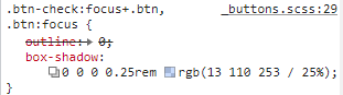
try removing box shadow of the :focus class in the button, the image attached shows of how this is in bootstrap.
.dropdown .btn:focus{
    box-shadow: none;
}
Solution 9 - Css
i just found this site that give a cool themes for the select box http://gregfranko.com/jquery.selectBoxIt.js/
and you can try this themes if your problem with the overall look blue - yellow - grey
Solution 10 - Css
Add this in your CSS code and change the red background-color with a color of your choice:
.dropdown-menu>.active>a {color:black; background-color:red;}
.dropdown-menu>.active>a:focus {color:black; background-color:red;}
.dropdown-menu>.active>a:hover {color:black; background-color:red;}