How to align entire html body to the center?
HtmlCssHtml Problem Overview
How do I align entire html body to the center ?
Html Solutions
Solution 1 - Html
I just stumbled on this old post, and while I'm sure user01 has long since found his answer, I found the current answers don't quite work. After playing around for a little bit using info provided by the others, I found a solution that worked in IE, Firefox, and Chrome. In CSS:
html, body {
	height: 100%;
}

html {
	display: table;
	margin: auto;
}

body {
	display: table-cell;
	vertical-align: middle;
}
This is almost identical to abernier's answer, but I found that including width would break the centering, as would omitting the auto margin. I hope anyone else who stumbles on this thread will find my answer helpful.
Note: Omit html, body { height: 100%; } to only center horizontally.
Solution 2 - Html
You can try:
body{ margin:0 auto; }
Solution 3 - Html
EDIT
As of today with flexbox, you could
body {
  display:flex; flex-direction:column; justify-content:center;
  min-height:100vh;
}
PREVIOUS ANSWER
html, body {height:100%;}
html {display:table; width:100%;}
body {display:table-cell; text-align:center; vertical-align:middle;}
Solution 4 - Html
Try this
body {
max-width: max-content;
margin: auto;
}
Solution 5 - Html
If I have one thing that I love to share with respect to CSS, it's MY FAVE WAY OF CENTERING THINGS ALONG BOTH AXES!!!
Advantages of this method:
- Full compatibility with browsers that people actually use
- No tables required
- Highly reusable for centering any other elements inside their parent
- Accomodates parents and children with dynamic (changing) dimensions!
I always do this by using 2 classes: One to specify the parent element, whose content will be centered (.centered-wrapper), and the 2nd one to specify which child of the parent is centered (.centered-content). This 2nd class is useful in the case where the parent has multiple children, but only 1 needs to be centered).
In this case, body will be the .centered-wrapper, and an inner div will be .centered-content.
<html>
    <head>...</head>
    <body class="centered-wrapper">
        <div class="centered-content">...</div>
    </body>
</html>
The idea for centering will now be to make .centered-content an inline-block. This will easily facilitate horizontal centering, through text-align: center;, and also allows for vertical centering as you shall see.
.centered-wrapper {
    position: relative;
    text-align: center;
}
.centered-wrapper:before {
    content: "";
    position: relative;
    display: inline-block;
    width: 0; height: 100%;
    vertical-align: middle;
}
.centered-content {
    display: inline-block;
    vertical-align: middle;
}
This gives you 2 really reusable classes for centering any child inside of any parent! Just add the .centered-wrapper and .centered-content classes.
So, what's up with that :before element? It facilitates vertical-align: middle; and is necessary because vertical alignment isn't relative to the height of the parent - vertical alignment is relative to the height of the tallest sibling!!!. Therefore, by ensuring that there is a sibling whose height is the parent's height (100% height, 0 width to make it invisible), we know that vertical alignment will be with respect to the parent's height.
One last thing: You need to ensure that your html and body tags are the size of the window so that centering to them is the same as centering to the browser!
html, body {
    width: 100%;
    height: 100%;
    padding: 0;
    margin: 0;
}
Solution 6 - Html
http://bluerobot.com/web/css/center1.html
body {
	margin:50px 0;
    padding:0;
	text-align:center;
}

#Content {
	width:500px;
	margin:0 auto;
	text-align:left;
	padding:15px;
	border:1px dashed #333;
	background-color:#eee;
}
Solution 7 - Html
I use flexbox on html. For a nice effect, you can match the browsers chrome so as to frame your content on screen sizes larger than your page maximums. I find that #eeeeee matches pretty well. You could add a box shadow for a nice float effect.
    html{
        display: flex;
        flex-flow: row nowrap;
        justify-content: center;
        align-content: center;
        align-items: center;
        height:100%;
        margin: 0;
        padding: 0;
        background:#eeeeee;
    }
    body {
        margin: 0;
        flex: 0 1 auto;
        align-self: auto;
        /*recommend 1920 / 1080 max based on usage stats, use 100% to that point*/
        width: 100%
        max-width: 900px;
        height: 100%;
        max-height: 600px;
        background:#fafafa;
        -webkit-box-shadow: 0px 0px 96px 0px rgba(0,0,0,0.75);
        -moz-box-shadow: 0px 0px 96px 0px rgba(0,0,0,0.75);
        box-shadow: 0px 0px 96px 0px rgba(0,0,0,0.75);
    }
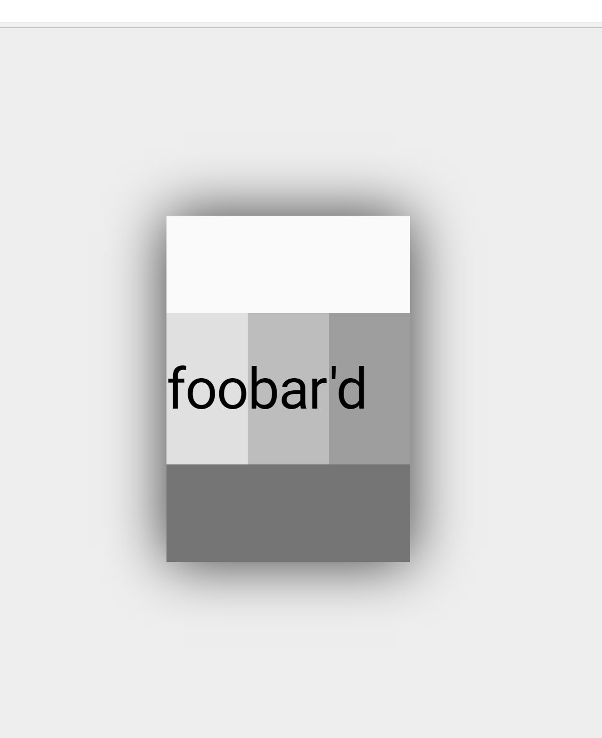
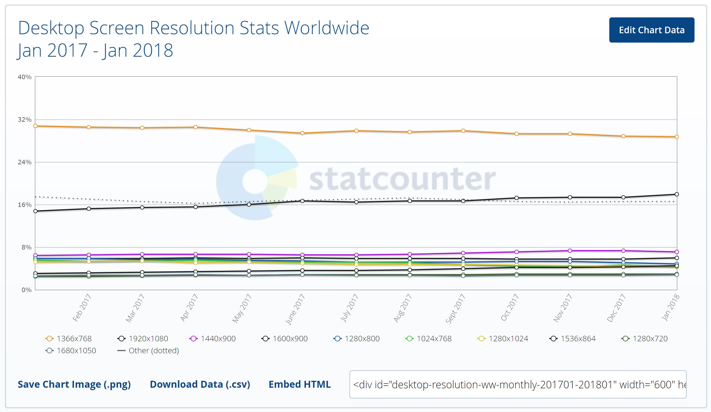 image/data courtesy StatCounter
Solution 8 - Html
Just write
<body>
   <center>
            *Your Code Here*
   </center></body>
Solution 9 - Html
<style>
		body{
			max-width: 1180px;
			width: 98%;
			margin: 0px auto;
			text-align: left;
		}
</style>
Just apply this style before applying any CSS. You can change width as per your need.
Solution 10 - Html
What about this:
- if width: 60%, then margin-left: (1-60%)/2 = 20%;
- if height: 50%, then margin-top: (1-50%)/2=25%;
So do margin-bottom and margin-right;
<style type="text/css">
        html {
            height: 100%;
        }

        body {
            width: 60%;
            height: 50%;
            margin: 25% 20% 25% 20%;
            border: 1px solid;
        }
    </style>
Solution 11 - Html
<body class="center">
    <div align="center">
    </div>
</body>
This is the code that worked for me, using glitch.me.