How do you style the dropdown on Google Places Autocomplete API?
CssGoogle MapsAutocompleteCss Problem Overview
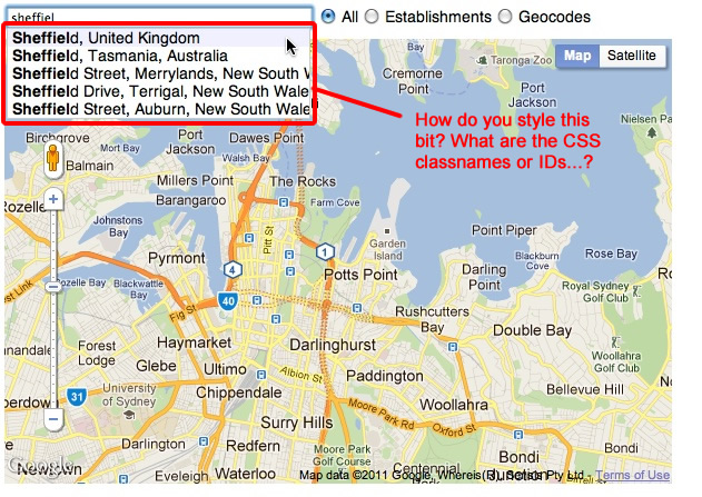
We need to tweak the styling of the dropdown that shows the autocomplete place suggestions when using the Google Places/Maps Autocomplete API.
Does anyone know if this is even possible? If so, I guess we just need to know the CSS classnames/IDs.
There's a screen grab of the bit I am referring to here:
Css Solutions
Solution 1 - Css
This is now documented by google: https://developers.google.com/maps/documentation/javascript/places-autocomplete#style_autocomplete
Solution 2 - Css
If you use firebug (as mentioned in a comment to your question...) you see that the container with the autocomplete results is a DIV with the class "pac-container" and the suggestions are inside it as a DIV with the class "pac-item". so just style with CSS.
Solution 3 - Css
This CSS will allow the drop-down to resize to fit the width of the results:
.pac-container, .pac-item {
    width: inherit !important;
}
Solution 4 - Css
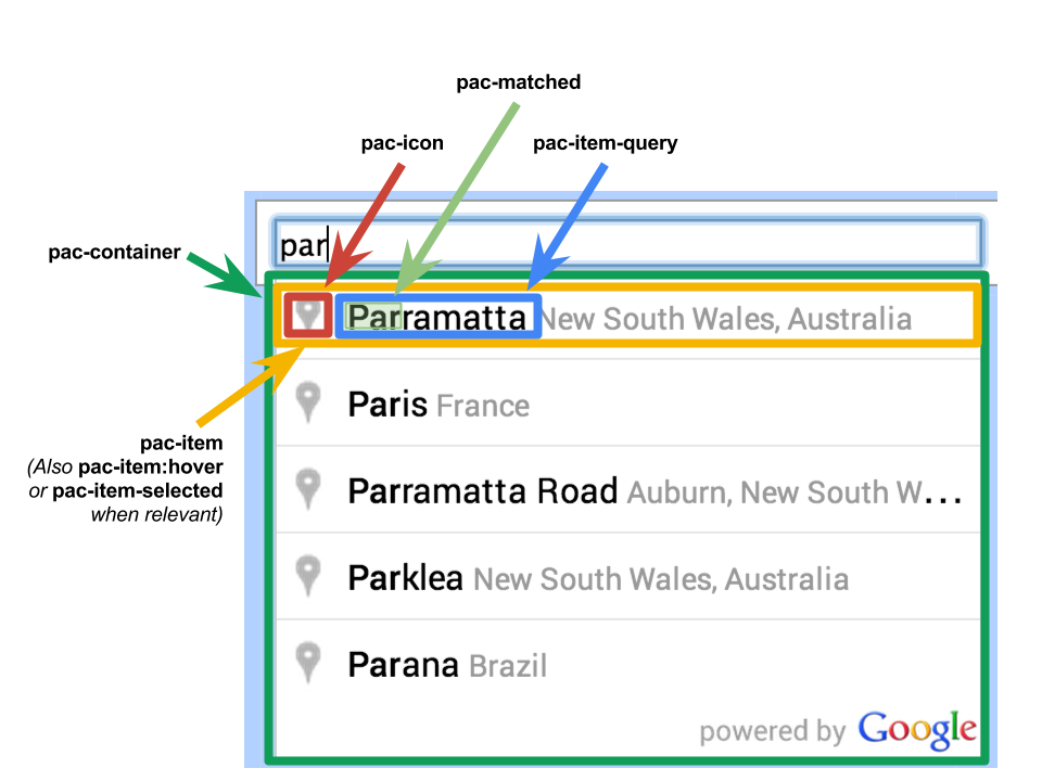
I case anyone is interested in the hierarchy I was able to scrape the following using Firebug:
<div class="pac-container pac-logo" style="width: 557px; position: absolute; left: 66px; top: 106px; display: none;">
	<div class="pac-item">
		<span class="pac-icon pac-icon-marker"></span>
		<span class="pac-item-query">
			<span>France</span>
		</span>
	</div>
<div>
Solution 5 - Css
It is pretty difficult to inspect the elements since it closes as soon as it loses focus.
Though we know that the container has the .pac-container class and items have .pac-item, upon further investigating the API I found that it embeds the CSS styles in the document.
Here's what initially there, so use it to change the pre-defined styles to fit your needs.
.pac-container {
    background-color: #fff;
    position: absolute!important;
    z-index: 1000;
    border-radius: 2px;
    border-top: 1px solid #d9d9d9;
    font-family: Arial, sans-serif;
    box-shadow: 0 2px 6px rgba(0, 0, 0, 0.3);
    -moz-box-sizing: border-box;
    -webkit-box-sizing: border-box;
    box-sizing: border-box;
    overflow: hidden
}

.pac-logo:after {
    content: "";
    padding: 1px 1px 1px 0;
    height: 16px;
    text-align: right;
    display: block;
    background-image: url(https://maps.gstatic.com/mapfiles/api-3/images/powered-by-google-on-white3.png);
    background-position: right;
    background-repeat: no-repeat;
    background-size: 120px 14px
}
.hdpi.pac-logo:after {
    background-image: url(https://maps.gstatic.com/mapfiles/api-3/images/powered-by-google-on-white3_hdpi.png)
}
.pac-item {
    cursor: default;
    padding: 0 4px;
    text-overflow: ellipsis;
    overflow: hidden;
    white-space: nowrap;
    line-height: 30px;
    text-align: left;
    border-top: 1px solid #e6e6e6;
    font-size: 11px;
    color: #999
}
.pac-item:hover {
    background-color: #fafafa
}
.pac-item-selected,
.pac-item-selected:hover {
    background-color: #ebf2fe
}
.pac-matched {
    font-weight: 700
}
.pac-item-query {
    font-size: 13px;
    padding-right: 3px;
    color: #000
}
.pac-icon {
    width: 15px;
    height: 20px;
    margin-right: 7px;
    margin-top: 6px;
    display: inline-block;
    vertical-align: top;
    background-image: url(https://maps.gstatic.com/mapfiles/api-3/images/autocomplete-icons.png);
    background-size: 34px
}
.hdpi .pac-icon {
    background-image: url(https://maps.gstatic.com/mapfiles/api-3/images/autocomplete-icons_hdpi.png)
}
.pac-icon-search {
    background-position: -1px -1px
}
.pac-item-selected .pac-icon-search {
    background-position: -18px -1px
}
.pac-icon-marker {
    background-position: -1px -161px
}
.pac-item-selected .pac-icon-marker {
    background-position: -18px -161px
}
.pac-placeholder {
    color: gray
}
Solution 6 - Css
This worked for me, and now I can run this on mobile!
.pac-container {
    z-index: 10000 !important;
    width: auto !important;
    position: initial !important;
    left: 0 !important;
    right: 0 !important;
    display: block !important;
}
.pac-container:empty{
	display: none !important;
}
And this somewhere!
$('selector').append('.pac-container');
Now the results will show in the selected div as a normal block element :)
Solution 7 - Css
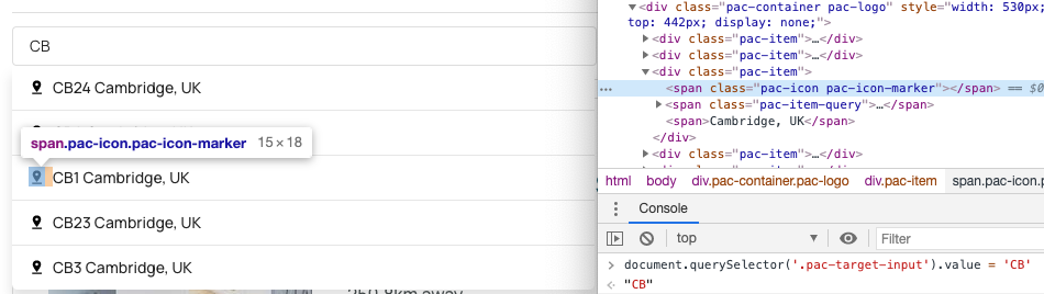
To force the box to stay open for much easier styling and inspection from dev tools you can set the input value from the JS console and the container will stay open when inspecting from the dev tools.
Simply run document.querySelector('.pac-target-input').value = 'CB' in the console on your page with the input, then go back to the Elements tab and you can now individually inspect each element.
This gets around the issue where it always closes when focus is lost.
Solution 8 - Css
if you want to create your custom html & css then AutocompleteService class is also available which will provide all data in json.
const service = new google.maps.places.AutocompleteService();
service.getQueryPredictions(
    { input: "provide location string here for search" },
    (suggestions) => console.log(suggestions)
);