How do I hide the address bar on iPhone?
JavascriptIphoneHtmlCssSafariJavascript Problem Overview
How do I hide the address bar on iPhone?
I tried two different methods so far:
-
The scroll down one pixel trick with JavaScript on page load
-
And the following meta tags:
<meta name="viewport" content="width=device-width; initial-scale=1.0; maximum-scale=1.0; user-scalable=0;" /><meta name="apple-mobile-web-app-capable" content="yes" />
Also this:
<meta names="apple-mobile-web-app-status-bar-style" content="black-translucent" />
I am completely confused.
PS: Oh, I forgot a really important thing: the web page itself does not overflow the browser window. It probably is the reason why the 1 pixel scrolldown trick does not work.
I can't make it bigger, since the hit thing about the design, that everyone can scroll, but this page folds... :)
Javascript Solutions
Solution 1 - Javascript
I just hit this myself. If the address bar is not hiding, the reason may simply be the page is not long enough to scroll.
When the
window.scrollTo(0,1)
is called the page MUST be longer than the window so a scrolling event can occur.
Only when the scrolling even occurs will mobile safari hide the address bar.
Solution 2 - Javascript
UPDATE: Apple removed support for minimal-ui in iOS 8 so this is no longer a useful answer :(
For new googlers looking into this: As of iOS 7.1 there's a new minimal-ui mode that works on mobile Safari:
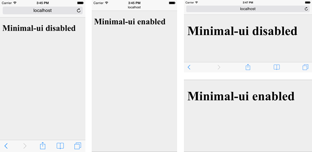
It's enabled by setting the minimal-ui property on the viewport:
<meta name="viewport" content="minimal-ui">
You can also use it in conjunction with other properties like so:
<meta name="viewport" content="width=device-width, minimal-ui">
Of note, there's no minimum content length requirement as there is with the scrollTo hack. There's a great overview of this new mode here. (That's where the above image comes from.) He also lists some shortcomings.
The only official documentation I could find on this is a note in Apple's iOS 7.1 release notes:
> A property, minimal-ui, has been added for the viewport meta tag key that allows minimizing the top and bottom bars on the iPhone as the page loads. While on a page using minimal-ui, tapping the top bar brings the bars back. Tapping back in the content dismisses them again.
>
> For example, use <meta name="viewport" content="width=1024, minimal-ui”>.
Of course, since this only works in iOS 7.1 and above, it's usefulness may be limited.
Solution 3 - Javascript
Unless something has changed in recent iOS versions, the scroll down trick is the only one that reliably works, I've had no issues with this version:
/mobile/i.test(navigator.userAgent) && !location.hash && setTimeout(function() {
window.scrollTo(0, 1);
}, 1000);
I didn't care about any other mobile platform for this particular page though, it was redirecting based on agent...you may want to change the regex to check for iPhone specifically, e.g. replace /mobile/ with /iPhone/.
Solution 4 - Javascript
I think this version is actually better. It tests to see if the user has already begun scrolling, which is an issue I noticed in my mobile project.
/Mobile/.test(navigator.userAgent) && !location.hash && setTimeout(function () {
	if (!pageYOffset) window.scrollTo(0, 1);
}, 1000);
Solution 5 - Javascript
You can run the function when the site content is ready instead of using timeout
addEventListener("load", function() {
	window.scrollTo(1, 0);
}, false);
Solution 6 - Javascript
Try:
setTimeout(function () {
  window.scrollTo(0, 1);
}, 1000);
If using jQuery, put it at the end of $(document).ready();. The time-out allows for the browser to determine the height of the page...
Solution 7 - Javascript
In case none of these solutions work and you are running into the very narrow issue that I faced, here's what fixed it for me.
I had this in my CSS
html{position: relative; height: 100%; overflow: hidden;}
This css applies a fix to one of my pages only, so I restricted it with a condition to that page, and the address bar is now behaving correctly on all other pages.
Solution 8 - Javascript
I have been searching around on this full screen web app as well and i found this.
http://www.onlywebpro.com/2015/07/19/optimizing-full-screen-mobile-web-app-for-ios/
- Basically you need add the following in your header:
<meta name="viewport" content = "width = device-width, initial-scale = 1.0, minimum-scale = 1, maximum-scale = 1, user-scalable = no" />

//App name
<meta name="apple-mobile-web-app-title" content="App name" />

<meta name="apple-mobile-web-app-capable" content="yes">

<meta name="apple-mobile-web-app-status-bar-style" content="black" />

//APP ICONS
<link rel="apple-touch-icon" href="/img/icon.png">

<link rel="apple-touch-icon" sizes="76x76" href="/img/icon.png">

<link rel="apple-touch-icon" sizes="120x120" href="/img/icon.png">

<link rel="apple-touch-icon" sizes="152x152" href="/img/icon.png">
- Open the site in Safari
- Tap on the "Open with" icon ( arrow pointing upwards and box below it) beside refresh button at the URL bar
- Select "Add to home screen"
- Go to the homescreen and open the "App name"
- Voila! website with no URL bar or navigation buttons!
Solution 9 - Javascript
I think it will never be solved unless the content is more than the browser window.
Here is some code that will hide the URL on load, on orientation change, and on a touchstart (the touchstart should only be used if you have a persistent hidden URL, which is a whole other can of worms - if you don't, remove that part of the script).
if( !window.location.hash && window.addEventListener ){
    window.addEventListener("load", function() {
        setTimeout(function(){
            window.scrollTo(0, 0);
        }, 0);
    });
    window.addEventListener( "orientationchange",function() {
        setTimeout(function(){
            window.scrollTo(0, 0);
        }, 0);
    });
    window.addEventListener( "touchstart",function() {
         setTimeout(function(){
             window.scrollTo(0, 0);
         }, 0);
     });
}
Solution 10 - Javascript
<meta name="apple-mobile-web-app-capable" content="yes" />
Solution 11 - Javascript
<meta charset="utf-8"><meta name="description" content="{MF_PLUGIN_SETTING:HOME_DESCRIPTION}"/><meta name="viewport" content="width=device-width,initial-scale=1,maximum-scale=1,minimum-scale=1"/><meta name="apple-mobile-web-app-capable" content="yes"><meta name="mobile-web-app-capable" content="yes">
This is used for adding a ios web app to the homescreen without the searchbar.