How do I fix blurry text in my HTML5 canvas?
JavascriptHtmlHtml5 CanvasJavascript Problem Overview
I am a total n00b with HTML5 and am working with the canvas to render shapes, colors, and text. In my app, I have a view adapter that creates a canvas dynamically, and fills it with content. This works really nicely, except that my text is rendered very fuzzy/blurry/stretched. I have seen a lot of other posts on why defining the width and height in CSS will cause this issue, but I define it all in javascript.
The relevant code (view Fiddle):
var width  = 500;//FIXME:size.w;
var height = 500;//FIXME:size.h;

var canvas = document.createElement("canvas");
//canvas.className="singleUserCanvas";
canvas.width=width;
canvas.height=height;
canvas.border = "3px solid #999999";
canvas.bgcolor = "#999999";
canvas.margin = "(0, 2%, 0, 2%)";

var context = canvas.getContext("2d");

//////////////////
////  SHAPES  ////
//////////////////

var left = 0;

//draw zone 1 rect
context.fillStyle = "#8bacbe";
context.fillRect(0, (canvas.height*5/6)+1, canvas.width*1.5/8.5, canvas.height*1/6);

left = left + canvas.width*1.5/8.5;

//draw zone 2 rect
context.fillStyle = "#ffe381";
context.fillRect(left+1, (canvas.height*5/6)+1, canvas.width*2.75/8.5, canvas.height*1/6);

left = left + canvas.width*2.75/8.5 + 1;

//draw zone 3 rect
context.fillStyle = "#fbbd36";
context.fillRect(left+1, (canvas.height*5/6)+1, canvas.width*1.25/8.5, canvas.height*1/6);

left = left + canvas.width*1.25/8.5;

//draw target zone rect
context.fillStyle = "#004880";
context.fillRect(left+1, (canvas.height*5/6)+1, canvas.width*0.25/8.5, canvas.height*1/6);

left = left + canvas.width*0.25/8.5;

//draw zone 4 rect
context.fillStyle = "#f8961d";
context.fillRect(left+1, (canvas.height*5/6)+1, canvas.width*1.25/8.5, canvas.height*1/6);

left = left + canvas.width*1.25/8.5 + 1;

//draw zone 5 rect
context.fillStyle = "#8a1002";
context.fillRect(left+1, (canvas.height*5/6)+1, canvas.width-left, canvas.height*1/6);

////////////////
////  TEXT  ////
////////////////

//user name
context.fillStyle = "black";
context.font = "bold 18px sans-serif";
context.textAlign = 'right';
context.fillText("User Name", canvas.width, canvas.height*.05);

//AT:
context.font = "bold 12px sans-serif";
context.fillText("AT: 140", canvas.width, canvas.height*.1);

//AB:
context.fillText("AB: 94", canvas.width, canvas.height*.15);

//this part is done after the callback from the view adapter, but is relevant here to add the view back into the layout.
var parent = document.getElementById("layout-content");
parent.appendChild(canvas);
<div id="layout-content"></div>
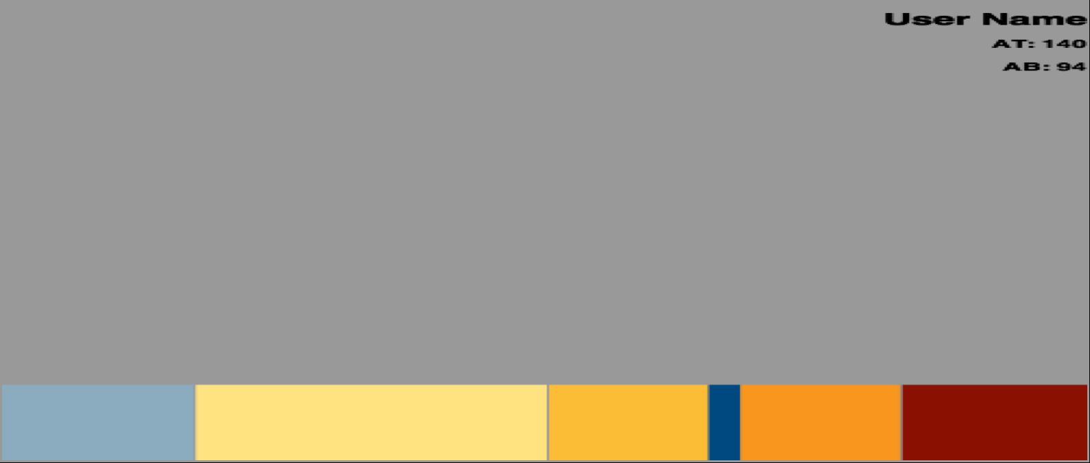
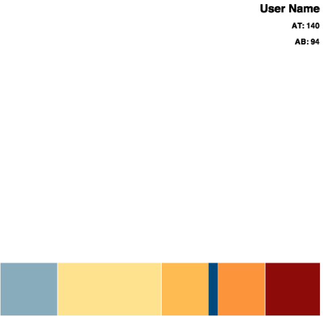
The results I am seeing (in Safari) are much more skewed than shown in the Fiddle:
Mine
Fiddle
What am I doing incorrectly? Do I need a separate canvas for each text element? Is it the font? Am I required to first define the canvas in the HTML5 layout? Is there a typo? I am lost.
Javascript Solutions
Solution 1 - Javascript
The canvas element runs independent from the device or monitor's pixel ratio.
On the iPad 3+, this ratio is 2. This essentially means that your 1000px width canvas would now need to fill 2000px to match it's stated width on the iPad display. Fortunately for us, this is done automatically by the browser. On the other hand, this is also the reason why you see less definition on images and canvas elements that were made to directly fit their visible area. Because your canvas only knows how to fill 1000px but is asked to draw to 2000px, the browser must now intelligently fill in the blanks between pixels to display the element at its proper size.
I would highly recommend you read this article from HTML5Rocks which explains in more detail how to create high definition elements.
tl;dr? Here is an example (based on the above tut) that I use in my own projects to spit out a canvas with the proper resolution:
var PIXEL_RATIO = (function () {
    var ctx = document.createElement("canvas").getContext("2d"),
        dpr = window.devicePixelRatio || 1,
        bsr = ctx.webkitBackingStorePixelRatio ||
              ctx.mozBackingStorePixelRatio ||
              ctx.msBackingStorePixelRatio ||
              ctx.oBackingStorePixelRatio ||
              ctx.backingStorePixelRatio || 1;

    return dpr / bsr;
})();


createHiDPICanvas = function(w, h, ratio) {
    if (!ratio) { ratio = PIXEL_RATIO; }
    var can = document.createElement("canvas");
    can.width = w * ratio;
    can.height = h * ratio;
    can.style.width = w + "px";
    can.style.height = h + "px";
    can.getContext("2d").setTransform(ratio, 0, 0, ratio, 0, 0);
    return can;
}

//Create canvas with the device resolution.
var myCanvas = createHiDPICanvas(500, 250);

//Create canvas with a custom resolution.
var myCustomCanvas = createHiDPICanvas(500, 200, 4);
Hope this helps!
Solution 2 - Javascript
Solved!
I decided to see what changing the width and height attributes I set in javascript to see how that affected the canvas size -- and it didn't. It changes the resolution.
To get the result I wanted, I also had to set the canvas.style.width attribute, which changes the physical size of the canvas:
canvas.width=1000;//horizontal resolution (?) - increase for better looking text
canvas.height=500;//vertical resolution (?) - increase for better looking text
canvas.style.width=width;//actual width of canvas
canvas.style.height=height;//actual height of canvas
Solution 3 - Javascript
While @MyNameIsKo's answer still works, it is a little outdated now in 2020, and can be improved:
function createHiPPICanvas(w, h) {
    let ratio = window.devicePixelRatio;
    let cv = document.createElement("canvas");
    cv.width = w * ratio;
    cv.height = h * ratio;
    cv.style.width = w + "px";
    cv.style.height = h + "px";
    cv.getContext("2d").scale(ratio, ratio);
    return cv;
}
In general, we make the following improvements:
- We remove the
backingStorePixelRatioreferences, as these aren't really implemented in any browser in any important way (in fact, only Safari returns something other thanundefined, and this version still works perfectly in Safari); - We replace all of that ratio code with
window.devicePixelRatio, which has fantastic support - This also means that we declare one less global property --- hooray!!
- We can also remove the
|| 1fallback onwindow.devicePixelRatio, as it is pointless: all browsers that don't support this property don't support.setTransformor.scaleeither, so this function won't work on them, fallback or not; - We can replace
.setTransformby.scale, as passing in a width and height is a little more intuitive than passing in a transformation matrix. - The function has been renamed from
createHiDPICanvastocreateHiPPICanvas. As @MyNameIsKo themselves mention in their answer's comments, DPI (Dots per Inch) is printing terminology (as printers make up images out of tiny dots of coloured ink). While similar, monitors display images using pixels, and as such PPI (Pixels per Inch) is a better acronym for our use case.
One large benefit of these simplifications is that this answer can now be used in TypeScript without // @ts-ignore (as TS doesn't have types for backingStorePixelRatio).
Solution 4 - Javascript
I resize canvas element via css to take whole width of parent element. I noticed that width and height of my element is not scaled. I was looking for best way to set size which should be.
canvas.width = canvas.clientWidth;
canvas.height = canvas.clientHeight;
This simple way your canvas will be set perfectly, no matter what screen you will use.
Solution 5 - Javascript
This 100% solved it for me:
var canvas = document.getElementById('canvas');
canvas.width = canvas.getBoundingClientRect().width;
canvas.height = canvas.getBoundingClientRect().height;
(it is close to Adam Mańkowski's solution).
Solution 6 - Javascript
I noticed a detail not mentioned in the other answers. The canvas resolution truncates to integer values.
The default canvas resolution dimensions are canvas.width: 300 and canvas.height: 150.
On my screen, window.devicePixelRatio: 1.75.
So when I set canvas.height = 1.75 * 150 the value is truncated from the desired 262.5 down to 262.
A solution is to choose CSS layout dimensions for a given window.devicePixelRatio such that truncation will not occur on scaling the resolution.
For example, I could use width: 300px and height: 152px which would yield whole numbers when multiplied by 1.75.
Edit: Another solution is to take advantage of the fact CSS pixels can be fractional to counteract the truncation of scaling canvas pixels.
Below is a demo using this strategy.
Edit: Here is the OP's fiddle updated to use this strategy: http://jsfiddle.net/65maD/83/.
main();

// Rerun on window resize.
window.addEventListener('resize', main);


function main() {
  // Prepare canvas with properly scaled dimensions.
  scaleCanvas();

  // Test scaling calculations by rendering some text.
  testRender();
}


function scaleCanvas() {
  const container = document.querySelector('#container');
  const canvas = document.querySelector('#canvas');

  // Get desired dimensions for canvas from container.
  let {width, height} = container.getBoundingClientRect();

  // Get pixel ratio.
  const dpr = window.devicePixelRatio;

  // (Optional) Report the dpr.
  document.querySelector('#dpr').innerHTML = dpr.toFixed(4);

  // Size the canvas a bit bigger than desired.
  // Use exaggeration = 0 in real code.
  const exaggeration = 20;
  width = Math.ceil (width * dpr + exaggeration);
  height = Math.ceil (height * dpr + exaggeration);

  // Set the canvas resolution dimensions (integer values).
  canvas.width = width;
  canvas.height = height;

  /*-----------------------------------------------------------
                         - KEY STEP -
   Set the canvas layout dimensions with respect to the canvas
   resolution dimensions. (Not necessarily integer values!)
   -----------------------------------------------------------*/
  canvas.style.width = `${width / dpr}px`;
  canvas.style.height = `${height / dpr}px`;

  // Adjust canvas coordinates to use CSS pixel coordinates.
  const ctx = canvas.getContext('2d');
  ctx.scale(dpr, dpr);
}


function testRender() {
  const canvas = document.querySelector('#canvas');
  const ctx = canvas.getContext('2d');

  // fontBaseline is the location of the baseline of the serif font
  // written as a fraction of line-height and calculated from the top
  // of the line downwards. (Measured by trial and error.)
  const fontBaseline = 0.83;

  // Start at the top of the box.
  let baseline = 0;

  // 50px font text
  ctx.font = `50px serif`;
  ctx.fillText("Hello World", 0, baseline + fontBaseline * 50);
  baseline += 50;

  // 25px font text
  ctx.font = `25px serif`;
  ctx.fillText("Hello World", 0, baseline + fontBaseline * 25);
  baseline += 25;

  // 12.5px font text
  ctx.font = `12.5px serif`;
  ctx.fillText("Hello World", 0, baseline + fontBaseline * 12.5);
}
/* HTML is red */

#container
{
  background-color: red;
  position: relative;
  /* Setting a border will mess up scaling calculations. */

  /* Hide canvas overflow (if any) in real code. */
  /* overflow: hidden; */
}

/* Canvas is green */

#canvas
{
  background-color: rgba(0,255,0,.8);
  animation: 2s ease-in-out infinite alternate both comparison;
}

/* animate to compare HTML and Canvas renderings */

@keyframes comparison
{
  33% {opacity:1; transform: translate(0,0);}
  100% {opacity:.7; transform: translate(7.5%,15%);}
}

/* hover to pause */

#canvas:hover, #container:hover > #canvas
{
  animation-play-state: paused;
}

/* click to translate Canvas by (1px, 1px) */

#canvas:active
{
  transform: translate(1px,1px) !important;
  animation: none;
}

/* HTML text */

.text
{
  position: absolute;
  color: white;
}

.text:nth-child(1)
{
  top: 0px;
  font-size: 50px;
  line-height: 50px;
}

.text:nth-child(2)
{
  top: 50px;
  font-size: 25px;
  line-height: 25px;
}

.text:nth-child(3)
{
  top: 75px;
  font-size: 12.5px;
  line-height: 12.5px;
}
<!-- Make the desired dimensions strange to guarantee truncation. -->
<div id="container" style="width: 313.235px; height: 157.122px">
  <!-- Render text in HTML. -->
  <div class="text">Hello World</div>
  <div class="text">Hello World</div>
  <div class="text">Hello World</div>

  <!-- Render text in Canvas. -->
  <canvas id="canvas"></canvas>
</div>

<!-- Interaction instructions. -->
<p>Hover to pause the animation.<br>
Click to translate the green box by (1px, 1px).</p>

<!-- Color key. -->
<p><em style="color:red">red</em> = HTML rendered<br>
<em style="color:green">green</em> = Canvas rendered</p>

<!-- Report pixel ratio. -->
<p>Device pixel ratio: <code id="dpr"></code>
<em>(physical pixels per CSS pixel)</em></p>

<!-- Info. -->
<p>Zoom your browser to re-run the scaling calculations.
(<code>Ctrl+</code> or <code>Ctrl-</code>)</p>
Solution 7 - Javascript
Try this one line of CSS on your canvas:
image-rendering: pixelated
As per MDN: >When scaling the image up, the nearest-neighbor algorithm must be used, so that the image appears to be composed of large pixels.
Thus it prevents anti-aliasing entirely.
Solution 8 - Javascript
I slightly adapted the MyNameIsKo code under canvg (SVG to Canvas js library). I was confused for a while and spend some time for this. Hope this help someone.
HTML
<div id="chart"><canvas></canvas><svg>Your SVG here</svg></div>
Javascript
window.onload = function() {

var PIXEL_RATIO = (function () {
	var ctx = document.createElement("canvas").getContext("2d"),
		dpr = window.devicePixelRatio || 1,
		bsr = ctx.webkitBackingStorePixelRatio ||
			  ctx.mozBackingStorePixelRatio ||
			  ctx.msBackingStorePixelRatio ||
			  ctx.oBackingStorePixelRatio ||
			  ctx.backingStorePixelRatio || 1;

	return dpr / bsr;
})();

setHiDPICanvas = function(canvas, w, h, ratio) {
	if (!ratio) { ratio = PIXEL_RATIO; }
	var can = canvas;
	can.width = w * ratio;
	can.height = h * ratio;
	can.style.width = w + "px";
	can.style.height = h + "px";
	can.getContext("2d").setTransform(ratio, 0, 0, ratio, 0, 0);
}

var svg = document.querySelector('#chart svg'),
	canvas = document.querySelector('#chart canvas');

var svgSize = svg.getBoundingClientRect();
var w = svgSize.width, h = svgSize.height;
setHiDPICanvas(canvas, w, h);

var svgString = (new XMLSerializer).serializeToString(svg);
var ctx = canvas.getContext('2d');
ctx.drawSvg(svgString, 0, 0, w, h);

}
Solution 9 - Javascript
For those of you working in reactjs, I adapted MyNameIsKo's answer and it works great. Here is the code.
import React from 'react'

export default class CanvasComponent extends React.Component {
    constructor(props) {
        this.calcRatio = this.calcRatio.bind(this);
    }

    // Use componentDidMount to draw on the canvas
    componentDidMount() {
        this.updateChart();
    }

    calcRatio() {
        let ctx = document.createElement("canvas").getContext("2d"),
        dpr = window.devicePixelRatio || 1,
        bsr = ctx.webkitBackingStorePixelRatio ||
          ctx.mozBackingStorePixelRatio ||
          ctx.msBackingStorePixelRatio ||
          ctx.oBackingStorePixelRatio ||
          ctx.backingStorePixelRatio || 1;
        return dpr / bsr;
    }

    // Draw on the canvas
    updateChart() {

        // Adjust resolution
        const ratio = this.calcRatio();
        this.canvas.width = this.props.width * ratio;
        this.canvas.height = this.props.height * ratio;
        this.canvas.style.width = this.props.width + "px";
        this.canvas.style.height = this.props.height + "px";
        this.canvas.getContext("2d").setTransform(ratio, 0, 0, ratio, 0, 0);
        const ctx = this.canvas.getContext('2d');

       // now use ctx to draw on the canvas
    }


    render() {
        return (
            <canvas ref={el=>this.canvas=el} width={this.props.width} height {this.props.height}/>
        )
    }
}
In this example, I pass in the width and height of the canvas as props.
Solution 10 - Javascript
For me, only a combination of different 'pixel perfect' techniques helped to archive the results:
- Get and scale with a pixel ratio as @MyNameIsKo suggested.
pixelRatio = window.devicePixelRatio/ctx.backingStorePixelRatio
- Scale the canvas on the resize (avoid canvas default stretch scaling).
- multiple the lineWidth with pixelRatio to find proper 'real' pixel line thickness:
context.lineWidth = thickness * pixelRatio;
- Check whether the thickness of the line is odd or even. add half of the pixelRatio to the line position for the odd thickness values.
x = x + pixelRatio/2;
The odd line will be placed in the middle of the pixel. The line above is used to move it a little bit.
function getPixelRatio(context) {
  dpr = window.devicePixelRatio || 1,
    bsr = context.webkitBackingStorePixelRatio ||
    context.mozBackingStorePixelRatio ||
    context.msBackingStorePixelRatio ||
    context.oBackingStorePixelRatio ||
    context.backingStorePixelRatio || 1;

  return dpr / bsr;
}


var canvas = document.getElementById('canvas');
var context = canvas.getContext("2d");
var pixelRatio = getPixelRatio(context);
var initialWidth = canvas.clientWidth * pixelRatio;
var initialHeight = canvas.clientHeight * pixelRatio;


window.addEventListener('resize', function(args) {
  rescale();
  redraw();
}, false);

function rescale() {
  var width = initialWidth * pixelRatio;
  var height = initialHeight * pixelRatio;
  if (width != context.canvas.width)
    context.canvas.width = width;
  if (height != context.canvas.height)
    context.canvas.height = height;

  context.setTransform(pixelRatio, 0, 0, pixelRatio, 0, 0);
}

function pixelPerfectLine(x) {

  context.save();
  context.beginPath();
  thickness = 1;
  // Multiple your stroke thickness  by a pixel ratio!
  context.lineWidth = thickness * pixelRatio;

  context.strokeStyle = "Black";
  context.moveTo(getSharpPixel(thickness, x), getSharpPixel(thickness, 0));
  context.lineTo(getSharpPixel(thickness, x), getSharpPixel(thickness, 200));
  context.stroke();
  context.restore();
}

function pixelPerfectRectangle(x, y, w, h, thickness, useDash) {
  context.save();
  // Pixel perfect rectange:
  context.beginPath();

  // Multiple your stroke thickness by a pixel ratio!
  context.lineWidth = thickness * pixelRatio;
  context.strokeStyle = "Red";
  if (useDash) {
    context.setLineDash([4]);
  }
  // use sharp x,y and integer w,h!
  context.strokeRect(
    getSharpPixel(thickness, x),
    getSharpPixel(thickness, y),
    Math.floor(w),
    Math.floor(h));
  context.restore();
}

function redraw() {
  context.clearRect(0, 0, canvas.width, canvas.height);
  pixelPerfectLine(50);
  pixelPerfectLine(120);
  pixelPerfectLine(122);
  pixelPerfectLine(130);
  pixelPerfectLine(132);
  pixelPerfectRectangle();
  pixelPerfectRectangle(10, 11, 200.3, 443.2, 1, false);
  pixelPerfectRectangle(41, 42, 150.3, 443.2, 1, true);
  pixelPerfectRectangle(102, 100, 150.3, 243.2, 2, true);
}

function getSharpPixel(thickness, pos) {

  if (thickness % 2 == 0) {
    return pos;
  }
  return pos + pixelRatio / 2;

}

rescale();
redraw();
canvas {
  image-rendering: -moz-crisp-edges;
  image-rendering: -webkit-crisp-edges;
  image-rendering: pixelated;
  image-rendering: crisp-edges;
  width: 100vh;
  height: 100vh;
}
<canvas id="canvas"></canvas>
Resize event is not fired in the snipped so you can try the file on the github
Solution 11 - Javascript
For me it was not only image but text had bad quality. The simplest cross browser working solution for retina/non-retina displays was to render image twice as big as intended and scale canvas context like this guy suggested: https://stackoverflow.com/a/53921030/4837965
Solution 12 - Javascript
The following code worked directly for me (while others didn't):
    const myCanvas = document.getElementById("myCanvas");
	const originalHeight = myCanvas.height;
	const originalWidth = myCanvas.width;
	render();
	function render() {
	  let dimensions = getObjectFitSize(
	    true,
	    myCanvas.clientWidth,
	    myCanvas.clientHeight,
	    myCanvas.width,
	    myCanvas.height
	  );
	  const dpr = window.devicePixelRatio || 1;
	  myCanvas.width = dimensions.width * dpr;
	  myCanvas.height = dimensions.height * dpr;

	  let ctx = myCanvas.getContext("2d");
	  let ratio = Math.min(
	    myCanvas.clientWidth / originalWidth,
	    myCanvas.clientHeight / originalHeight
	  );
	  ctx.scale(ratio * dpr, ratio * dpr); //adjust this!
	}

	// adapted from: https://www.npmjs.com/package/intrinsic-scale
	function getObjectFitSize(
	  contains /* true = contain, false = cover */,
	  containerWidth,
	  containerHeight,
	  width,
	  height
	) {
	  var doRatio = width / height;
	  var cRatio = containerWidth / containerHeight;
	  var targetWidth = 0;
	  var targetHeight = 0;
	  var test = contains ? doRatio > cRatio : doRatio < cRatio;

	  if (test) {
	    targetWidth = containerWidth;
	    targetHeight = targetWidth / doRatio;
	  } else {
	    targetHeight = containerHeight;
	    targetWidth = targetHeight * doRatio;
	  }

	  return {
	    width: targetWidth,
	    height: targetHeight,
	    x: (containerWidth - targetWidth) / 10,
	    y: (containerHeight - targetHeight) / 10
	  };
	}
The implementation was adapted from this Medium post.