How do I disable a Button in Flutter?
FlutterDartButtonDisableFlutter Problem Overview
I'm just starting to get the hang of Flutter, but I'm having trouble figuring out how to set the enabled state of a button.
From the docs, it says to set onPressed to null to disable a button, and give it a value to enable it. This is fine if the button continues to be in the same state for the lifecycle.
I get the impression I need to create a custom Stateful widget that will allow me to update the button's enabled state (or onPressed callback) somehow.
So my question is how would I do that? This seems like a pretty straightforward requirement, but I can't find anything in the docs on how to do it.
Thanks.
Flutter Solutions
Solution 1 - Flutter
I think you may want to introduce some helper functions to build your button as well as a Stateful widget along with some property to key off of.
- Use a StatefulWidget/State and create a variable to hold your condition (e.g.
isButtonDisabled) - Set this to true initially (if that's what you desire)
- When rendering the button, don't directly set the
onPressedvalue to eithernullor some functiononPressed: () {} - Instead, conditionally set it using a ternary or a helper function (example below)
- Check the
isButtonDisabledas part of this conditional and return eithernullor some function. - When the button is pressed (or whenever you want to disable the button) use
setState(() => isButtonDisabled = true)to flip the conditional variable. - Flutter will call the
build()method again with the new state and the button will be rendered with anullpress handler and be disabled.
Here's is some more context using the Flutter counter project.
class MyHomePage extends StatefulWidget {
  @override
  _MyHomePageState createState() => new _MyHomePageState();
}

class _MyHomePageState extends State<MyHomePage> {
  int _counter = 0;
  bool _isButtonDisabled;

  @override
  void initState() {
    _isButtonDisabled = false;
  }

  void _incrementCounter() {
    setState(() {
      _isButtonDisabled = true;
      _counter++;
    });
  }

  @override
  Widget build(BuildContext context) {
    return new Scaffold(
      appBar: new AppBar(
        title: new Text("The App"),
      ),
      body: new Center(
        child: new Column(
          mainAxisAlignment: MainAxisAlignment.center,
          children: <Widget>[
            new Text(
              'You have pushed the button this many times:',
            ),
            new Text(
              '$_counter',
              style: Theme.of(context).textTheme.display1,
            ),
            _buildCounterButton(),
          ],
        ),
      ),
    );
  }

  Widget _buildCounterButton() {
    return new RaisedButton(
      child: new Text(
        _isButtonDisabled ? "Hold on..." : "Increment"
      ),
      onPressed: _isButtonDisabled ? null : _incrementCounter,
    );
  }
}
In this example I am using an inline ternary to conditionally set the Text and onPressed, but it may be more appropriate for you to extract this into a function (you can use this same method to change the text of the button as well):
Widget _buildCounterButton() {
    return new RaisedButton(
      child: new Text(
        _isButtonDisabled ? "Hold on..." : "Increment"
      ),
      onPressed: _counterButtonPress(),
    );
  }

  Function _counterButtonPress() {
    if (_isButtonDisabled) {
      return null;
    } else {
      return () {
        // do anything else you may want to here
        _incrementCounter();
      };
    }
  }
Solution 2 - Flutter
According to the docs:
> If the onPressed callback is null, then the button will be disabled
> and by default will resemble a flat button in the disabledColor.
So, you might do something like this:
RaisedButton(
  onPressed: calculateWhetherDisabledReturnsBool() ? null : () => whatToDoOnPressed,
  child: Text('Button text')
);
Solution 3 - Flutter
The simple answer is onPressed : null gives a disabled button.
Solution 4 - Flutter
Disables click:
onPressed: null
Enables click:
onPressed: () => fooFunction()
// or
onPressed: fooFunction
Combination:
onPressed: shouldEnable ? fooFunction : null
Solution 5 - Flutter
For a specific and limited number of widgets, wrapping them in a widget IgnorePointer does exactly this: when its ignoring property is set to true, the sub-widget (actually, the entire subtree) is not clickable.
IgnorePointer(
    ignoring: true, // or false
    child: RaisedButton(
        onPressed: _logInWithFacebook,
        child: Text("Facebook sign-in"),
        ),
),
Otherwise, if you intend to disable an entire subtree, look into AbsorbPointer().
Solution 6 - Flutter
This is the easiest way in my opinion:
RaisedButton(
  child: Text("PRESS BUTTON"),
  onPressed: booleanCondition
    ? () => myTapCallback()
    : null
)
Solution 7 - Flutter
You can also use the AbsorbPointer, and you can use it in the following way:
AbsorbPointer(
      absorbing: true, // by default is true
      child: RaisedButton(
        onPressed: (){
          print('pending to implement onPressed function');
        },
        child: Text("Button Click!!!"),
      ),
    ),
If you want to know more about this widget, you can check the following link Flutter Docs
Solution 8 - Flutter
Enable and Disable functionality is same for most of the widgets.
Ex, button , switch, checkbox etc.
Just set the onPressed property as shown below
onPressed : null returns Disabled widget
onPressed : (){} or onPressed : _functionName returns Enabled widget
Solution 9 - Flutter
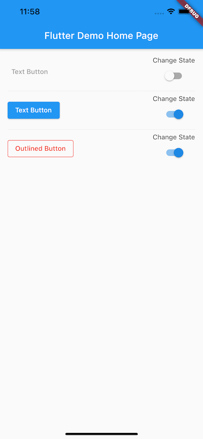
This answer is based on updated Buttons TextButton/ElevatedButton/OutlinedButton for Flutter 2.x
Still, buttons are enabled or disabled based on onPressed property. If that property is null then button would be disabled. If you will assign function to onPressed then button would be enabled.
In the below snippets, I have shown how to enable/disable button and update it's style accordingly.
> This post also indicating that how to apply different styles to new > Flutter 2.x buttons.
import 'package:flutter/material.dart';

void main() {
  runApp(MyApp());
}

class MyApp extends StatelessWidget {
  @override
  Widget build(BuildContext context) {
    return MaterialApp(
      title: 'Flutter Demo',
      theme: ThemeData(
        primarySwatch: Colors.blue,
        visualDensity: VisualDensity.adaptivePlatformDensity,
      ),
      home: MyHomePage(title: 'Flutter Demo Home Page'),
    );
  }
}

class MyHomePage extends StatefulWidget {
  MyHomePage({Key key, this.title}) : super(key: key);

  final String title;

  @override
  _MyHomePageState createState() => _MyHomePageState();
}

class _MyHomePageState extends State<MyHomePage> {
  bool textBtnswitchState = true;
  bool elevatedBtnSwitchState = true;
  bool outlinedBtnState = true;

  @override
  Widget build(BuildContext context) {
    return Scaffold(
      appBar: AppBar(
        title: Text(widget.title),
      ),
      body: Padding(
        padding: const EdgeInsets.all(16.0),
        child: Column(
          children: <Widget>[
            Row(
              mainAxisAlignment: MainAxisAlignment.spaceBetween,
              children: [
                TextButton(
                  child: Text('Text Button'),
                  onPressed: textBtnswitchState ? () {} : null,
                  style: ButtonStyle(
                    foregroundColor: MaterialStateProperty.resolveWith(
                      (states) {
                        if (states.contains(MaterialState.disabled)) {
                          return Colors.grey;
                        } else {
                          return Colors.red;
                        }
                      },
                    ),
                  ),
                ),
                Column(
                  children: [
                    Text('Change State'),
                    Switch(
                      value: textBtnswitchState,
                      onChanged: (newState) {
                        setState(() {
                          textBtnswitchState = !textBtnswitchState;
                        });
                      },
                    ),
                  ],
                )
              ],
            ),
            Divider(),
            Row(
              mainAxisAlignment: MainAxisAlignment.spaceBetween,
              children: [
                ElevatedButton(
                  child: Text('Text Button'),
                  onPressed: elevatedBtnSwitchState ? () {} : null,
                  style: ButtonStyle(
                    foregroundColor: MaterialStateProperty.resolveWith(
                      (states) {
                        if (states.contains(MaterialState.disabled)) {
                          return Colors.grey;
                        } else {
                          return Colors.white;
                        }
                      },
                    ),
                  ),
                ),
                Column(
                  children: [
                    Text('Change State'),
                    Switch(
                      value: elevatedBtnSwitchState,
                      onChanged: (newState) {
                        setState(() {
                          elevatedBtnSwitchState = !elevatedBtnSwitchState;
                        });
                      },
                    ),
                  ],
                )
              ],
            ),
            Divider(),
            Row(
              mainAxisAlignment: MainAxisAlignment.spaceBetween,
              children: [
                OutlinedButton(
                  child: Text('Outlined Button'),
                  onPressed: outlinedBtnState ? () {} : null,
                  style: ButtonStyle(
                      foregroundColor: MaterialStateProperty.resolveWith(
                    (states) {
                      if (states.contains(MaterialState.disabled)) {
                        return Colors.grey;
                      } else {
                        return Colors.red;
                      }
                    },
                  ), side: MaterialStateProperty.resolveWith((states) {
                    if (states.contains(MaterialState.disabled)) {
                      return BorderSide(color: Colors.grey);
                    } else {
                      return BorderSide(color: Colors.red);
                    }
                  })),
                ),
                Column(
                  children: [
                    Text('Change State'),
                    Switch(
                      value: outlinedBtnState,
                      onChanged: (newState) {
                        setState(() {
                          outlinedBtnState = !outlinedBtnState;
                        });
                      },
                    ),
                  ],
                )
              ],
            ),
          ],
        ),
      ),
    );
  }
}
Solution 10 - Flutter
For disabling any Button in flutter such as FlatButton, RaisedButton, MaterialButton, IconButton etc all you need to do is to set the onPressed and onLongPress properties to null. Below is some simple examples for some of the buttons:
FlatButton (Enabled)
FlatButton(
  onPressed: (){},
  onLongPress: null, // Set one as NOT null is enough to enable the button
  textColor: Colors.black,
  disabledColor: Colors.orange,
  disabledTextColor: Colors.white,
  child: Text('Flat Button'),
),
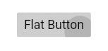
FlatButton (Disabled)
FlatButton(
  onPressed: null,
  onLongPress: null,
  textColor: Colors.black,
  disabledColor: Colors.orange,
  disabledTextColor: Colors.white,
  child: Text('Flat Button'),
),

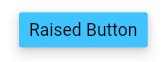
RaisedButton (Enabled)
RaisedButton(
  onPressed: (){},
  onLongPress: null, // Set one as NOT null is enough to enable the button
  // For when the button is enabled
  color: Colors.lightBlueAccent,
  textColor: Colors.black,
  splashColor: Colors.blue,
  elevation: 8.0,

  // For when the button is disabled
  disabledTextColor: Colors.white,
  disabledColor: Colors.orange,
  disabledElevation: 0.0,

  child: Text('Raised Button'),
),
RaisedButton (Disabled)
RaisedButton(
  onPressed: null,
  onLongPress: null,
  // For when the button is enabled
  color: Colors.lightBlueAccent,
  textColor: Colors.black,
  splashColor: Colors.blue,
  elevation: 8.0,

  // For when the button is disabled
  disabledTextColor: Colors.white,
  disabledColor: Colors.orange,
  disabledElevation: 0.0,

  child: Text('Raised Button'),
),
IconButton (Enabled)
IconButton(
  onPressed: () {},
  icon: Icon(Icons.card_giftcard_rounded),
  color: Colors.lightBlueAccent,

  disabledColor: Colors.orange,
),


IconButton (Disabled)
IconButton(
  onPressed: null,
  icon: Icon(Icons.card_giftcard_rounded),
  color: Colors.lightBlueAccent,

  disabledColor: Colors.orange,
),

Note: Some of buttons such as IconButton have only the onPressed property.
Solution 11 - Flutter
You can set also blank condition, in place of set null
         var isDisable=true;


          RaisedButton(
              padding: const EdgeInsets.all(20),
              textColor: Colors.white,
              color: Colors.green,
              onPressed:  isDisable
                  ? () => (){} : myClickingData(),
              child: Text('Button'),
            )
Solution 12 - Flutter
You can use this code in your app for button with loading and disable:
class BtnPrimary extends StatelessWidget {
  bool loading;
  String label;
  VoidCallback onPressed;

  BtnPrimary(
      {required this.label, required this.onPressed, this.loading = false});

  @override
  Widget build(BuildContext context) {
    return ElevatedButton.icon(
      icon: loading
          ? const SizedBox(
              child: CircularProgressIndicator(
                color: Colors.white,
              ),
              width: 20,
              height: 20)
          : const SizedBox(width: 0, height: 0),
      label: loading ? const Text('Waiting...'): Text(label),
      onPressed: loading ? null : onPressed,
    );
  }
}
I hope useful
Solution 13 - Flutter
This is the easiest way to disable a button in Flutter is assign the null value to the onPressed
ElevatedButton(
  style: ElevatedButton.styleFrom(
    primary: Colors.blue, // background
    onPrimary: Colors.white, // foreground
  ),
  onPressed: null,
  child: Text('ElevatedButton'),
),
Solution 14 - Flutter
I like to use flutter_mobx for this and work on the state.
Next I use an observer:
Container(child: Observer(builder: (_) {
  var method;
  if (!controller.isDisabledButton) method = controller.methodController;
  return RaiseButton(child: Text('Test') onPressed: method);
}));
On the Controller:
@observable
bool isDisabledButton = true;
Then inside the control you can manipulate this variable as you want.
Refs.: Flutter mobx
Solution 15 - Flutter
If you are searching for a quick way and don't care about letting the user actually clicking more then once on a button. You could do it also the following way:
// Constant whether button is clicked
bool isClicked = false;
and then checking in the onPressed() function whether the user has already clicked the button or not.
onPressed: () async {
    if (!isClicked) {
       isClicked = true;
       // await Your normal function
    } else {
       Toast.show(
          "You click already on this button", context,
          duration: Toast.LENGTH_LONG, gravity: Toast.BOTTOM);
    }
}