How can I put an input element on the same line as its label?
HtmlCssHtml Problem Overview
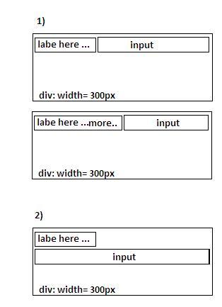
I would like to put a label and an input[type=text] on the same line, and I would like for the input's width to fill the remaining width of the containing element, regardless of the length of the label's text (see first image).
I tried to use width: auto; for the input, but it seems to have a static width. I also tried width: 100%;, but that moves the input to a new line (see second image).
How can I achieve this using CSS?
Html Solutions
Solution 1 - Html
It's possible without JavaScript, see: http://jsfiddle.net/Khmhk/
This works in IE7+ and all modern browsers.
HTML:
<label for="test">Label</label>
<span><input name="test" id="test" type="text" /></span>
CSS:
label {
    float: left
}
span {
    display: block;
    overflow: hidden;
    padding: 0 4px 0 6px
}
input {
    width: 100%
}
The reason why overflow: hidden is so magically useful in this instance is explained here.
display: table-cell is another option, see: http://jsfiddle.net/Khmhk/1/
This works in IE8+ and all modern browsers:
HTML:
<div class="container">
    <label for="test">Label</label>
    <span><input name="test" id="test" type="text" /></span>
</div>
CSS:
.container {
    display: table;
    width: 100%
}
label {
    display: table-cell;
    width: 1px;
    white-space: nowrap
}
span {
    display: table-cell;
    padding: 0 0 0 5px
}
input {
    width: 100%
}
Solution 2 - Html
That still works for me, but ftr this is how Bootstrap 3 does it (thanks to @morten.c's answer to "Bootstrap full-width text-input within inline-form"). Don't know if it's harder to break than @thirtydot's, or anything. But here it is, and here's a fiddle that also gives a basic example of how to deal with a narrow-screen break point.
HTML:
<form class="responsive">
    <input type="text" placeholder="wide input..."/>
    <span>
        <input type="submit"/>
    </span>
</form>
CSS:
form.responsive, form.responsive * {
    box-sizing: border-box;
    width: 100%;
    height: 40px !important; /* specify a height */
}
form.responsive {
    position: relative;
    display: table;
    border-collapse: separate;

    /* just to be safe */
    border: 0;
    padding: 0;
    margin: 0;
}
form.responsive > input {
    position: relative;
    width: 100%;
    float:left;
    margin-bottom: 0;
    display: table-cell;
}
form.responsive span {
    position: relative;
    width: 1%;
    vertical-align: middle;
    display: table-cell;
}
form.responsive span input {
    margin: 0;
    margin-left: -1px;
    display: inline-block;
    vertical-align: middle;
    overflow: visible;
}