How can I prevent the textarea from stretching beyond his parent DIV element? (google-chrome issue only)
CssGoogle ChromeTextareaCss Problem Overview
How can I prevent the textarea from stretching beyond its parent DIV element?
I have this textarea inside a table which is inside a DIV and it seems that it causes the entire table to stretch out of its bounds.
You can see an example of the same situation even in a more simple case, just putting a text area inside a div (like what is used here in www.stackoverflow.com)
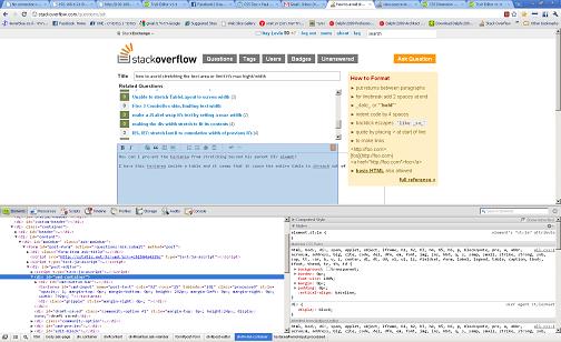
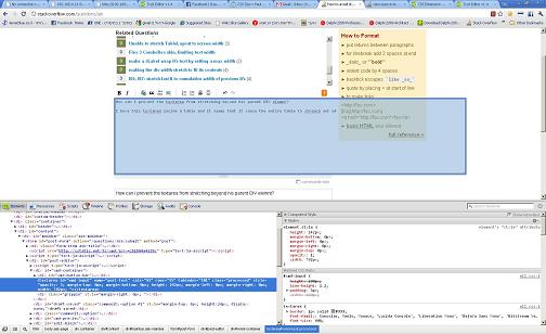
You can see from the images below that the textarea can stretch beyond the size of its parent? How do I prevent this?
I'm kind of new to CSS so I don't really know what CSS attributes should I be using. I tried several like display, and overflow. But they don't seem to do the trick. Anything else I might have missed?
UPDATE: HTML
</table>
CSS
textarea {
max-width: 50%;
}
#container {
width: 80%;
border: 1px solid red;
}
#cont2{
width: 60%;
border: 1px solid blue;
}
If you put this code inside the http://jsfiddle.net, you will see that they act differently. Although the textarea is limited to the percentage declared in its css style, it is still possible to get it to cause its parent table to be as large as it wants to be, and then you can see that it spills over its parent border. Any thoughts on how to fix this?
Css Solutions
Solution 1 - Css
To disable resizing completely:
textarea {
    resize: none;
}
To allow only vertical resizing:
textarea {
    resize: vertical;
}
To allow only horizontal resizing:
textarea {
    resize: horizontal;
}
Or you can limit size:
textarea {
    max-width: 100px;
    max-height: 100px;
}
To limit size to parents width and/or height:
textarea {
    max-width: 100%;
    max-height: 100%;
}
Solution 2 - Css
Textarea resize control is available via the CSS3 resize property:
textarea { resize: both; } /* none|horizontal|vertical|both */
textarea.resize-vertical{ resize: vertical; }
textarea.resize-none { resize: none; }
Allowable values self-explanatory: none (disables textarea resizing), both, vertical and horizontal.
Notice that in Chrome, Firefox and Safari the default is both.
If you want to constrain the width and height of the textarea element, that's not a problem: these browsers also respect max-height, max-width, min-height, and min-width CSS properties to provide resizing within certain proportions.
Code example:
#textarea-wrapper {
  padding: 10px;
  background-color: #f4f4f4;
  width: 300px;
}

#textarea-wrapper textarea {
  min-height:50px;
  max-height:120px;
  width: 290px;
}

#textarea-wrapper textarea.vertical {
  resize: vertical;
}
<div id="textarea-wrapper">
  <label for="resize-default">Textarea (default):</label>
  <textarea name="resize-default" id="resize-default"></textarea>

  <label for="resize-vertical">Textarea (vertical):</label>
  <textarea name="resize-vertical" id="resize-vertical" class="vertical">Notice this allows only vertical resize!</textarea>
</div>
Solution 3 - Css
I'm hoping you are having the same problem that I had... my issue was simple: Make a fixed textarea with locked percentages inside the container (I'm new to CSS/JS/HTML, so bear with me, if I don't get the lingo correct) so that no matter the device it's displaying on, the box filling the container (the table cell) takes up the correct amount of space. Here's how I solved it:
<table width=100%>
    <tr class="idbbs">
        B.S.:
    </tr></br>
    <tr>
        <textarea id="bsinpt"></textarea>
    </tr>
</table>
Then CSS Looks like this...
#bsinpt
{
    color: gainsboro;
    float: none;
    background: black;
    text-align: left;
    font-family: "Helvetica", "Tahoma", "Verdana", "Arial Black", sans-serif;
    font-size: 100%;
  position: absolute;
  min-height: 60%;
  min-width: 88%;
  max-height: 60%;
  max-width: 88%;
  resize: none;
    border-top-color: lightsteelblue;
    border-top-width: 1px;
    border-left-color: lightsteelblue;
    border-left-width: 1px;
    border-right-color: lightsteelblue;
    border-right-width: 1px;
    border-bottom-color: lightsteelblue;
    border-bottom-width: 1px;
}
Sorry for the sloppy code block here, but I had to show you what's important and I don't know how to insert quoted CSS code on this website. In any case, to ensure you see what I'm talking about, the important CSS is less indented here...
What I then did (as shown here) is very specifically tweak the percentages until I found the ones that worked perfectly to fit display, no matter what device screen is used.
Granted, I think the "resize: none;" is overkill, but better safe than sorry and now the consumers will not have anyway to resize the box, nor will it matter what device they are viewing it from.
It works great.
Solution 4 - Css
textarea {
width: 700px;
height: 100px;
resize: none; }
> assign your required width and height for the textarea and then use. > resize: none ; css property which will disable the textarea's stretchable property.