How can I change the default width of a Twitter Bootstrap modal box?
JavascriptJqueryTwitter Bootstrap-2Javascript Problem Overview
I tried the following:
   <div class="modal hide fade modal-admin" id="testModal" style="display: none;">
        <div class="modal-header">
          <a data-dismiss="modal" class="close">×</a>
          <h3 id='dialog-heading'></h3>
        </div>
        <div class="modal-body">
            <div id="dialog-data"></div>
        </div>
        <div class="modal-footer">
          <a data-dismiss="modal" class="btn" >Close</a>
          <a class="btn btn-primary" id="btnSaveChanges">Save changes</a>
        </div>
    </div>
And this Javascript:
    $('.modal-admin').css('width', '750px');
    $('.modal-admin').css('margin', '100px auto 100px auto');
    $('.modal-admin').modal('show')
The result is not what I expected. The modal top left is positioned in the center of the screen.
Can anyone help me. Has anyone else tried this. I assume it's not an unusual thing to want to do.
Javascript Solutions
Solution 1 - Javascript
UPDATE:
In bootstrap 3 you need to change the modal-dialog.
So in this case you can add the class modal-admin in the place where modal-dialog stands.
Original Answer (Bootstrap < 3)
Is there a certain reason you're trying to change it with JS/jQuery?
You can easily do it with just CSS, which means you don't have to do your styling in the document. In your own custom CSS file, you add:
body .modal {
    /* new custom width */
    width: 560px;
    /* must be half of the width, minus scrollbar on the left (30px) */
    margin-left: -280px;
}
In your case:
body .modal-admin {
    /* new custom width */
    width: 750px;
    /* must be half of the width, minus scrollbar on the left (30px) */
    margin-left: -375px;
}
The reason I put body before the selector is so that it takes a higher priority than the default. This way you can add it to an custom CSS file, and without worries update Bootstrap.
Solution 2 - Javascript
If you want to make it responsive with just CSS, use this:
.modal.large {
    width: 80%; /* respsonsive width */
    margin-left:-40%; /* width/2) */
}
Note 1: I used a .large class, you could also do this on the normal .modal
Note 2: In Bootstrap 3 the negative margin-left may not be needed anymore (not confirmed personally)
/*Bootstrap 3*/
.modal.large {
     width: 80%;
}
Note 3: In Bootstrap 3 and 4, there is a modal-lg class. So this may be sufficient, but if you want to make it responsive, you still need the fix I provided for Bootstrap 3.
In some application fixed modals are used, in that case you could try width:80%; left:10%; (formula: left = 100 - width / 2)
Solution 3 - Javascript
If you're using Bootstrap 3, you need to change the modal-dialog div and not the modal div like it is shown in the accepted answer. Also, to keep the responsive nature of Bootstrap 3, it's important to write the override CSS using a media query so the modal will be full width on smaller devices.
See this JSFiddle to experiment with different widths.
HTML
<div class="modal fade">
<div class="modal-dialog custom-class">
<div class="modal-content">
<div class="modal-header">
<button type="button" class="close" data-dismiss="modal" aria-hidden="true">×</button>
<h3 class="modal-header-text">Text</h3>
</div>
<div class="modal-body">
This is some text.
</div>
<div class="modal-footer">
This is some text.
</div>
</div><!-- /.modal-content -->
</div><!-- /.modal-dialog -->
</div><!-- /.modal -->
CSS
@media screen and (min-width: 768px) {
    .custom-class {
        width: 70%; /* either % (e.g. 60%) or px (400px) */
    }
}
Solution 4 - Javascript
If you want something that does not break the relative design try this:
body .modal {
  width: 90%; /* desired relative width */
  left: 5%; /* (100%-width)/2 */
  /* place center */
  margin-left:auto;
  margin-right:auto;
}
As, @Marco Johannesen says, the "body" before the selector is so that it takes a higher priority than the default.
Solution 5 - Javascript
In Bootstrap 3+ the most appropriate way to change the size of a modal dialog is to use the size property. Below is an example, notice the modal-sm along the modal-dialog class, indicating a small modal. It can contain the values sm for small, md for medium and lg for large.
<div class="modal fade" id="ww_vergeten" tabindex="-1" role="dialog" aria-labelledby="modal_title" aria-hidden="true">
<div class="modal-dialog modal-sm"> <!-- property to determine size -->
<div class="modal-content">
<div class="modal-header">
<button type="button" class="close" data-dismiss="modal" aria-hidden="true">×</button>
<h4 class="modal-title" id="modal_title">Some modal</h4>
</div>
<div class="modal-body">
<!-- modal content -->
</div>
<div class="modal-footer">
<button type="button" class="btn btn-primary" id="some_button" data-loading-text="Loading...">Send</button>
</div>
</div>
</div>
</div>
Solution 6 - Javascript
For Bootstrap 3 here's how to do it.
Add a modal-wide style to your HTML markup (as adapted from the example in the Bootstrap 3 docs)
<div class="modal fade modal-wide" id="myModal" tabindex="-1" role="dialog" aria-labelledby="myModalLabel" aria-hidden="true">
<div class="modal-dialog">
<div class="modal-content">
<div class="modal-header">
<button type="button" class="close" data-dismiss="modal" aria-hidden="true">×</button>
<h4 id="myModalLabel" class="modal-title">Modal title</h4>
</div>
<div class="modal-body">
<p>One fine body…</p>
</div>
<div class="modal-footer">
<button type="button" class="btn btn-default" data-dismiss="modal">Close</button>
<button type="button" class="btn btn-primary">Save changes</button>
</div>
</div><!-- /.modal-content -->
</div><!-- /.modal-dialog -->
</div><!-- /.modal -->
and add the following CSS
.modal-wide .modal-dialog {
  width: 80%; /* or whatever you wish */
}
There is no need to override margin-left in Bootstrap 3 to get this to be centered now.
Solution 7 - Javascript
In Bootstrap 3 all you need is this
<style>
    .modal .modal-dialog { width: 80%; }
</style>
Most of the above answers did not worked for me !!!
<script src="https://ajax.googleapis.com/ajax/libs/jquery/1.9.1/jquery.min.js"></script>
<script src="https://cdnjs.cloudflare.com/ajax/libs/twitter-bootstrap/3.3.5/js/bootstrap.min.js"></script>
<link href="https://cdnjs.cloudflare.com/ajax/libs/twitter-bootstrap/3.3.5/css/bootstrap.min.css" rel="stylesheet" />
<style>
#myModal1 .modal-dialog {
width: 80%;
}
#myModal2 .modal-dialog {
width: 50%;
}
</style>
<button type="button" class="btn btn-primary btn-lg" data-toggle="modal" data-target="#myModal1">
80%
</button>
<button type="button" class="btn btn-primary btn-lg" data-toggle="modal" data-target="#myModal2">
50%
</button>
<center>
<!-- Modal -->
<div class="modal fade" id="myModal1" tabindex="-1" role="dialog" aria-labelledby="myModalLabel">
<div class="modal-dialog" role="document">
<div class="modal-content">
<div class="modal-header">
<button type="button" class="close" data-dismiss="modal" aria-label="Close"><span aria-hidden="true">×</span>
</button>
<h4 class="modal-title" id="myModalLabel">Modal title</h4>
</div>
<div class="modal-body">
custom width : 80%
</div>
<div class="modal-footer">
<button type="button" class="btn btn-default" data-dismiss="modal">Close</button>
<button type="button" class="btn btn-primary">Save changes</button>
</div>
</div>
</div>
</div>
<!-- Modal -->
<div class="modal fade" id="myModal2" tabindex="-1" role="dialog" aria-labelledby="myModalLabel">
<div class="modal-dialog" role="document">
<div class="modal-content">
<div class="modal-header">
<button type="button" class="close" data-dismiss="modal" aria-label="Close"><span aria-hidden="true">×</span>
</button>
<h4 class="modal-title" id="myModalLabel">Modal title</h4>
</div>
<div class="modal-body">
custom width : 50%
</div>
<div class="modal-footer">
<button type="button" class="btn btn-default" data-dismiss="modal">Close</button>
<button type="button" class="btn btn-primary">Save changes</button>
</div>
</div>
</div>
</div>
</center>
Solution 8 - Javascript
Solution was taken from this page
$('#feedback-modal').modal({
    backdrop: true,
    keyboard: true
}).css({
    width: 'auto',
    'margin-left': function () {
        return -($(this).width() / 2);
    }
});
Solution 9 - Javascript
In v3 of Bootstrap there is a simple method to make a modal larger. Just add the class modal-lg next to modal-dialog.
<!-- My Modal Popup -->
<div id="MyWidePopup" class="modal fade" role="dialog">
    <div class="modal-dialog modal-lg"> <---------------------RIGHT HERE!!
        <!-- Modal content-->
        <div class="modal-content">
Solution 10 - Javascript
Bootstrap 3: In order to maintain responsive features for small and extra small devices I did the following:
@media (min-width: 768px) {
.modal-dialog-wide
{ width: 750px;/* your width */ }
}
Solution 11 - Javascript
This is what I did, in my custom.css I added these lines and that was all.
.modal-lg {
    width: 600px!important;
    margin: 0 auto;
}
Obviously, you can change the size of the width.
Solution 12 - Javascript
If Bootstrap>3, Just add style to your modal.
<div class="modal-dialog" style="width:80%;">
  <div class="modal-content">
  </div>
</div>
Solution 13 - Javascript
I've found this solution that works better for me. You can use this:
$('.modal').css({
  'width': function () {
    return ($(document).width() * .9) + 'px';
  },
  'margin-left': function () {
    return -($(this).width() / 2);
  }
});
or this depending your requirements:
$('.modal').css({
  width: 'auto',
  'margin-left': function () {
     return -($(this).width() / 2);
  }
});
See the post where I found that: https://github.com/twitter/bootstrap/issues/675
Solution 14 - Javascript
FYI Bootstrap 3 handles the left property automatically. So simply adding this CSS will change the width and keep it centered:
.modal .modal-dialog { width: 800px; }
Solution 15 - Javascript
Preserve the responsive design, set the width to what you desire.
.modal-content {
  margin-left: auto;
  margin-right: auto;
  max-width: 360px;
}
Keep it simple.
Solution 16 - Javascript
Altering the class model-dialog you can achieve expected result. These small tricks work for me. Hope it will help you to solve this issue.
.modal-dialog {
	width: 70%;
}
Solution 17 - Javascript
I used a combination of CSS and jQuery, along with hints on this page, to create a fluid width and height using Bootstrap 3.
First, some CSS to handle the width and optional scrollbar for the content area
.modal.modal-wide .modal-dialog {
  width: 90%;
}
.modal-wide .modal-body {
  overflow-y: auto;
}
And then some jQuery to adjust the height of the content area if needed
$(".modal-wide").on("show.bs.modal", function() {
  var height = $(window).height() - 200;
  $(this).find(".modal-body").css("max-height", height);
});
Full write-up and code at http://scottpdawson.com/development/creating-a-variable-width-modal-dialog-using-bootstrap-3/
Solution 18 - Javascript
With Bootstrap 3, all that is required is a percentage value given to the modal-dialog via CSS
CSS
#alertModal .modal-dialog{
     width: 20%;
}
Solution 19 - Javascript
In Bootstrap 3 with CSS you can simply use:
body .modal-dialog {
    /* percentage of page width */
    width: 40%;
}
This ensures you don't break the design of the page, because we're using .modal-dialog instead of .modal which will be applied even to the shading.
Solution 20 - Javascript
Try something like the following (see live jsfiddle example here: http://jsfiddle.net/periklis/hEThw/1/)
<a class="btn" onclick = "$('#myModal').modal('show');$('#myModal').css('width', '100px').css('margin-left','auto').css('margin-right','auto');" ref="#myModal" >Launch Modal</a>
<div class="modal" id="myModal" style = "display:none">
<div class="modal-header">
<a class="close" data-dismiss="modal">×</a>
<h3>Modal header</h3>
</div>
<div class="modal-body">
<p>One fine body…</p>
</div>
<div class="modal-footer">
<a href="#" class="btn">Close</a>
<a href="#" class="btn btn-primary">Save changes</a>
</div>
</div>
Solution 21 - Javascript
Rather than using percentages to make the modal responsive, I find there can be more control taken from using the columns and other responsive elements already built into bootstrap.
To make the modal responsive/the size of any amount of columns:
-
Add an extra div around the modal-dialog div with a class of .container -
2) Add a little CSS to make the modal full width -
.modal-dialog {
    width: 100% }
3) Alternatively add in an extra class if you have other modals -
<div class="container">
    <div class="modal-dialog modal-responsive">
    </div>
</div>

.modal-responsive.modal-dialog {
    width: 100% }
4) Add in a row/columns if you want various sized modals -
<div class="container">
  <div class="row">
    <div class="col-md-4">
      <div class="modal-dialog modal-responsive">
       ...
      </div>
    </div>
  </div>
</div>
Solution 22 - Javascript
Add the following on your css file
.popover{
         width:auto !important;
         max-width:445px !important;
         min-width:200px !important;
       }
Solution 23 - Javascript
Use Below Script:
.modal {
  --widthOfModal: 98%;
  width: var(--widthOfModal) !important;
  margin-left: calc(calc(var(--widthOfModal) / 2) * (-1)) !important;
  height: 92%;

  overflow-y: scroll;
}
Demo:
Solution 24 - Javascript
I solved it for Bootstrap 4.1
Mix of previously posted solutions
.modal-lg {
  max-width: 90% !important; /* desired relative width */
  margin-left:auto !important;
  margin-right:auto !important;
}
Solution 25 - Javascript
Achieved expected result using,
.modal-dialog {
    width: 41% !important;
}
Solution 26 - Javascript
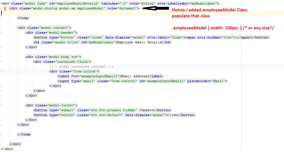
Bootstrap 3.x.x
<!-- Modal -->
<div class="modal fade" id="employeeBasicDetails" tabindex="-1" role="dialog" aria-labelledby="myModalLabel">
<div class="modal-dialog modal-sm employeeModal" role="document">
<form>
<div class="modal-content">
<div class="modal-header">
<button type="button" class="close" data-dismiss="modal" aria-label="Close"><span aria-hidden="true">×</span></button>
<h4 class="modal-title" id="myModalLabel">Modal Title</h4>
</div>
<div class="modal-body row">
Modal Body...
</div>
<div class="modal-footer">
<button type="button" class="btn btn-default" data-dismiss="modal">Close</button>
</div>
</div>
</form>
</div>
</div>
Notice I added .employeeModal class in second div. Then style that class.
.employeeModal{
        width: 700px;
    }
Solution 27 - Javascript
I used this way, and it's work perfect for me
$("#my-modal")
.modal("toggle")
.css({'width': '80%', 'margin-left':'auto', 'margin-right':'auto', 'left':'10%'});
Solution 28 - Javascript
Less-based solution (no js) for Bootstrap 2:
.modal-width(@modalWidth) {
    width: @modalWidth;
    margin-left: -@modalWidth/2;

    @media (max-width: @modalWidth) {
        position: fixed;
        top:   20px;
        left:  20px;
        right: 20px;
        width: auto;
        margin: 0;
        &.fade  { top: -100px; }
        &.fade.in { top: 20px; }
    }
}
Then wherever you want to specify a modal width:
#myModal {
    .modal-width(700px);
}
Solution 29 - Javascript
I used SCSS, and the fully responsive modal:
.modal-dialog.large {
    @media (min-width: $screen-sm-min) { width:500px; }
    @media (min-width: $screen-md-min) { width:700px; }
    @media (min-width: $screen-lg-min) { width:850px; }
}
Solution 30 - Javascript
you can use any prefix or postfix name for modal. but you need to make sure that's should use everywhere with same prefix/postfix name.

body .modal-nk {
        /* new custom width */
        width: 560px;
        /* must be half of the width, minus scrollbar on the left (30px) */
        margin-left: -280px;
    }
or
body .nk-modal {
            /* new custom width */
            width: 560px;
            /* must be half of the width, minus scrollbar on the left (30px) */
            margin-left: -280px;
        }
Solution 31 - Javascript
Below is the code for set the modal pop-up width and left position from the screen through javascript.
$('#openModalPopupId').css({ "width": "80%", "left": "30%"});
Solution 32 - Javascript
.Size(ModalSize.Large)

sample:
 using (var modal = Html.Bootstrap().Begin(new Modal().Id("modalProject_" + modelItem.id).Closeable().Size(ModalSize.Large)))
                {
}