Flutter Text Field: How to add Icon inside the border
FlutterFlutter LayoutFlutter Problem Overview

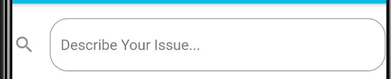
I would like to add the icon in the search bar. Here is my code so far:
new TextField(
     decoration: new InputDecoration(
     icon: new Icon(Icons.search)
     labelText: "Describe Your Issue...",
     enabledBorder: const OutlineInputBorder(
     borderRadius: BorderRadius.all(Radius.circular(20.0)),
     borderSide: const BorderSide(
       color: Colors.grey,
      ),
    ),
    focusedBorder: OutlineInputBorder(
      borderRadius: BorderRadius.all(Radius.circular(10.0)),
      borderSide: BorderSide(color: Colors.blue),
    ),
   ),
  ),
This is the result of the code above (this is not what i want):
Flutter Solutions
Solution 1 - Flutter
Edited Answer
Updating answer as my original answer doesn't actually cover the original context of the question.
You can use the prefixIcon in the TextField or in the TextFormField to get some widget as a leading in your TextField.
Example
    TextField(
//    ...,other fields
      decoration: InputDecoration(
        prefixIcon: prefixIcon??Icon(Icons.done),
      ),
    ),
> PS: Do not get confuse between prefixIcon and prefix as this two
> are different things.
> https://api.flutter.dev/flutter/material/InputDecoration/prefix.html
Also if you want to achieve something like floating app bar then you can refer to my original answer.
Original answer
You can use my Flutter package to implement Floating AppBar in your application.
You need to add below package in your pub.
rounded_floating_app_bar: ^0.1.0
run $ flutter packages get from the command line.
Now in your Dart code, you can use:
import 'package:rounded_floating_app_bar/rounded_floating_app_bar.dart';
...
NestedScrollView(
  headerSliverBuilder: (context, isInnerBoxScroll) {
    return [
      RoundedFloatingAppBar(
        floating: true,
        snap: true,
        title: TextField(
          decoration: InputDecoration(
            prefixIcon: Icon(Icons.search),
            border: InputBorder.none,
          ),
        ),
      ),
    ];
  },
  body: Container(),
),
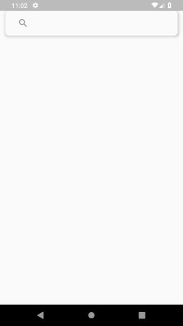
Output:
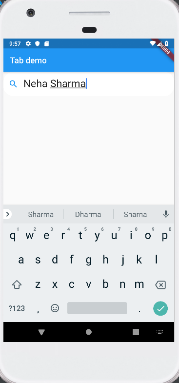
Solution 2 - Flutter
Use the prefixIcon in Just adjust in Boarder Radius
import 'package:flutter/material.dart';

class TextFieldShow extends StatelessWidget {
  TextEditingController _controller = TextEditingController();
  @override
  Widget build(BuildContext context) {
    return Scaffold(
      appBar: AppBar(
        title: new Text("Tab demo"),
      ),
      body: Padding(
        padding: const EdgeInsets.all(8.0),
        child: TextField(
            style: TextStyle(
              fontSize: 25.0,
              color: Colors.blueAccent,
            ),
            decoration: InputDecoration(
                contentPadding: EdgeInsets.fromLTRB(20.0, 15.0, 20.0, 15.0),
                prefixIcon: Icon(Icons.people),
                hintText: "Enter Your Name",
                border: OutlineInputBorder(
                    borderSide: BorderSide(color: Colors.blueAccent, width: 32.0),
                    borderRadius: BorderRadius.circular(25.0)),
                focusedBorder: OutlineInputBorder(
                    borderSide: BorderSide(color: Colors.white, width: 32.0),
                    borderRadius: BorderRadius.circular(25.0)))),
      ),
    );
  }
}
Solution 3 - Flutter
Try this way (using prefixIcon), just adjust the border radius
TextField(
          style: TextStyle(fontSize: 25.0),
          decoration: InputDecoration(
          	contentPadding: EdgeInsets.fromLTRB(20.0, 15.0, 20.0, 15.0),
          	prefixIcon: Icon(Icons.search),
          	hintText: "Describe your issue",
          	border: OutlineInputBorder(
            		borderSide: BorderSide(color: Colors.red[300], width: 32.0),
            		borderRadius: BorderRadius.circular(25.0)
	          ),
          	focusedBorder: OutlineInputBorder(
              		borderSide: BorderSide(color: Colors.red[300], width: 32.0),
              		borderRadius: BorderRadius.circular(25.0)))
Hope this help.
Solution 4 - Flutter
use prefixicon
return TextFormField(
  decoration: InputDecoration(
    hintText: hint,
    labelText: label,
    prefixIcon: Icon(Icons.person),
    contentPadding: EdgeInsets.fromLTRB(20.0, 10.0, 20.0, 10.0),
  ),
);
Solution 5 - Flutter
You can use the InputDecoration argument prefixIcon, or suffixIcon.
prefixIcon will show before the text inside your TextField.
TextField(
  decoration: InputDecoration(
    prefixIcon: Icon(Icons.done),
  ),
);
OR
suffixIcon will show after the text inside your TextField.
TextField(
  decoration: InputDecoration(
    suffixIcon: Icon(Icons.done),
  ),
);
ATTN: Code above does not include the border styling that is shown on the screenshots :)
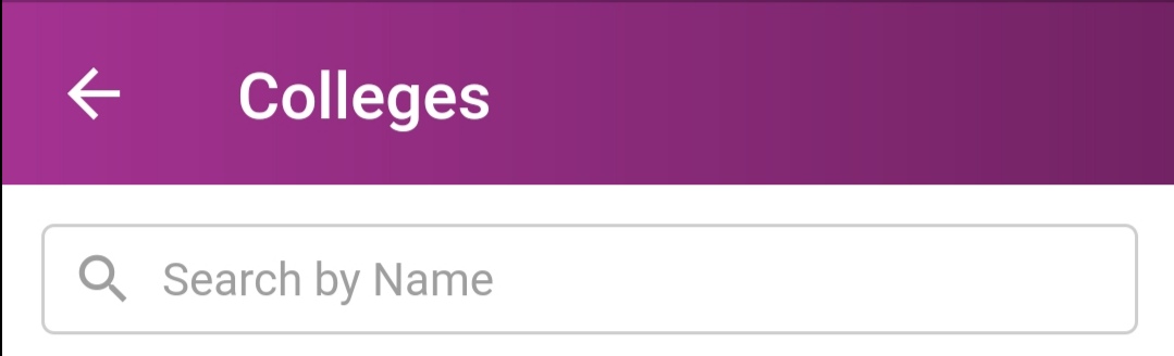
Solution 6 - Flutter
You can try this:
Container(
  decoration: BoxDecoration(
    border: Border.all(
      color: Colors.grey.withOpacity(0.5),
      width: 1.0,
    ),
    borderRadius: BorderRadius.circular(4.0),
  ),
  margin: EdgeInsets.all(12),
  child: Row(
    children: <Widget>[
      Padding(
        padding: EdgeInsets.only(left: 8),
        child: Icon(
          Icons.search,
          color: Colors.grey,
          size: 20,
        ),
      ),
      new Expanded(
        child: TextField(
          keyboardType: TextInputType.text,
          decoration: InputDecoration(
            border: InputBorder.none,
            hintText: "Search by Name",
            hintStyle: TextStyle(color: Colors.grey),
            contentPadding:
                EdgeInsets.symmetric(vertical: 8, horizontal: 8),
            isDense: true,
          ),
          style: TextStyle(
            fontSize: 14.0,
            color: Colors.black,
          ),
        ),
      )
    ],
  ),
)
It will be displayed as:
Solution 7 - Flutter
If you need to ad an icon in the Textfield use the arguments prefixIcon and suffixIcon inside it, like
TextField(
  decoration: InputDecoration(
    prefixIcon: Icon(Icons.mail),
    suffixIcon: Icon(Icons.search),
  ),
);
Solution 8 - Flutter
TextField(
      decoration: InputDecoration(
        filled: true,
        fillColor: Color(0xFFFFFFFF),
        prefixIcon: Icon(Icons.search, color: Colors.pink),
        border: OutlineInputBorder(
          borderRadius: BorderRadius.all(
            Radius.circular(30),
          ),
        ),
        hintText: ' Search',
      ),
    ),