Edit line thickness of CSS 'underline' attribute
HtmlCssHtml Problem Overview
Since you can underline any text in CSS like so:
h4 {
  text-decoration: underline;
}
How can you also then edit the 'line' that is drawn, the color you get on the line is easily specified as color: red but how does one edit the height of the line, i.e. the thickness?
Html Solutions
Solution 1 - Html
Here is one way of achieving this :
HTML :
<h4>This is a heading</h4>

<h4><u>This is another heading</u></h4>
CSS :
u {
text-decoration: none;
border-bottom: 10px solid black;
}
Here is an example: http://jsfiddle.net/AQ9rL/
Solution 2 - Html
Recently I had to deal with FF which underlines were too thick and too far from the text in FF, and found a better way to deal with it using a pair of box-shadows:
.custom-underline{
  box-shadow: inset 0 0px 0 white, inset 0 -1px 0 black
}
First shadow is put on top of the second one and that's how you can control the second one by varying the 'px' value of both.
Plus: various colors, thickness and underline position
Minus: can not use on non-solid backgrounds
Here I made couple of examples: http://jsfiddle.net/xsL6rktx/
Solution 3 - Html
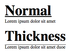
There is text-decoration-thickness, currently part of CSS Text Decoration Module Level 4. It's at "Editor's Draft" stage - so it's a work in progress and subject to change. As of January 2020, it is only supported in Firefox and Safari.
> The text-decoration-thickness CSS property sets the thickness, or > width, of the decoration line that is used on text in an element, such > as a line-through, underline, or overline.
a {
  text-decoration-thickness: 2px;
}
Codepen: https://codepen.io/mrotaru/pen/yLyLOgr (Firefox only)
There's also text-decoration-color, which is part of CSS Text Decoration Module Level 3. This is more mature (Candidate Recommendation) and is supported in most major browsers (exceptions are Edge and IE). Of course it can't be used to alter the thickness of the line, but can be used to achieve a more "muted" underline (also shown in the codepen).
Solution 4 - Html
Very easy ... outside "span" element with small font and underline, and inside "font" element with bigger font size.
<span style="font-size:1em;text-decoration:underline;">
 <span style="font-size:1.5em;">
   Text with big font size and thin underline
 </span>
</span>
Solution 5 - Html
Another way to do this is using ":after" (pseudo-element) on the element you want to underline.
h2 {
  position:relative;
  display:inline-block;
  font-weight:700;
  font-family:arial,sans-serif;
  text-transform:uppercase;
  font-size:3em;
}
h2:after {
  content:"";
  position:absolute;
  left:0;
  bottom:0;
  right:0;
  margin:auto;
  background:#000;
  height:1px;
}
Solution 6 - Html
I will do something simple like :
.thickness-underline {
  display: inline-block;
  text-decoration: none;
  border-bottom: 1px solid black;
  margin-bottom: -1px;
}
- You can use
line-heightorpadding-bottomto set possition between them - You can use
display: inlinein some case
Demo : http://jsfiddle.net/5580pqe8/
Solution 7 - Html
The background-image can also be used to create an underline. This method handles line breaks.
It has to be shifted down via background-position and repeated horizontally. The line width can be adjusted to some degree using background-size (the background is limited to the content box of the element).
.underline
{
    --color: green;
    font-size: 40px;
    background-image: linear-gradient(var(--color) 0%, var(--color) 100%);
    background-repeat: repeat-x;
    background-position: 0 1.05em;
    background-size: 2px 5px;
}
<span class="underline">
     Underlined<br/>
     Text
</span>
Solution 8 - Html
a {
  text-decoration: none;
  position: relative;
}

a.underline {
  text-decoration: underline;
}

a.shadow {
   box-shadow: inset 0 -4px 0 white, inset 0 -4.5px 0 blue;
}
<h1><a href="#" class="underline">Default: some text alpha gamma<br>the quick brown fox</a></h1>
<p>Working:</p>
<h1><a href="#" class="shadow">Using Shadow: some text alpha gamma<br>the quick brown fox<br>even works with<br>multiple lines</a></h1>
<br>
Final Solution: http://codepen.io/vikrant-icd/pen/gwNqoM
a.shadow {
   box-shadow: inset 0 -4px 0 white, inset 0 -4.5px 0 blue;
}
Solution 9 - Html
Thanks to the magic of new css options this is now possible natively:
a {
  text-decoration: underline;
  text-decoration-thickness: 5px;
  text-decoration-skip-ink: auto;
  text-underline-offset: 3px;
}
As of yet support is relatively poor. But it'll land in other browsers than ff eventually.
Solution 10 - Html
My Solution : https://codepen.io/SOLESHOE/pen/QqJXYj
{
    display: inline-block;
    border-bottom: 1px solid;
    padding-bottom: 0;
    line-height: 70%;
}
You can adjust underline position with line-height value, underline thickness and style with border-bottom.
Beware to disable default underline behavior if you want to underline an href.
Solution 11 - Html
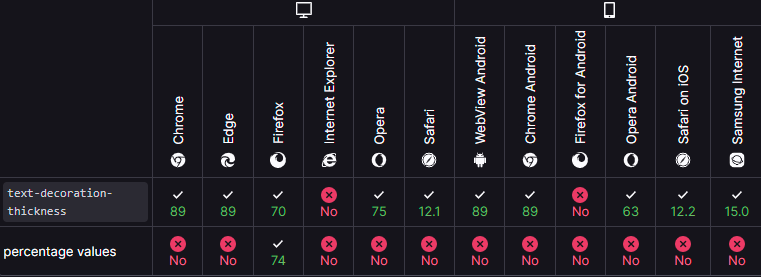
Now, as can be seen in the picture below, the property is fully supported in most browsers (according to Mozilla).
So, you can use the following attributes:
.thin {
  text-decoration-line: underline;
  text-decoration-style: solid;
  text-decoration-color: red;
  text-decoration-thickness: 1px;
}

.thick {
  text-decoration-line: underline;
  text-decoration-style: solid;
  text-decoration-color: red;
  text-decoration-thickness: 5px;
}

.shorthand {
  text-decoration: underline solid red 5px;
}
(example code from Mozilla).