Easy way to make a confirmation dialog in Angular?
AngularConfirmationAngular Problem Overview
Is there any not-so-complicated way to make a confirm dialog in angular 2, the idea is to click on an item and then show a popup or modal to confirm its deletion, I tried angular 2 modals from here angular2-modal, but I don't know how to make that if you confirm or cancel it does something. the click function works fine, the only problem is that I don't know too well how to use it. I also have another modal with the same plugin with the difference that I use.
this.modal.open(MyComponent);
And I don't want to create another component just for show a confirmation box that's why I'm asking.
Angular Solutions
Solution 1 - Angular
Method 1
One simple way to confirm is to use the native browser confirm alert. The template can have a button or link.
<button type=button class="btn btn-primary" (click)="clickMethod('name')">Delete me</button>
And the component method can be something like below.
clickMethod(name: string) {
  if(confirm("Are you sure to delete "+name)) {
    console.log("Implement delete functionality here");
  }
}
Method 2
Another way to get a simple confirmation dialog is to use the angular bootstrap components like ng-bootstrap or ngx-bootstrap. You can simply install the component and use the modal component.
Method 3
Provided below is another way to implement a simple confirmation popup using angular2/material that I implemented in my project.
app.module.ts
import { FormsModule, ReactiveFormsModule } from '@angular/forms';
import { ConfirmationDialog } from './confirm-dialog/confirmation-dialog';

@NgModule({
  imports: [
    ...
    FormsModule,
    ReactiveFormsModule
  ],
  declarations: [
    ...
    ConfirmationDialog
  ],
  providers: [ ... ],
  bootstrap: [ AppComponent ],
  entryComponents: [ConfirmationDialog]
})
export class AppModule { }
confirmation-dialog.ts
import { Component, Input } from '@angular/core';
import { MdDialog, MdDialogRef } from '@angular/material';

@Component({
  selector: 'confirm-dialog',
  templateUrl: '/app/confirm-dialog/confirmation-dialog.html',
})
export class ConfirmationDialog {
  constructor(public dialogRef: MdDialogRef<ConfirmationDialog>) {}

  public confirmMessage:string;
}
confirmation-dialog.html
<h1 md-dialog-title>Confirm</h1>
<div md-dialog-content>{{confirmMessage}}</div>
<div md-dialog-actions>
  <button md-button style="color: #fff;background-color: #153961;" (click)="dialogRef.close(true)">Confirm</button>
  <button md-button (click)="dialogRef.close(false)">Cancel</button>
</div>
app.component.html
<button (click)="openConfirmationDialog()">Delete me</button>
app.component.ts
import { MdDialog, MdDialogRef } from '@angular/material';
import { ConfirmationDialog } from './confirm-dialog/confirmation-dialog';

@Component({
  moduleId: module.id,
  templateUrl: '/app/app.component.html',
  styleUrls: ['/app/main.css']
})

export class AppComponent implements AfterViewInit {
  dialogRef: MdDialogRef<ConfirmationDialog>;

  constructor(public dialog: MdDialog) {}

  openConfirmationDialog() {
    this.dialogRef = this.dialog.open(ConfirmationDialog, {
      disableClose: false
    });
    this.dialogRef.componentInstance.confirmMessage = "Are you sure you want to delete?"

    this.dialogRef.afterClosed().subscribe(result => {
      if(result) {
        // do confirmation actions
      }
      this.dialogRef = null;
    });
  }
}
index.html => added following stylesheet
<link rel="stylesheet" href="node_modules/@angular/material/core/theming/prebuilt/indigo-pink.css">
Solution 2 - Angular
you can use window.confirm inside your function combined with if condition
 delete(whatever:any){
    if(window.confirm('Are sure you want to delete this item ?')){
    //put your delete method logic here
   }
}
when you call the delete method it will popup a confirmation message and when you press ok it will perform all the logic inside the if condition.
Solution 3 - Angular
I'm pretty late to the party, but here is another implementation using [tag:ng-bootstrap]: https://stackblitz.com/edit/angular-confirmation-dialog
confirmation-dialog.service.ts
import { Injectable } from '@angular/core';
import { Observable } from 'rxjs/Observable';

import { NgbModal } from '@ng-bootstrap/ng-bootstrap';

import { ConfirmationDialogComponent } from './confirmation-dialog.component';

@Injectable()
export class ConfirmationDialogService {

  constructor(private modalService: NgbModal) { }

  public confirm(
    title: string,
    message: string,
    btnOkText: string = 'OK',
    btnCancelText: string = 'Cancel',
    dialogSize: 'sm'|'lg' = 'sm'): Promise<boolean> {
    const modalRef = this.modalService.open(ConfirmationDialogComponent, { size: dialogSize });
    modalRef.componentInstance.title = title;
    modalRef.componentInstance.message = message;
    modalRef.componentInstance.btnOkText = btnOkText;
    modalRef.componentInstance.btnCancelText = btnCancelText;

    return modalRef.result;
  }

}
confirmation-dialog.component.ts
import { Component, Input, OnInit } from '@angular/core';
import { NgbActiveModal } from '@ng-bootstrap/ng-bootstrap';

@Component({
  selector: 'app-confirmation-dialog',
  templateUrl: './confirmation-dialog.component.html',
  styleUrls: ['./confirmation-dialog.component.scss'],
})
export class ConfirmationDialogComponent implements OnInit {

  @Input() title: string;
  @Input() message: string;
  @Input() btnOkText: string;
  @Input() btnCancelText: string;

  constructor(private activeModal: NgbActiveModal) { }

  ngOnInit() {
  }

  public decline() {
    this.activeModal.close(false);
  }

  public accept() {
    this.activeModal.close(true);
  }

  public dismiss() {
    this.activeModal.dismiss();
  }

}
confirmation-dialog.component.html
<div class="modal-header">
<h4 class="modal-title">{{ title }}</h4>
<button type="button" class="close" aria-label="Close" (click)="dismiss()">
<span aria-hidden="true">×</span>
</button>
</div>
<div class="modal-body">
{{ message }}
</div>
<div class="modal-footer">
<button type="button" class="btn btn-danger" (click)="decline()">{{ btnCancelText }}</button>
<button type="button" class="btn btn-primary" (click)="accept()">{{ btnOkText }}</button>
</div>
Use the dialog like this:
public openConfirmationDialog() {
    this.confirmationDialogService.confirm('Please confirm..', 'Do you really want to ... ?')
    .then((confirmed) => console.log('User confirmed:', confirmed))
    .catch(() => console.log('User dismissed the dialog (e.g., by using ESC, clicking the cross icon, or clicking outside the dialog)'));
  }
Solution 4 - Angular
UPDATE: Plunkr added
I was looking for a solution on all forums but found none, so found a solution with Old School Javascript Callback function.
This is a really simple and clean way to create a confirmation dialog and set Callback functions for both YES and NO click events.
I have used Bootstrap CSS for Modal and An Alert Service with rxjs Subject.
alert.component.html
        <div *ngIf="message.type == 'confirm'"  class="modal-body">
            <div class="row">
                <div class="col-md-12">
                    <h3 class="text-center">{{message.text}}</h3>
                </div>
            </div>
            <div class="row">
                <div class="col-md-12">
                    <p class="text-center">
                        <a (click)="message.noFn()">
                            <button class="btn btn-pm">No</button>
                        </a>
                        <a (click)="message.siFn()">
                            <button  class="btn btn-sc" >Yes</button>
                        </a>
                    </p>
                </div>
            </div>
         </div>
alert.component.ts
export class AlertComponent {
    message: any;
    constructor(
      public router: Router,
      private route: ActivatedRoute,
      private alertService: AlertService,
   ) { }
   ngOnInit() {
    //this function waits for a message from alert service, it gets
    //triggered when we call this from any other component
    this.alertService.getMessage().subscribe(message => {
        this.message = message;
    });
}
The most important part is here alert.service.ts
     import { Injectable } from '@angular/core';
     import { Router, NavigationStart } from '@angular/router';
     import { Observable } from 'rxjs';
     import { Subject } from 'rxjs/Subject';
     @Injectable() export class AlertService {
          private subject = new Subject<any>();
          constructor(){}
          confirm(message: string,siFn:()=>void,noFn:()=>void){
            this.setConfirmation(message,siFn,noFn);
          }
          setConfirmation(message: string,siFn:()=>void,noFn:()=>void) {
            let that = this;
            this.subject.next({ type: "confirm",
                        text: message,
                        siFn:
                        function(){
                            that.subject.next(); //this will close the modal
                            siFn();
                        },
                        noFn:function(){
                            that.subject.next();
                            noFn();
                        }
                     });

                 }

          getMessage(): Observable<any> {
             return this.subject.asObservable();
          }
       }
Call the function from any component
this.alertService.confirm("You sure Bro?",function(){
    //ACTION: Do this If user says YES
},function(){
    //ACTION: Do this if user says NO
})
Solution 5 - Angular
You could use sweetalert: https://sweetalert.js.org/guides/
npm install sweetalert --save
Then, simply import it into your application:
import swal from 'sweetalert';
If you pass two arguments, the first one will be the modal's title, and the second one its text.
swal("Here's the title!", "...and here's the text!");
Solution 6 - Angular
Here's a slghtly different take using javascript's native confirm functionality and a custom Angular directive. It's super flexible and pretty lightweight:
Usage:
<button (hrsAreYouSure) (then)="confirm(arg1)" (else)="cancel(arg2)">
  This will execute confirm if user presses Ok on the confirmation dialog, or cancel if they
  hit Cancel
</button>
Directive:
import {Directive, ElementRef, EventEmitter, Inject, OnInit, Output} from '@angular/core';

@Directive({
  selector: '[hrsAreYouSure]'
})

export class AreYouSureDirective implements OnInit {

  @Output() then = new EventEmitter<boolean>();
  @Output() else = new EventEmitter<boolean>();

  constructor(@Inject(ElementRef) private element: ElementRef) { }

  ngOnInit(): void {
    const directive = this;
    this.element.nativeElement.onclick = function() {
      const result = confirm('Are you sure?');
      if (result) {
        directive.then.emit(true);
      } else {
        directive.else.emit(true);
      }
    };
  }
}
Solution 7 - Angular
Adding more options to the answer.
You could use npm i sweetalert2
Don't forget to add the style to your angular.json
"styles": [
         ...
          "node_modules/sweetalert2/src/sweetalert2.scss"
          ]
Then just import,
// ES6 Modules or TypeScript
import Swal from 'sweetalert2'


// CommonJS
const Swal = require('sweetalert2')
Boom, you are ready to go.
Swal.fire({
  title: 'Are you sure?',
  text: 'You will not be able to recover this imaginary file!',
  icon: 'warning',
  showCancelButton: true,
  confirmButtonText: 'Yes, delete it!',
  cancelButtonText: 'No, keep it'
}).then((result) => {
  if (result.value) {
    Swal.fire(
      'Deleted!',
      'Your imaginary file has been deleted.',
      'success'
    )
  // For more information about handling dismissals please visit
  // https://sweetalert2.github.io/#handling-dismissals
  } else if (result.dismiss === Swal.DismissReason.cancel) {
    Swal.fire(
      'Cancelled',
      'Your imaginary file is safe :)',
      'error'
    )
  }
})
More on this:- https://www.npmjs.com/package/sweetalert2
I do hope this helps someone.
Thanks.
Solution 8 - Angular
In order to reuse a single confirmation dialog implementation in a multi-module application, the dialog must be implemented in a separate module. Here's one way of doing this with Material Design and FxFlex, though both of those can be trimmed back or replaced.
First the shared module (./app.module.ts):
import {NgModule} from '@angular/core';
import {CommonModule} from '@angular/common';
import {MatDialogModule, MatSelectModule} from '@angular/material';
import {ConfirmationDlgComponent} from './confirmation-dlg.component';
import {FlexLayoutModule} from '@angular/flex-layout';

@NgModule({
   imports: [
      CommonModule,
      FlexLayoutModule,
      MatDialogModule
   ],
   declarations: [
      ConfirmationDlgComponent
   ],
   exports: [
      ConfirmationDlgComponent
   ],
   entryComponents: [ConfirmationDlgComponent]
})

export class SharedModule {
}
And the dialog component (./confirmation-dlg.component.ts):
import {Component, Inject} from '@angular/core';
import {MAT_DIALOG_DATA} from '@angular/material';

@Component({
   selector: 'app-confirmation-dlg',
   template: `
      <div fxLayoutAlign="space-around" class="title colors" mat-dialog-title>{{data.title}}</div>
      <div class="msg" mat-dialog-content>
         {{data.msg}}
      </div>
      <a href="#"></a>
      <mat-dialog-actions fxLayoutAlign="space-around">
         <button mat-button [mat-dialog-close]="false" class="colors">No</button>
         <button mat-button [mat-dialog-close]="true" class="colors">Yes</button>
      </mat-dialog-actions>`,
   styles: [`
      .title {font-size: large;}
      .msg {font-size: medium;}
      .colors {color: white; background-color: #3f51b5;}
      button {flex-basis: 60px;}
   `]
})
export class ConfirmationDlgComponent {
   constructor(@Inject(MAT_DIALOG_DATA) public data: any) {}
}
Then we can use it in another module:
import {FlexLayoutModule} from '@angular/flex-layout';
import {NgModule} from '@angular/core';
import {GeneralComponent} from './general/general.component';
import {NgbModule} from '@ng-bootstrap/ng-bootstrap';
import {CommonModule} from '@angular/common';
import {MaterialModule} from '../../material.module';

@NgModule({
   declarations: [
      GeneralComponent
   ],
   imports: [
      FlexLayoutModule,
      MaterialModule,
      CommonModule,
      NgbModule.forRoot()
   ],
   providers: []
})
export class SystemAdminModule {}
The component's click handler uses the dialog:
import {Component} from '@angular/core';
import {ConfirmationDlgComponent} from '../../../shared/confirmation-dlg.component';
import {MatDialog} from '@angular/material';

@Component({
   selector: 'app-general',
   templateUrl: './general.component.html',
   styleUrls: ['./general.component.css']
})
export class GeneralComponent {

   constructor(private dialog: MatDialog) {}

   onWhateverClick() {
      const dlg = this.dialog.open(ConfirmationDlgComponent, {
         data: {title: 'Confirm Whatever', msg: 'Are you sure you want to whatever?'}
      });

      dlg.afterClosed().subscribe((whatever: boolean) => {
         if (whatever) {
            this.whatever();
         }
      });
   }

   whatever() {
      console.log('Do whatever');
   }
}
Just using the this.modal.open(MyComponent); as you did won't return you an object whose events you can subscribe to which is why you can't get it to do something. This code creates and opens a dialog whose events we can subscribe to.
If you trim back the css and html this is really a simple component, but writing it yourself gives you control over its design and layout whereas a pre-written component will need to be much more heavyweight to give you that control.
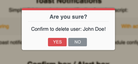
Solution 9 - Angular
Always is better to make functionality and features to suit your specific project needs, but we often do not have time to code all the little things that we would like to. If you don't want to code it for yourself, it could be accomplished easily with the npm package @costlydeveloper/ngx-awesome-popup.
You could implement only Confirm Box module from the package in this way:
In your app.module.ts
    import {NgModule} from '@angular/core';
    import {BrowserModule} from '@angular/platform-browser';
    import {AppComponent} from './app.component';

    // Import your library
    import {ConfirmBoxConfigModule, NgxAwesomePopupModule} from '@costlydeveloper/ngx-awesome-popup';


    @NgModule({
        declarations: [
            AppComponent
        ],
        imports     : [
            BrowserModule,

            // Import popup and confirm box module
            NgxAwesomePopupModule.forRoot(),
            ConfirmBoxConfigModule.forRoot()
        ],
        providers   : [],
        bootstrap   : [AppComponent]
    })
    export class AppModule {
    }
Then evoke it anywhere in typescript code from this kind of method:
     confirmBox() {
            const confirmBox = new ConfirmBoxInitializer();
            confirmBox.setTitle('Are you sure?');
            confirmBox.setMessage('Confirm to delete user: John Doe!');
            // Set button labels, the first argument for the confirmation button, and the second one for the decline button.
            confirmBox.setButtonLabels('YES', 'NO');

            confirmBox.setConfig({
                DisableIcon: true, // optional
                AllowHTMLMessage: false, // optional
                ButtonPosition: 'center', // optional
                // Evoke the confirmation box with predefined types.
                LayoutType: DialogLayoutDisplay.DANGER // SUCCESS | INFO | NONE | DANGER | WARNING
            });

            // Simply evoke the popup and listen which button is clicked.
            const subscription = confirmBox.openConfirmBox$().subscribe(resp => {
                // IConfirmBoxPublicResponse
                console.log('ConfirmBox button response: ', resp);
                subscription.unsubscribe();
            });
        }
Get result like this: