Does "display:none" prevent an image from loading?
CssResponsive DesignCss Problem Overview
Every responsive website development tutorial recommends using the display:none CSS property to hide content from loading on mobile browsers so the website loads faster. Is it true? Does display:none not load the images or does it still load the content on mobile browser? Is there any way to prevent loading unnecessary content on mobile browsers?
Css Solutions
Solution 1 - Css
Browsers are getting smarter. Today your browser (depending on the version) might skip the image loading if it can determine it's not useful.
The image has a display:none style but its size may be read by the script.
Chrome v68.0 does not load images if the parent is hidden.
You may check it there : http://jsfiddle.net/tnk3j08s/
You could also have checked it by looking at the "network" tab of your browser's developer tools.
Note that if the browser is on a small CPU computer, not having to render the image (and layout the page) will make the whole rendering operation faster but I doubt this is something that really makes sense today.
If you want to prevent the image from loading you may simply not add the IMG element to your document (or set the IMG src attribute to "data:" or "about:blank").
Solution 2 - Css
If you make the image a background-image of a div in CSS, when that div is set to "display: none", the image will not load. When CSS is disabled, it still will not load, because, well, CSS is disabled.
Solution 3 - Css
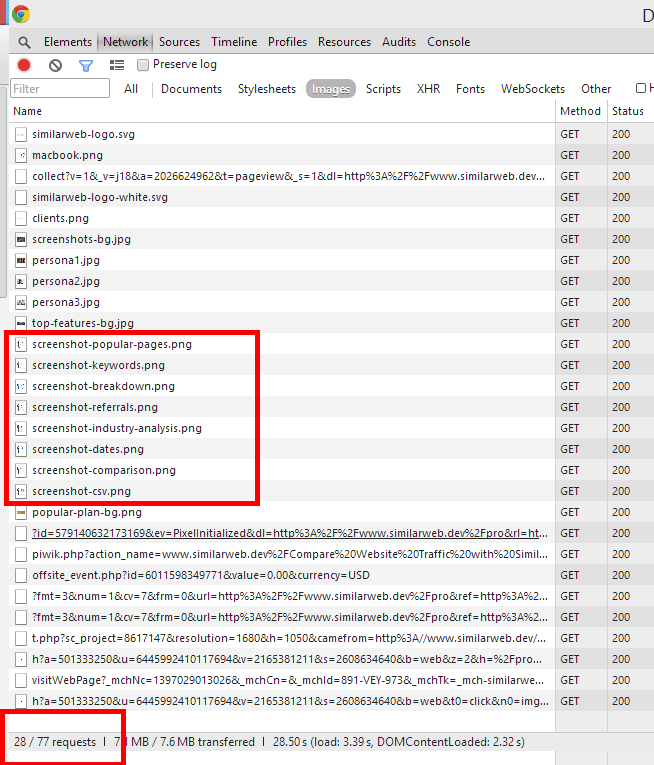
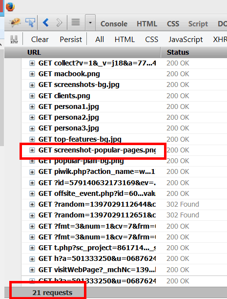
The answer is not as easy as a simple yes or no. Check out the results of a test I recently did:
- In Chrome: All 8 screenshot-* images loaded (img 1)
- In Firefox: Only the 1 screenshot-* image loaded that is currently being displayed (img 2)
So after digging further I found this, which explains how each browser handles loading img assets based on css display: none;
Excerpt from the blog post:
> - Chrome and Safari (WebKit):
WebKit downloads the file every time except when a background is applied through a non-matching
> media-query.
> - Firefox:
Firefox won't download the image called with background image if the styles are hidden but they will still download assets
> from img tags.
> - Opera:
Like Firefox does, Opera won't load useless background-images.
> - Internet Explorer:
IE, like WebKit will download background-images even if they have display: none;
> Something odd appears with IE6 : Elements with a background-image and display: none set inline won't be downloaded... But they will be
> if those styles aren't applied inline.
Solution 4 - Css
HTML5 <picture> tag will help you to resolve the right image source depending on the screen width
Apparently the browsers behaviour hasn't changed much over the past 5 years and many would still download the hidden images, even if there was a display: none property set on them.
Even though there's a media queries workaround, it could only be useful when the image was set as a background in the CSS.
While I was thinking that there's just a JS solution to the problem (lazy load, picturefill, etc.), it appeared that there's a nice pure HTML solution that comes out of the box with HTML5.
And that is the <picture> tag.
Here's how MDN describes it:
> The HTML <picture> element is a container used to specify multiple <source> elements for a specific <img> contained in it. The browser will choose the most suitable source according to the current layout of the page (the constraints of the box the image will appear in) and the device it will be displayed on (e.g. a normal or hiDPI device.)
And here's how to use it:
<picture>
 <source srcset="mdn-logo-wide.png" media="(min-width: 600px)">
 <img src="mdn-logo-narrow.png" alt="MDN">
</picture>
The logic behind
The browser would load the source of the img tag, only if none of the media rules applies. When the <picture> element is not supported by the browser, it will again fallback to showing the img tag.
Normally you'd put the smallest image as the source of the <img> and thus not load the heavy images for larger screens. Vice versa, if a media rule applies, the source of the <img> will not be downloaded, instead it will download the url's contents of the corresponding <source> tag.
Only pitfall here is that if the element is not supported by the browser, it will only load the small image. On the other hand in 2017 we ought to think and code in the mobile first approach.
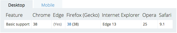
And before someone got too exited, here's the current browser support for <picture>:
Desktop browsers
Mobile browsers
More about the browser support you can find on Can I use.
The good thing is that html5please's sentence is to use it with a fallback. And I personally intend to take their advise.
More about the tag you can find in the W3C's specification. There's a disclaimer there, which I find important to mention:
> The picture element is somewhat different from the similar-looking video and audio elements. While all of them contain source elements, the source element’s src attribute has no meaning when the element is nested within a picture element, and the resource selection algorithm is different. As well, the picture element itself does not display anything; it merely provides a context for its contained img element that enables it to choose from multiple URLs.
So what it says is that it only helps you improve the performance when loading an image, by providing some context to it.
And you can still use some CSS magic in order to hide the image on small devices:
<style>
  picture { display: none; }

  @media (min-width: 600px) {
    picture {
      display: block;
    }
  }
</style>

<picture>
 <source srcset="the-real-image-source" media="(min-width: 600px)">
 <img src="a-1x1-pixel-image-that-will-be-hidden-in-the-css" alt="MDN">
</picture>
Thus the browser will not display the actual image and will only download the 1x1 pixel image (which can be cached if you use it more than once). Be aware, though, that if the <picture> tag is not supported by the browser, even on descktop screens the actual image won't be displayed (so you'll definitely need a polyfill backup there).
Solution 5 - Css
** 2019 Answer **
In a normal situation display:none doesn't prevent the image to be downloaded
/*will be downloaded*/

#element1 {
    display: none;
    background-image: url('https://picsum.photos/id/237/100');
}
But if an ancestor element has display:none then the descendant's images will not be downloaded
/* Markup */

<div id="father">
    <div id="son"></div>
</div>


/* Styles */

#father {
    display: none;
}

/* #son will not be downloaded because the #father div has display:none; */

#son {
    background-image: url('https://picsum.photos/id/234/500');
}
Other situations that prevent the image to be downloaded:
1- The target element doesn't exist
/* never will be downloaded because the target element doesn't exist */

#element-dont-exist {
    background-image: url('https://picsum.photos/id/240/400');
}
2- Two equal classes loading different images
/* The first image of #element2 will never be downloaded because the other #element2 class */

#element2 {
    background-image: url('https://picsum.photos/id/238/200');
}

/* The second image of #element2 will be downloaded */

#element2 {
    background-image: url('https://picsum.photos/id/239/300');
}
You can watch for yourself here: https://codepen.io/juanmamenendez15/pen/dLQPmX
Solution 6 - Css
Yes it will render faster, slightly, only because it doesn't have to render the image and is one less element to sort on the screen.
If you don't want it loaded, leave a DIV empty where you can load html into it later containing an <img> tag.
Try using firebug or wireshark as I've mentioned before and you'll see that the files DO get transferred even if display:none is present.
Opera is the only browser which will not load the image if the display is set to none. Opera has now moved to webkit and will render all images even if their display is set to none.
Here is a testing page that will prove it:
Solution 7 - Css
Quirks Mode: images and display: none
> When image has display: none or is inside an element with
> display:none, the browser may opt not to download the image until the display
> is set to another value.
>
> Only Opera downloads the image when you switch the display to block.
> All other browsers download it immediately.
Solution 8 - Css
The background-image of a div element will load if the div is set do 'display:none'.
Anyway, if that same div has a parent and that parent is set to 'display:none', the background-image of the child element will not load. :)
Example using bootstrap:
<link href="https://maxcdn.bootstrapcdn.com/bootstrap/3.3.7/css/bootstrap.min.css" rel="stylesheet" integrity="sha384-BVYiiSIFeK1dGmJRAkycuHAHRg32OmUcww7on3RYdg4Va+PmSTsz/K68vbdEjh4u" crossorigin="anonymous">


<div class="col-xs-12 visible-lg">
	<div style="background-image: url('http://via.placeholder.com/300x300'); background-repeat:no-repeat; height: 300px;">lg</div>
</div>
<div class="col-xs-12 visible-md">
	<div style="background-image: url('http://via.placeholder.com/200x200'); background-repeat:no-repeat; height: 200px;">md</div>
</div>
<div class="col-xs-12 visible-sm">
	<div style="background-image: url('http://via.placeholder.com/100x100'); background-repeat:no-repeat; height: 100px">sm</div>
</div>
<div class="col-xs-12 visible-xs">
	<div style="background-image: url('http://via.placeholder.com/50x50'); background-repeat:no-repeat; height: 50px">xs</div>
</div>
Solution 9 - Css
It seems browsers still download images even if the latter are directly or indirectly hidden with display: none property.
The only standard way to prevent this from happening I found was using loading attribute of the img tag:
<img src="https://cdn.test/img.jpg" loading="lazy">
All latest browsers support it except Safari and Firefox Android.
Solution 10 - Css
Just expanding on Brent's solution.
You can do the following for a pure CSS solution, it also makes the img box actually behave like an img box in a responsive design setting (that's what the transparent png is for), which is especially useful if your design uses responsive-dynamically-resizing images.
<img style="display: none; height: auto; width:100%; background-image:
url('img/1078x501_1.jpg'); background-size: cover;" class="center-block
visible-lg-block" src="img/400x186_trans.png" alt="pic 1 mofo">
The image will only be loaded when the media query tied to visible-lg-block is triggered and display:none is changed to display:block. The transparent png is used to allow the browser to set appropriate height:width ratios for your <img> block (and thus the background-image) in a fluid design (height: auto; width: 100%).
1078/501 = ~2.15  (large screen)
400/186  = ~2.15  (small screen)
So you end up with something like the following, for 3 different viewports:
<img style="display: none; height: auto; width:100%; background-image: url('img/1078x501_1.jpg'); background-size: cover;" class="center-block visible-lg-block" src="img/400x186_trans.png" alt="pic 1">
<img style="display: none; height: auto; width:100%; background-image: url('img/517x240_1.jpg'); background-size: cover;" class="center-block visible-md-block" src="img/400x186_trans.png" alt="pic 1">
<img style="display: none; height: auto; width:100%; background-image: url('img/400x186_1.jpg'); background-size: cover;" class="center-block visible-sm-block" src="img/400x186_trans.png" alt="pic 1">
And only your default media viewport size images load during the initial load, then afterwards, depending on your viewport, images will dynamically load.
And no javascript!
Solution 11 - Css
> If so is there a way to not load the unnecessary content on mobile > browsers?
use <img src="" srcset="">
http://www.webdesignerdepot.com/2015/08/the-state-of-responsive-images/
Solution 12 - Css
To prevent fetching resources, use the <template> element of Web Components.
Solution 13 - Css
Use @media query CSS, basically we just release a project where we had an enormous image of a tree on desktop at the side but not showing in table/mobile screens. So prevent image from loading its quite easy
Here is a small snippet:
.tree {
	background: none top left no-repeat;
}

@media only screen and (min-width: 1200px) {
	.tree {
		background: url(enormous-tree.png) top left no-repeat;
	}
}
You can use the same CSS to show and hide with display/visibility/opacity but image was still loading, this was the most fail safe code we came up with.
Solution 14 - Css
Hi guys I was struggling with the same issue, how to not load an image on mobile.
But I figured out a good solution. First make an img tag and then load a blank svg in the src attribute. Now you can set your URL to the image as an inline style with content: url('link to your image');. Now wrap your img tag in a wrapper of your choice.
<div class="test">
<img src="data:image/svg+xml,%3Csvg%20xmlns=%22http://www.w3.org/2000/svg%22/%3E" style="content:url('https://blog.prepscholar.com/hubfs/body_testinprogress.gif?t=1495225010554')">
</div>
@media only screen and (max-width: 800px) {
.test{
display: none;
}
}
Set the wrapper to display none on the breakpoint where you dont want to load the image. The inline css of the img tag is now ignored since the style of an element wrapped in a wrapper with display none will be ignored, therefore the image is not loaded, until you reach a breakpoint where the wrapper has display block.
There you go, really easy way not to load an img on mobile breakpoint :)
Check out this codepen, for a working example: http://codepen.io/fennefoss/pen/jmXjvo
Solution 15 - Css
No.The image will be loaded as usual and will still use the user’s bandwidth if you are considering the mobile phone user bandwidth saving.What u can do is to use media query and filter the devices that you want your image to be loaded.Your image must be set as a background image of a div,etc and NOT an tag since the the image tag will load the image regardless if the screen size and the media query set.
Solution 16 - Css
we're talking about images not loading on mobile, right? so what if you just did an @media (min-width: 400px){background-image:thing.jpg}
wouldn't it then only look for the image at above a certain screen width?
Solution 17 - Css
Another possibility is using a <noscript> tag and placing the image inside the <noscript> tag. Then use javascript to remove the noscript tag as you need the image. In this way you can load images on demand using progressive enhancement.
Use this polyfill I wrote to read the contents of <noscript> tags in IE8
Solution 18 - Css
The trick to using display:none with images is to assign them an id. This was there is not a lot of code needed to make it work. Here is an example using media queries and 3 stylesheets. One for phone, one for tablet, and one for desktop. I have 3 images, image of a phone, a tablet, and a desktop. On a phone screen only an image of the phone will display, a tablet will display only the tablet image, a desktop displays on the desktop computer image. Here is a code example to make it work:
Source code:
<div id="content">
<img id="phone" src="images/phone.png" />
<img id="tablet" src="images/tablet.png" />
<img id="desktop" src="images/desktop.png" />
</div>
The phone CSS which doesn't need a media query. Its the img#phone that makes it work:
img#phone {
    display: block;
    margin: 6em auto 0 auto;
    width: 70%;
    }

img#tablet {display: none;}
img#desktop {display: none;}
The tablet css:
@media only screen and (min-width: 641px) {
img#phone {display: none;}

img#tablet {
    display: block;
    margin: 6em auto 0 auto;
    width: 70%;
    }
}
And the desktop css:
@media only screen and (min-width: 1141px) {
img#tablet {display: none;}

img#desktop {
    display: block;
    margin: 6em auto 0 auto;
    width: 80%;
    }
}
Good luck and let me know how it works for you.