CSS Media Query - Soft-keyboard breaks css orientation rules - alternative solution?
AndroidCssMedia QueriesAndroid Problem Overview
I am working with multiple tablet devices - both Android and iOS. Currently I have following resolution variations for all the tablets.
- 1280 x 800
- 1280 x 768
1024 x 768 (iPad Obviously)- iPad does not have this issue
Simplest way to apply device orientation based style is to use media query's orientation using following syntax.
@media all and (orientation:portrait)
{
  /* My portrait based CSS here */
}

@media all and (orientation:landscape)
{
  /* My landscape based CSS here */
}
This works perfectly fine on all tablet devices. BUT, the problem is, when device is in portrait mode and user taps on any input field (eg. search) the soft-keyboard pops up - which reduces the visible area of web page and forces it to render in landscape based css. On android tablet devices, it depends on keyboard's height. So, ultimately the web page looks broken. Therefore, I can't use CSS3's orientation media query to apply styles based on orientation (unless there is better media query to target orientation). Here is a fiddle http://jsfiddle.net/hossain/S5nYP/5/ which emulates this - for device testing use full test page - http://jsfiddle.net/S5nYP/embedded/result/
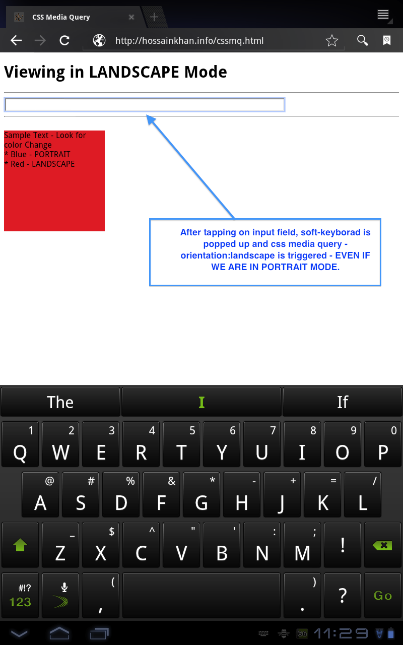
Here is a screenshot of the behaviour taken from the demo page.
So, is there any alternative to takle this issue, I'm open to JavaScript based solution if native CSS based solution does not work.
I found a snippet on http://davidbcalhoun.com/2010/dealing-with-device-orientation which suggests to add class on and target based on that. For example:
<html class="landscape">
  <body>
    <h1 class="landscape-only">Element Heading - Landscape</h1>
    <h1 class="portrait-only">Element Heading - Portrait</h1>
    <!-- .... more... ->

# CSS
.landscape .landscape-only { display:block; }
.landspace .portrait-only  { display:none; }
.portrait .portrait-only   { display:block; }
.portrait .landscape-only  { display:none; }
What do you guys think about this? Do you have better solution?
Android Solutions
Solution 1 - Android
I know this is a couple of years late but I found a great solution
For landscape media:
@media screen and (min-aspect-ratio: 13/9) { /* landscape styles here */}
And for portrait media:
@media screen and (max-aspect-ratio: 13/9) { /* portrait styles here */}
The full solution and why it works can be found here Michael Barret - Android browser challenges
Edit: this link is now expired, but a snapshot can be found on the internet archive: Michael Barret - Android browser challenges
Solution 2 - Android
The problem lies in the way that orientation is calculated:
http://www.w3.org/TR/css3-mediaqueries/#orientation > The ‘orientation’ media feature is ‘portrait’ when the value of the ‘height’ media feature is greater than or equal to the value of the ‘width’ media feature. Otherwise ‘orientation’ is ‘landscape’.
Since the height/width is calculated on the visible viewport, the soft keyboard apparently causes the orientation to flip now that the viewport width is less than the height. One solution would be just to use your media queries based on just width instead. This makes it more flexible across devices regardless of orientation, not to mention width/height is more widely supported than orientation.
If you want to account for the width instead of orientation, I'll use the iPhone as an example:
@media screen and (max-width: 320px) {
  /* rules applying to portrait */
}

@media screen and (max-width: 480px) {
  /* rules applying to landscape */
}
This approach is more flexible than orientation since the queries aren't limited to devices/user-agents that support orientation, not to mention that orientation tells you very little versus the width.
Of course if you really need to know orientation, it seems like setting the class initially and just use that might be your best option.
Solution 3 - Android
An alternative might be to use device-aspect-ratio, which remains unchanged. However, in Webkit, rotating the device doesn't trigger an update of CSS rules using this query, even though JavaScript tests return true for the new aspect ratio. This is apparently due to a bug, but I'm not able to find a bug report. Using a combination of orientation and {min,max}-device-aspect-ratio seems to work fine:
@media screen and (max-device-aspect-ratio: 1/1) and (orientation: portrait)
@media screen and (min-device-aspect-ratio: 1/1) and (orientation: landscape)
The use of orientation triggers updates as expected, and the use of device-aspect-ratio restricts updated to actual changes of orientation.
Solution 4 - Android
I worked through the options listed above and none quite fixed the issues for me. I switched to using screen.availHeight as it gives consistent height results avoiding the keyboard display issue.
// Avoiding the keyboard in Android causing the portrait orientation to change to landscape.
// Not an issue in IOS. Can use window.orientation.
var currentOrientation = function() {
  // Use screen.availHeight as screen height doesn't change when keyboard displays.
  if(screen.availHeight > screen.availWidth){
    $("html").addClass('portrait').removeClass('landscape');
  } else {
    $("html").addClass('landscape').removeClass('portrait');
  }
}

// Set orientation on initiliasation
currentOrientation();
// Reset orientation each time window is resized. Keyboard opening, or change in orientation triggers this.
$(window).on("resize", currentOrientation);
Solution 5 - Android
For me, this did the trick:
  @media screen and (max-device-aspect-ratio: 1/1), (max-aspect-ratio: 1/1){
        /*Portrait Mode*/
};
While max-aspect-ratio takes care of triggering Portrait mode simply by resizing the window (useful for PCs and other landscape-only devices), max-device-aspect-ratio helps with smartphones or other devices with variable orientation. And because I'm not declaring specific settings for Landscape mode, even if max-aspect-ratio is reporting >1 to the system, Portrait mode will still be triggered by max-device-aspect-ratio if the Android device is oriented that way.
The 1/1 part basically means that if the ratio is <=1, it goes to Portrait mode, otherwise it goes to landscape mode.
Solution 6 - Android
I've run through several of the answers above and none of them did exacly what i wanted, which is, to mimic iPhone functionality as closely as possible. The following is what is working for me in production now.
It works by assigning the window width and height of the device viewport to a data attribute for future checking. Since phones don't resize width when pulling up the keyboard, only the height, checking the ratio AND the width against the original width can tell you if the keyboard is up. I haven't found a use case this has failed yet, but I'm sure I will. If you all find one, please let me know.
I am using some globals, like InitialRun and MobileOrientation, which are used for js switching, I am also using html5 data-attributes to store info in the DOM for css manipulation.
    var InitialRun = true; // After the initial bootstrapping, this is set to false;
    var MobileOrientation = 'desktop';
    function checkOrientation(winW, winH){ // winW and winH are the window's width and hieght, respectively
		if (InitialRun){
			if (winW > winH){
				$('body').attr('data-height',winW);
				$('body').attr('data-width',winH);
				MobileOrientation = 'landscape';
				$('body').attr('data-orientation','landscape');
			}
			else{
				$('body').attr('data-height',winH);
				$('body').attr('data-width',winW);
				MobileOrientation = 'portrait';
				$('body').attr('data-orientation','portrait');
			}
		}
		else{
			if (winW > winH && winW != $('body').data('width')){
				MobileOrientation = 'landscape';
				$('body').hdata('orientation','landscape'); //TODO:uncomment
				$('body, #wrapper').css({'height':"100%",'overflow-y':'hidden'});
				//$('body').attr('data-orientation','portrait');
			}
			else{
				MobileOrientation = 'portrait';
				$('body').attr('data-orientation','portrait');
				$('body, #wrapper').css({'height':$('body').data('height'),'overflow-y':'auto'});
			}
		}

    }
Solution 7 - Android
I used a simple trick to solve this problem
@media (max-width: 896px) and (min-aspect-ratio: 13/9){/* Landscape content*/}
I found max-width: 896px can be used for all mobile device. try this solution it works!
Solution 8 - Android
Take a look at this link:
http://www.alistapart.com/articles/a-pixel-identity-crisis/
Relying not only on orientation, but also on max-device-height or device-pixel-ratio may help. Anyway, I did not test it, so not sure that it'll help.
Solution 9 - Android
Idea: Take the portrait parameter off of your media query and leave it only with a min-width. Do your normal styling for portrait mode in that media query. Then, create another media query for landscape mode with a min-height tall enough so that the the browser won't use that query when the keyboard pops up. You'd have to experiment with what this 'tall enough min-height' is, but it shouldn't be too hard since most (if not all) landscape modes have a height larger than you'd have when a keyboard pops up. Additionally, you could add a 'min-width' to the landscape query that is larger that most smart-phones in portrait view (i.e around ~400px) to limit scope of the query.
Here's an alternative (and tenuous) solution:
- Add an empty arbitrary element to your html that will have 'display: none' in anything other than portrait mode.
- Create a jquery or javascript listener for input:focus. When an input is clicked, your javascript checks the display property of the arbitrary element. If it returns 'block' or whatever you set it during portrait mode, then you can override your styling with JS to your portrait mode queries. Conversely, you'd have an input:blur listener to blank out the style.cssText properties of the elements you hard-coded.
I'm experimenting with this myself right now - I'll post code of what works when I get something solid and manageable. (My first solution seems the most reasonable).
Solution 10 - Android
This works reliably for me. I am using http://detectmobilebrowsers.com/ for the jQuery extension to detect $.browser.mobile.
if ($.browser.mobile) {
  var newOrientationPortrait = true;

//Set orientation based on height/width by default
  if ($(window).width() < $(window).height())
  	  newOrientationPortrait = true;
  else
	  newOrientationPortrait = false;

//Overwrite orientation if mobile browser supports window.orientation
if (window.orientation != null)
	if (window.orientation === 0)
		newOrientationPortrait = true;
	else
		newOrientationPortrait = false;
Here is my code to modify the viewport based on orientation. This function is only called for mobile devices, not even tablets. This allows me to easily write CSS for 400px and 800px (Portrait vs Landscape).
_onOrientationChange = function() {
	if (_orientationPortrait)
		$("meta[name=viewport]").attr("content", "width=400,user-scalable=no");
	else
		$("meta[name=viewport]").attr("content", "width=800");
}
Due to the nature of my requirements I was not able to do this in CSS Media queries alone, since the DOM itself needed to change based on orientation. Unfortunately at my job, business people write software requirements without consulting development first.
Solution 11 - Android
I faced the exact same issue in iPad.
ie; when the soft keyboard appears in portrait mode, device is detected in landscape orientation and styles for landscape is applied to the screen, which resulted in a messed up view.
Device Specification
- Device: iPad Mini 4
- OS: iOS 11.2.6
- Screen Resolution: 1024 x 768
unfortunately, for me, this solution didn't worked.
@media screen and (min-aspect-ratio: 13/9) { /* landscape styles here */}
@media screen and (max-aspect-ratio: 13/9) { /* portrait styles here */}
So, what I did is, I've written a media query like this for my portrait mode.
@media only screen and (min-width : 300px) and (max-width : 768px) and (orientation : landscape) {
/* portrait styles, when softkeyboard appears, goes here */
}
ie; when the soft keyboard appears, the screen height reduces but screen width remains to 768px, which resulted in media query detecting screen as landscape orientation. Hence the work around given as above.
Solution 12 - Android
Since iPhone 11 Pro Max Viewport is 414 x 896 PX - should be enough to have orientation: landscape with min-width: 500px