Creating a percentage based iOS layout
IosInterface BuilderIphone 5Ios Problem Overview
I'm trying to replicate a layout that I currently have in an Android application, but I don't know how to go about it in iOS especially because of the tallness of the iPhone 5.
I know how to explain this in "Android" terms but I've been trying for the past few days to do this in iOS but I can't quite get it to work.
Best way to explain it:
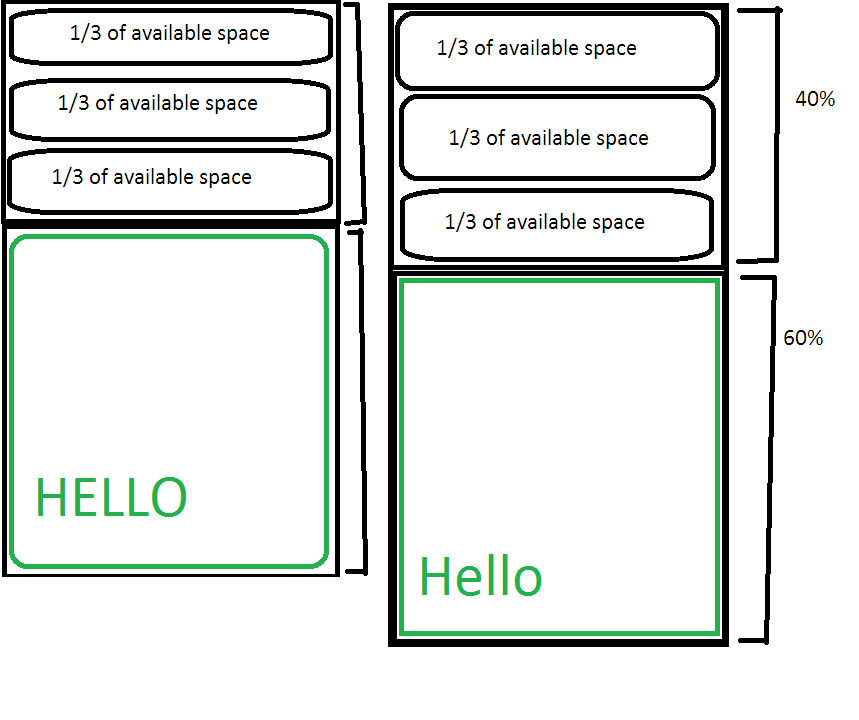
- I want two layouts. The top layout must take up 40% and the bottom must take up 60%.
- In the top layout, they must be three buttons that fill up all space possible (Essentially 1/3 of the space)
- In the bottom layout, I want an imageView, and then a textView on top of that.
This is a paint mockup. Is this possible to do in iOS? I feel that layouts are much harder to create than android.
Ios Solutions
Solution 1 - Ios
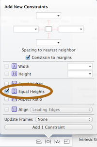
Using Xcode 6.0, you can now specify proportional width or height in Interface Builder. Steps for percentage height from superview:
While both the child view and its superview are selected, add an "equal height" constraint (or "equal width" if you wish to have a proportional width).
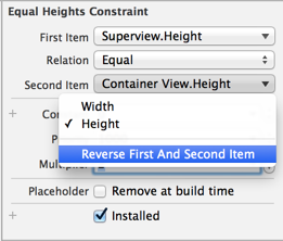
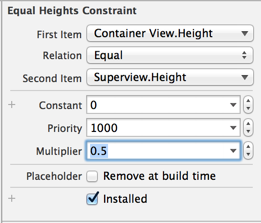
Then change the "multiplier" of the constraint you just added to the proportion you need. For example, for 50%, change it to 2.
If you like to specify the inner view as percentage of the superview, you can reverse the items in the constraint:
Now you can use a multiplier of 0.5 (or any other proportion you need):
In your specific case, you can define an "equal height" constraint between the 2 child views, and change the multiplier to 1.5 (the bottom being 1.5 the size of the top) or 0.6667 if the items are reversed.
Solution 2 - Ios
Contrary to the other answers, I think you should at least consider the auto layout system. It was created to make it easier to build predictable layouts like the one you've described. Autolayout is ruled by constraints that you put on the views in the layout. You can create those constraints visually or programmatically. Visually, your first view would look something like this:
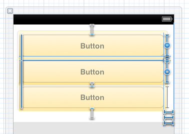
The blue lines you see there are a number of constraints that specify the inter-button spacing, the space around the buttons, and the heights and widths of the buttons. You can see a couple constraints that have a = on them -- I selected all three buttons and gave them an "equal height" constraint.
There's a nice visual format syntax that lets you describe constraints as strings. Take a minute to look at the linked document -- it won't take much longer than that to learn enough that you can read the strings. For example, your top layout can be specified like this:
V:[button1]-[button2(==button1)]-[button3(==button1)]
The parenthetical ==button1 tells the layout system to make button2 and button3 the same height as button1. The - indicates that the standard spacing should be used between the buttons; you can specify a different spacing if you want. For 10 point spacing, do this:
V:|-10-[button1]-10-[button2(==button1)]-10-[button3(==button1)]-10-|
Once you have such a string, you can turn it into a constraint using the method: +[NSLayoutConstraint constraintsWithVisualFormat:options:metrics:views:]
Some constraints can't be specified either visually or with the strings described above. Chief among these are those where you want to set a constant (but unequal) relationship between two views, as with your top and bottom layouts. You want one of those to take up 40% of the available vertical space, and the other to take 60%. Do this using the method: +[NSLayoutConstraint constraintWithItem:attribute:relatedBy:toItem:attribute:multiplier:constant:]. For example:
NSLayoutConstraint *c = [NSLayoutConstraint constraintWithItem:bottomView
                                                     attribute:NSLayoutAttributeHeight
                                                     relatedBy:NSLayoutRelationEqual
                                                        toItem:topView
                                                    multiplier:1.5
                                                      constant:0];
That gives you a constraint that sets the height of bottomView to 1.5 times the height of topView (which is what you want, since 60/40 = 1.5).
If you create constraints programmatically, you can add them to the appropriate view when you create (or load) the view hierarchy. Your view controller's -viewDidLoad method is a fine place to do that.
Solution 3 - Ios
I don't know about using autolayout as I dont use it, but in code without it, you could create two UIViews and set their frames to:
CGRectMake(0, 0, self.view.frame.size.width, self.view.frame.size.height * 0.4f);
CGRectMake(0, self.view.frame.size.height * 0.4f, self.view.frame.size.width, self.view.frame.size.width * 0.6f);
And then in the top view, you can add the buttons with frames (assuming the view is called view1):
CGRectmake(0, 0, self.view.frame.size.width, view1.frame.size.height * (1.0f/3.0f));
CGRectmake(0, view1.frame.size.height * (1.0f/3.0f), self.view.frame.size.width, view1.frame.size.height * (1.0f/3.0f));
CGRectmake(0, view1.frame.size.height * (2.0f/3.0f), self.view.frame.size.width, view1.frame.size.height * (1.0f/3.0f));
Solution 4 - Ios
You need to add a couple of constraints to make it work. So here's a brief description of what you need:
-
You will need horizontal spacing constraints. One if for the top view, because it has zero distance to the top. Another one for the bottom view, because its distance to the bottom is zero. One more constraint between the two views, because they have also zero spacing between each other.
-
The same principle will be applied to the buttons inside the top view. Put your buttons with the correct size inside the top view and add similar constraints, but now you have three elements (instead of two). So constraints for zero spacing to the top, bottom and between buttons.
When you add components to your view, it will create a few constraints for you. Adding one one top and the other on bottom, it will create both spacing to the top and spacing between each other. To edit them, just go to inspector, fifth tab (ruler) and you will see the list of constraints. Lastly, you may want to try to constraints menu (I don't know if there's a well-known name for this). It's on the bottom-right corner of the Interface Builder canvas. See the image:

Please, let me know if you need further assistance.
Solution 5 - Ios
This can be done automatically when using Storyboards (you might have to change a setting or two here and there). When you create your GUI, you can toggle between the screen sizes (3.5 and 4 inch) to make sure that it will look good on both. See the answer to this question.
You could also see this tutorial. That should give you an idea on how to work with the GUI layouts.
Solution 6 - Ios
Refer to GK100's answer but let's extend that with below Q/A(s).
How to make constant auto-resize in Storyboard?
Percent based constant is not supported yet, and people try different workarounds, like:
- Creating invisible
UIView(s) as spacers with width/height and specifying a multiplier against theSafe Areasize. - People even manually override Storyboard constraints in code:
NSLayoutConstraint(item: myView, attribute: .top,
    relatedBy: .equal, toItem: myOtherView, attribute: .bottom,
    multiplier: 1,
    constant: UIScreen.main.bounds.width * 0.05)
While both of above are a headache, my solution's downside is that you need to hardcode at least shortDimensionInDesignTime to your preferred Interface Builder's preview-size (but far better than my PercentConstraint class).
Usage:
- Add below
ResponsiveConstraintclass's code to your project. - Select your constraint in
Storyboardeditor. - In
Identity Inspector, useResponsiveConstraintas class.
import Foundation

/// Auto-Resize based Layout-Constraint.
/// Later at run-time, resizes initial constant to screen's short dimension.
///
/// For Mac's Catalyst. remember to set size-restrictions to something like:
/// ```
/// let portrait: CGSize = ResponsiveConstraint.maxSize;
/// scene.sizeRestrictions?.maximumSize = portrait;
/// scene.sizeRestrictions?.minimumSize = portrait;
/// ```
///
/// WARNING: supports only Storyboard (by use as class in Identity Inspector),
/// but there is no harm in using static provided field and methods.
///
public class ResponsiveConstraint: NSLayoutConstraint {
    var actualConstant: CGFloat = 0;
    public var isValid: Bool { actualConstant > 0 }

    /// Preset shorter dimension of screen, within Design-Time only
    /// (i.e. it's your Interface-Builder's preview size).
    public static let shortDimensionInDesignTime: CGFloat = 414;
    public static let longDimensionInDesignTime: CGFloat = 896;

    /// Normally same as "UIScreen.main.bounds.size" variable (i.e. screen size).
    /// But for Computers, we limit to a portrait-size (to look same as Mobile).
    public static var maxSize: CGSize {
        #if targetEnvironment(macCatalyst)
        return .init(
            width: Self.shortDimensionInDesignTime,
            height: Self.longDimensionInDesignTime);
        #else
        return UIScreen.main.bounds.size;
        #endif
    }

    public static var shortDimension: CGFloat {
        let screenSize: CGSize = Self.maxSize;
        return screenSize.width < screenSize.height
            ? screenSize.width : screenSize.height;
    }

    public static var longDimension: CGFloat {
        let screenSize: CGSize = Self.maxSize;
        return screenSize.height > screenSize.width
              ? screenSize.height : screenSize.width;
    }

    /// Does same as "init()" would, but for Storyboard.
    override public func awakeFromNib() {
        super.awakeFromNib()
        // Backup real constant (and continue if it's valid).
        self.actualConstant = self.constant
        guard isValid else { return }
        // Listens to screen rotate.
        NotificationCenter.default.addObserver(self,
            selector: #selector(onLayoutChange),
            name: UIDevice.orientationDidChangeNotification,
            object: nil)
        // Apply for current screen size.
        self.onLayoutChange();
    }

    deinit {
        guard isValid else { return }
        NotificationCenter.default.removeObserver(self)
    }

    /// Recalculates constant.
    @objc public func onLayoutChange() {
        guard isValid else { return }
        self.constant = Self.resize(self.actualConstant)
    }

    /// Converts constant from DesignTime to fit current max view-size.
    public static func resize(_ constant: CGFloat) -> CGFloat {
        return constant / Self.shortDimensionInDesignTime * Self.shortDimension;
    }
}
How to achieve percent based constant in Storyboard?
Below solution's downside is need to run App before seeing result (which even that may not be required in future Xcode versions).
Usage:
- Add below
PercentConstraintclass's code to your project. - Select your constraint in
Storyboardeditor. - In
Identity Inspector, usePercentConstraintas class. - In
Attribute Inspector, setPercent of Screenfield. - Optionally, Run App to see result.
import Foundation

/// Percent based Layout-Constraint.
/// Later at run-time, replaces constant with percentage of screen.
///
/// WARNING: supports only Storyboard (used as class in Identity Inspector).
///
class PercentConstraint: NSLayoutConstraint {

    @IBInspectable public var percentOfScreen: CGFloat = 0

    var isValid: Bool { percentOfScreen > 0 }
    var screenSize: CGSize { UIScreen.main.bounds.size }

    override func awakeFromNib() {
        super.awakeFromNib()

        guard isValid else { return }
        NotificationCenter.default.addObserver(self,
            selector: #selector(onLayoutChange),
            name: UIDevice.orientationDidChangeNotification,
            object: nil)
        self.onLayoutChange();
    }

    deinit {
        guard isValid else { return }
        NotificationCenter.default.removeObserver(self)
    }

    /// Recalculates constant.
    @objc func onLayoutChange() {
        guard isValid else { return }

        switch self.firstAttribute {
        case .height, .top, .topMargin, .bottom, .bottomMargin,
             .centerY, .centerYWithinMargins,
             .firstBaseline, .lastBaseline:
            self.constant = screenSize.height * percentOfScreen / 100.0;
        case .width, .leading, .leadingMargin, .trailing, .trailingMargin,
             .left, .leftMargin, .right, .rightMargin,
             .centerX, .centerXWithinMargins:
            self.constant = screenSize.width * percentOfScreen / 100.0;
        default:
            break;
        }
    }
}
>Note that the constant is overwritten at runtime,
>but you may want to set it anyway (to get an idea how it looks like before running).