Contain an image within a div?
CssImageCss Problem Overview
I want to contain an image into a 250 x 250 div, forcing the image to resize but not stretch. How can I do this? By the way, the image will usually be bigger than the div itself, which is why resizing comes into the picture.
<div id = "container">
  <img src = "whatever" />
</div>

#container { width:250px; height:250px; border:1px solid #000; }
Here's a jsfiddle which someone can edit:
Css Solutions
Solution 1 - Css
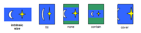
object-fit, behaves like background-size, solving the issue of scaling images up and down to fit.
> The object-fit CSS property specifies how the contents of a replaced element should be fitted to the box established by its used height and width.
https://developer.mozilla.org/en-US/docs/Web/CSS/object-fit
.cover img {
    width: 100%;
    height: 100%;
    object-fit: cover;
    overflow: hidden;
}
Browser Support
There's no IE support, and support in Edge begins at v16, only for img element: https://caniuse.com/#search=object-fit
The bfred-it/object-fit-images polyfill works very well for me in IE11, tested on Browserstack: demo.
Alternative without polyfill using an image in SVG
For Edge pre v16, and ie9, ie10, ie11:
> You can crop and scale any image using CSS object-fit and object-position. However, these properties are only supported in the latest version of MS Edge as well as all other modern browsers.
>
> If you need to crop and scale an image in Internet Explorer and provide support back to IE9, you can do that by wrapping the image in an <svg>, and using the viewBox and preserveAspectRatio attributes to do what object-fit and object-position do.
>
> http://www.sarasoueidan.com/blog/svg-object-fit/#summary-recap
(The author explains the technique thoroughly, and duplicating the detail here would be impractical.)
Solution 2 - Css
Use max width and max height. It will keep the aspect ratio
#container img
{
 max-width: 250px;
 max-height: 250px;
}
Solution 3 - Css
You have to style the image like this
#container img{width:100%;}
and the container with hidden overflow:
#container{width:250px; height:250px; overflow:hidden; border:1px solid #000;}
Solution 4 - Css
Since you don't want stretching (all of the other answers ignore that) you can simply set max-width and max-height like in my jsFiddle edit.
#container img {
    max-height: 250px;
    max-width: 250px;
}
See my example with an image that isn't a square, it doesn't stretch
Solution 5 - Css
Here is javascript I wrote to do just this.
function ImageTile(parentdiv, imagediv) {
imagediv.style.position = 'absolute';

function load(image) {
    //
    // Reset to auto so that when the load happens it resizes to fit our image and that
    // way we can tell what size our image is. If we don't do that then it uses the last used
    // values to auto-size our image and we don't know what the actual size of the image is.
    //
    imagediv.style.height = "auto";
    imagediv.style.width = "auto";
    imagediv.style.top = 0;
    imagediv.style.left = 0;

    imagediv.src = image;
}

//bind load event (need to wait for it to finish loading the image)
imagediv.onload = function() {
    var vpWidth = parentdiv.clientWidth;
    var vpHeight = parentdiv.clientHeight;
    var imgWidth = this.clientWidth;
    var imgHeight = this.clientHeight;

    if (imgHeight > imgWidth) {
        this.style.height = vpHeight + 'px';
        var width = ((imgWidth/imgHeight) * vpHeight);
        this.style.width = width + 'px';
        this.style.left = ((vpWidth - width)/2) + 'px';
    } else {
        this.style.width = vpWidth + 'px';
        var height = ((imgHeight/imgWidth) * vpWidth);
        this.style.height = height + 'px';
        this.style.top = ((vpHeight - height)/2) + 'px';
    }
};

return {
    "load": load
};
}
And to use it just do something like this:
 var tile1 = ImageTile(document.documentElement, document.getElementById("tile1"));
 tile1.load(url);
I use this for a slideshow in which I have two of these "tiles" and I fade one out and the other in. The loading is done on the "tile" that is not visible to avoid the jarring visual affect of the resetting of the style back to "auto".
Solution 6 - Css
#container img{
 height:100%;
 width:100%;
}
Solution 7 - Css
>
#container img {
        max-width:250px;
        max-height:250px;
        width: 250px;
        height: 250px;
        border:1px solid #000;
    }
The img will lose aspect ratio