Color for Unicode Emoji
HtmlCssUnicodeEmojiHtml Problem Overview
It's possible to include Emoji characters in modern browsers, but how can one make it a single color and choose that color?
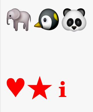
For example, here is some Emoji and some regular (plane 0) Unicode symbols. All should be red, but only the symbols are rendered in red.
Associated HTML + CSS:
<p>
  🐘🐧🐼
</p>
<p>
  ♥★ℹ
</div>

p {
  font-size: 3em;
  color: red
}
Html Solutions
Solution 1 - Html
Yes, you can color them!
div {
  color: transparent;
  text-shadow: 0 0 0 red;
}
<div>🚀🎭😻</div>
Solution 2 - Html
Not every emoji works the same. Some are old textual symbols that now have an (optional or default) colorful representation, others were explicitly (only) as emojis. That means, some Unicode codepoints should have two possible representations, text and emoji. Authors and users should be able to express their preference for one or the other. This is currently done with otherwise invisible variation selectors U+FE0E (text, VS-15) and U+FE0F (emoji, VS-16), but higher-level solutions (e.g. for CSS) have been proposed.
The text-style emojis are monochromatic and should be displayed in the foreground color, i.e. currentcolor in CSS, just like any other glyph. The Unicode Consortium provides an overview of emojis by style (beta version). You should be able to append ︎ in HTML to select the textual variant with anything in the columns labeled “Default Text Style; has VSs” and “Default Emoji Style; has VSs”. This doesn’t include the example emojis and many others, though.
p {
  color: red; font-size: 3em; margin: 0;
  text-transform: text;           /* proposed */
  font-variant-emoji: text;       /* proposed */
  font-variant-color: monochrome; /* proposed */
  font-color: monochrome;         /* proposed */
  font-palette: dark;             /* drafted for CSS Fonts Level 4 */
}
p.hack {
  color: rgba(100%, 0%, 0%, 0);
  text-shadow: 0 0 0 red;
}
p.font {
  font-family: Emojione, Noto, Twemoji, Symbola;
}
@font-face { /* http://emojione.com/developers/ */
  font-family: Emojione;
  src: local("EmojiOne BW"), local("EmojiOne"), local("Emoji One"),
       /*   https://cdn.rawgit.com/Ranks/emojione/master/assets/fonts/emojione-bw.otf – monochrome only, deprecated, removed
            https://cdn.rawgit.com/Ranks/emojione/master/assets/fonts/emojione-android.ttf – with hack
            https://cdn.rawgit.com/Ranks/emojione/master/assets/fonts/emojione-apple.ttf – with hack */
       url("https://cdn.rawgit.com/Ranks/emojione/master/assets/fonts/emojione-svg.woff2") format("woff2"),
       url("https://cdn.rawgit.com/Ranks/emojione/master/assets/fonts/emojione-svg.woff") format("woff"),
       url("https://cdn.rawgit.com/Ranks/emojione/master/assets/fonts/emojione-svg.otf") format("truetype");
}
@font-face { /* https://www.google.com/get/noto/#noto-emoji-zsye */
  font-family: Noto;
  src: local("Noto Emoji"), local("Noto Color Emoji"), local("Noto"),
       url("https://cdn.rawgit.com/googlei18n/noto-emoji/master/fonts/NotoEmoji-Regular.ttf");
}
@font-face { /* https://github.com/eosrei/twemoji-color-font/releases */
  font-family: Twemoji;
  src: local("Twemoji");
}
@font-face { /* http://users.teilar.gr/~g1951d/ */
  font-family: Symbola;
  src: local("Symbola");
}
<p title="🐘🐧🐼♥★ℹ💀👌 without variation selectors">🐘 🐧 🐼 ♥ ★ ℹ 💀 👌</p>
<p title="🐘🐧🐼♥★ℹ💀👌 with text variation selector 15">🐘︎ 🐧︎ 🐼︎ ♥︎ ★︎ ℹ︎ 💀︎ 👌︎</p>
<p title="🐘🐧🐼♥★ℹ💀👌 with emoji variation selector 16">🐘️ 🐧️ 🐼️ ♥️ ★️ ℹ️ 💀️ 👌️</p>
<p title="🐘🐧🐼♥★ℹ💀👌 with `text-shadow` hack" class="hack">🐘 🐧 🐼 ♥ ★ ℹ 💀 👌</p>
<p title="🐘🐧🐼♥★ℹ💀👌 with custom font" class="font">🐘 🐧 🐼 ♥ ★ ℹ 💀 👌</p>
I’ve added U+1F480 Skull and U+1F44C OK Hand Sign because the background should show through their “eyes” and I’ve used numeric character references just to make the code more obvious and more robust against copy-and-paste errors.
It has been proposed, however, that both variation selectors can be applied to any character, which would have no effect in most cases. Note that some vendors, especially Samsung, are already shipping (default) emoji glyphs for several other characters (goo.gl/a4yK6p or goo.gl/DqtHcc).
Solution 3 - Html
I wanted to do this myself so I've recently come up with a solution using newer CSS effects that works on Firefox and Edge as well.
Using filter, you first normalize the color by using sepia(1), you then saturate the heck out of it to get a pure red. If you want to get rid of black lines, suck the contrast out of the emoji before applying other filters using contrast(0). After that you just spin the colour wheel from red to whatever color you'd like using hue-rotate(). Note that because I used decimal values instead of %'s, a value of 100 means 10000%.
Hue offsets are defined as beginning at red. We are lucky that sepia is mostly red so the wheel starts off perfectly at 0-degrees. You can calculate what offset you want using a RGB to HSL converter. I found a nice one written in Javascript here: https://web.archive.org/web/20180808220922/http://axonflux.com/handy-rgb-to-hsl-and-rgb-to-hsv-color-model-c
You must multiply the hue value by 360 to get the desired result from that function. An example would be rgbToHsl(0,100,100)[0]*360. Which would return 180. Since there is no red, this would be the expected result, you would be spinning 180 degrees away from red.
As Litherium an Crissov pointed out, there are text emojis as well. These work better with transformations and often look better. You can't apply the method I have described above however, until you first apply invert(.5) on the text emojis, this is because the functions need some sort of shade to operate on. So simply adding invert(.5) to the beginning of each formula, allows for them to operate on both code points on all browsers.
.a { /* Normalize colour to a primary red */
    filter: sepia(1) saturate(100);
}
.b { /* Less saturation so more features, shifted colour 90-degrees */
    filter: sepia(1) saturate(5)  hue-rotate(90deg);
}
.c { /* Remove black outlines if desired by removing contrast */
    filter: contrast(0) sepia(1) saturate(100) hue-rotate(180deg);
}
.d { /* Other shades possible by lowering brightness */
    filter: contrast(0) sepia(1) saturate(100) brightness(.05) hue-rotate(180deg);
}
.e { /* Weird possibilities with no colour normalization */
    filter: contrast(100) hue-rotate(180deg);
}
.ma { /* Invert to provide a gray shade to apply sepia*/
    filter: invert(.5) sepia(1) saturate(100);
}
div {
    font-size: 25px;
}
.emo > div::after {
    content: "🌍⛄😍🐱";
}
.mono > div::after {
    content: "\1F30D\FE0E\26C4\FE0E\1F60D\FE0E\1F431\FE0E";
}
<div class="emo">
    <div>-:</div>
    <div class="a">a:</div>
    <div class="b">b:</div>
    <div class="c">c:</div>
    <div class="d">d:</div>
    <div class="e">e:</div>
</div>
<span>Change the code point to text mode:</span>
<div class="mono">
    <div class="a">a:</div>
    <div class="ma">ma:</div>
</div>
Update: There are newer packages available on npm now that can calculate hues etc. You don't need to use that snippet on the website I had previously linked. Here's an example: https://stackoverflow.com/a/56082323/5078765
Solution 4 - Html
You can fill them with a solid color:

p {
  font-size: 20px;
  color: transparent;
  text-shadow: 0 0 0 blue;
}
<p>🚀</p>
<p>🎭</p>
<p>😻</p>
Or you can outline them:

body {
  background: #fff;
}

p {
  margin: 0;
  color: transparent;
  text-shadow: 0 0 3px blue;
  font-size: 20px;
  position: relative;
}

p::before {
  content: attr(title);
  position: absolute;
  text-shadow: 0 0 0 #fff;
}
<p title="🚀">🚀</p>
<p title="🎭">🎭</p>
<p title="😻">😻</p>
Solution 5 - Html
If you want to keep the details within the emoji you can use filter: url(svg) where url() will take an svg filter
svg {
  display: none;
}

div {
  -webkit-filter: url(#red);
  filter: url(#red);
}
<svg>
  <filter id="red">
    <feColorMatrix type="matrix" values="
      1 0 0 0 0
      0 0 0 0 0
      0 0 0 0 0
      0 0 0 1 0" />
  </filter>
</svg>

<div>🐘🐧🐼</div>
While the use of feColorMatrix may seem daunting at first, it is actually straight forward to define your own colors. Take the following example which represents the color red:
1 0 0 0 0
0 0 0 0 0
0 0 0 0 0
0 0 0 1 0
If you grab the bold values from above, we can see how they relate to the RGBA color mode:
1 - red   (r)
0 - green (g)
0 - blue  (b)
1 - alpha (a)
Here each color relates to a value from 0 to 255 divided by 255. Thus, if you had the color green, which has a RGBA of:
R   G   B  A
(0, 255, 0, 1)
Then your values would be:
0/255   -> 0 (r)
255/255 -> 1 (g)
0/255   -> 0 (b)
1       -> 1 (a) - don't divide
And so, using these values in our matrix we get:
0 0 0 0 0
0 1 0 0 0
0 0 0 0 0
0 0 0 1 0
You can now add this as an additional filter (or remove the old one) and give it an id so that it can be referenced within css filter: url(#filterID)
See implemented version below:
svg {
  display: none;
}

.red {
  -webkit-filter: url(#red);
  filter: url(#red);
}

.green {
  -webkit-filter: url(#green);
  filter: url(#green);
}
<svg>
  <filter id="red">
    <feColorMatrix type="matrix" values="
      1 0 0 0 0
      0 0 0 0 0
      0 0 0 0 0
      0 0 0 1 0" />
  </filter>

  <!--         \/ --- change id to be referenced within css -->
  <filter id="green">
    <feColorMatrix type="matrix" values="
      0 0 0 0 0
      0 1 0 0 0
      0 0 0 0 0
      0 0 0 1 0" />
  </filter>
</svg>

<div class="red">🐘🐧🐼</div>
<div class="green">🐘🐧🐼</div>
<feColorMatrix /> color matrix generator:
For convenience, I've made a feColorMatrix generator, which allows you to pick or enter a color as well as an opacity and generate a feColorMatrix from that color:
const colorPicker = document.getElementById("color-picker");
const alphaPicker = document.getElementById("alpha-picker");
const codeOutput = document.getElementById("code-output");
const alphaValue = document.getElementById("alpha-value");
const pickedFilter = document.getElementById("picked-filter");
let r=0, g=0, b=0, a=1;

const generateFeColorMatrix = () => `<feColorMatrix type="matrix" values="
  ${r} 0 0 0 0
  0 ${g} 0 0 0
  0 0 0 ${b} 0
  0 0 0 ${a} 0"
/>
`;

const update = () => {
  const feColorMatrixStr = generateFeColorMatrix();
  codeOutput.textContent = feColorMatrixStr;
  pickedFilter.innerHTML = feColorMatrixStr;
}

colorPicker.addEventListener("input", (e) => {
  const hexparts = e.target.value.match(/(\w{1,2})/g);
  ([r,g,b] = hexparts.map(hex => (parseInt(hex, 16) / 255).toFixed(2)));
  update();
});

alphaPicker.addEventListener("input", e => {
  a = e.target.value;
  alphaValue.textContent = a;
  update();
});
alphaValue.textContent = a;
svg {
  display: none;
}

#color-picker {
  float: right;
}

#code-output {
  background-color: #f6f6f6;
}

#emojis {
  -webkit-filter: url(#picked-filter);
  filter: url(#picked-filter);
  font-size: 30px;
}
<input type="color" id="color-picker" />
<input type="range" id="alpha-picker" value="1" min="0" max="1" step="0.01"/><span id="alpha-value">1</span>
<pre id="code-output">
</pre>
<svg>
  <filter id="picked-filter"></filter>
</svg>
<p id="emojis">🐘🐧🐼</p>
Please note Currently, this solution has very limited browser support. To see a full list of browsers supported by this feature please see here.
Solution 6 - Html
Some, but not all, code points can be drawn in either text form (non-picture-based glyph) or emoji form (picture-based glyph). Unicode describes that these two forms can be selected by using one of two variation selectors: either U+FE0E (VARIATION SELECTOR-15) or U+FE0F (VARIATION SELECTOR-16). When drawn in non-picture-based form, the color CSS property should apply.
Example:
U+2603 (SNOWMAN) is drawn this way: ☃
The sequence of code points U+2603 U+FE0E is drawn this way: ☃︎
The sequence of code points U+2603 U+FE0F is drawn this way: ☃️
More information, along with a full list of the code points which participate in these variation sequences, can be found at http://unicode.org/emoji/charts/emoji-variants.html
(Note that different operating systems may choose a different default when the bare code point is used. For example, try viewing this post in macOS and iOS - the bare code point above looks different!)
Solution 7 - Html
As Emoji is quite new, styling it is not yet supported natively.
The workaround is to use an Emoji font such as Twitter's Twemoji. Then it can be styled much the same way Font Awesome or native Unicode can be styled.
Solution 8 - Html
The SVG matrix solution by Nick Parsons can be also converted to an in-line solution using the data: scheme:
filter: url("data:image/svg+xml,<svg xmlns='http://www.w3.org/2000/svg'><filter id='f'><feColorMatrix color-interpolation-filters='sRGB' type='matrix' values='0 0 0 0 0 0 1 0 0 0 0 0 0 0 0 0 0 0 1 0'/></filter></svg>#f");
color-interpolation-filters='sRGB' is there since some browsers use a different default color space.
I also recommend adding a grayscale filter, since otherwise some emojis will lose contrast if pure colors are used:
filter: grayscale(100%) url("data:image/svg+xml,<svg xmlns='http://www.w3.org/2000/svg'><filter id='f'><feColorMatrix color-interpolation-filters='sRGB' type='matrix' values='0 0 0 0 0 0 1 0 0 0 0 0 0 0 0 0 0 0 1 0'/></filter></svg>#f");
The grayscale filter may also be represented by a matrix and incorporated into the SVG data. Here is one that should match human perception better than what CSS offers:
filter: url("data:image/svg+xml,<svg xmlns='http://www.w3.org/2000/svg'><filter id='f'><feColorMatrix color-interpolation-filters='linearRGB' type='matrix' values='0.2126 0.7152 0.0722 0 0 0.2126 0.7152 0.0722 0 0 0.2126 0.7152 0.0722 0 0 0 0 0 1 0'/><feColorMatrix color-interpolation-filters='sRGB' type='matrix' values='0 0 0 0 0 0 1 0 0 0 0 0 0 0 0 0 0 0 1 0'/></filter></svg>#f");
Lastly, here is some PHP code that generates the matrix from a given color (entered as a CSS hex-based color code):
function matrixcolor($hex)
{
  list($r, $g, $b) = array_map(function($c) {return $c / 255 / 3;}, sscanf($hex, "#%02x%02x%02x"));
  return "$r $r $r 0 0  $g $g $g 0 0  $b $b $b 0 0";
}

function colormatrix($col)
{
  return "url(\"data:image/svg+xml,<svg xmlns='http://www.w3.org/2000/svg'><filter id='f'><feColorMatrix color-interpolation-filters='linearRGB' type='matrix' values='0.2126 0.7152 0.0722 0 0  0.2126 0.7152 0.0722 0 0  0.2126 0.7152 0.0722 0 0  0 0 0 1 0'/><feColorMatrix color-interpolation-filters='sRGB' type='matrix' values='".matrixcolor($col)."  0 0 0 1 0'/></filter></svg>#f\")";
}
Solution 9 - Html
IF YOU NEED TO USE CSS AFTER,BEFORE PSEUDO ELEMENT YOU CAN PROCED LIKE THIS
<span class="react-thumb-fly" title="Aimé">
   <button class="react-toggle-icon-thumb"></button>
</span>
THEN WRITE THIS FOR CSS
.react-toggle-icon-thumb {
  width: 20pt;
  height: 20pt;
  font-size: 30pt;
  position: relative;
  color: gray;
  cursor: pointer;
  border: none;
  background: transparent;
  margin-left: 0px;
  margin-right: 8px;
  top: -0px;
}
.react-toggle-icon-thumb:before, .react-toggle-icon-thumb:after {
  position: absolute;
  top: 0;
  left: 0;
  transition: all .3s ease-out;
  content: "👍";
  font-family: fontawesome;
  color: transparent;
 text-shadow: 0 0 0 #3498db;
}

.react-toggle-icon-thumb:hover:before {
  transform: scale(1.2);
  animation: thumbs-up 2s linear infinite;
}

@keyframes thumbs-up {
 25% {
  transform: rotate(20deg);
 }
 50%, 100% {
   transform: rotate(5deg);
 }
}