`col-xs-*` not working in Bootstrap 4
HtmlCssTwitter BootstrapTwitter Bootstrap-4Text AlignmentHtml Problem Overview
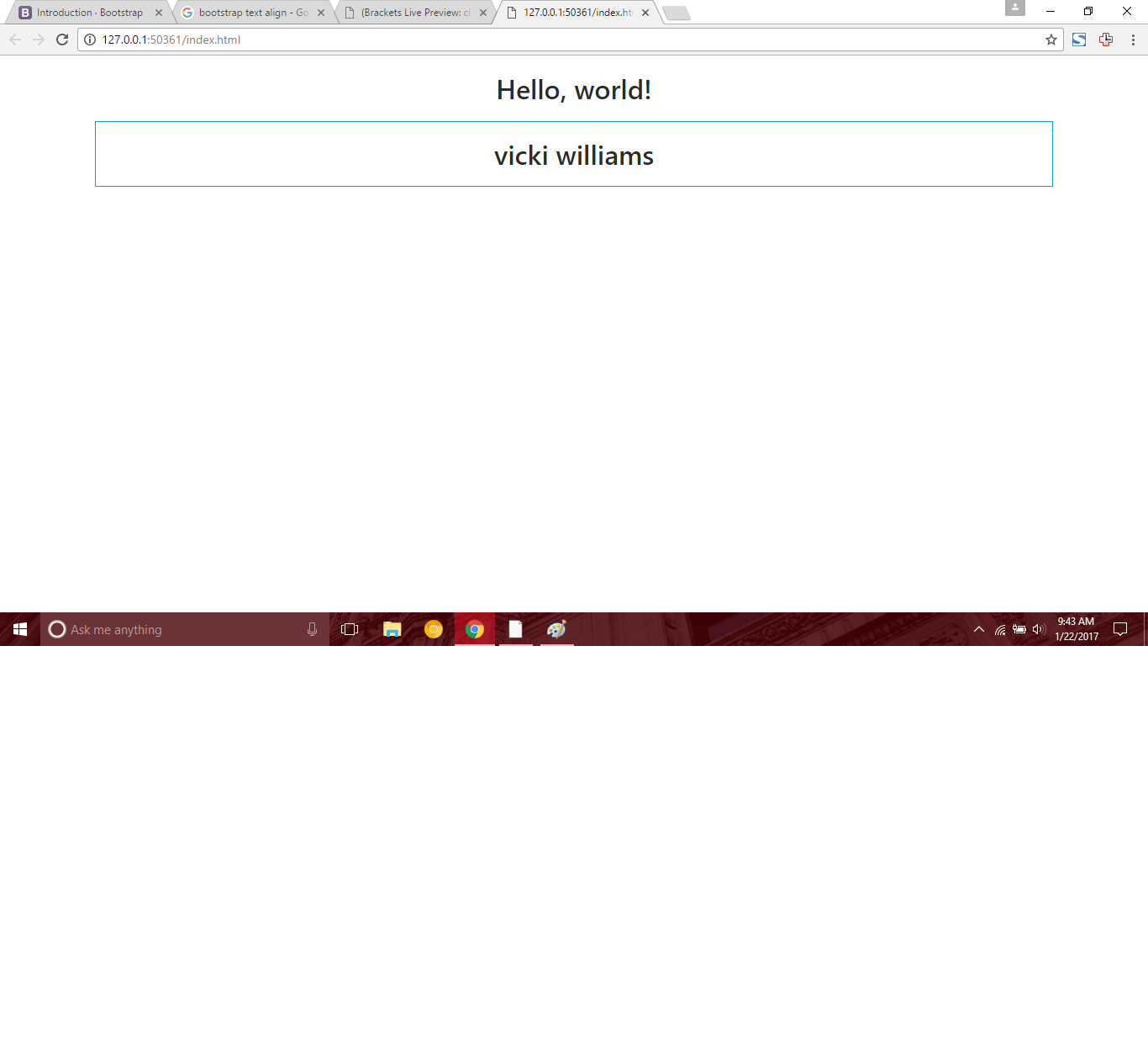
I have not encountered this before, and I am having a very hard time trying to find the solution. When having a column equal to medium in bootstrap like so:
<h1 class="text-center">Hello, world!</h1>

  <div class="container">
      <div class="row">
          <div class="col-md-12 text-center">
              <h1>vicki williams</h1>
          </div>
      </div>
  </div>
The text-align works fine:
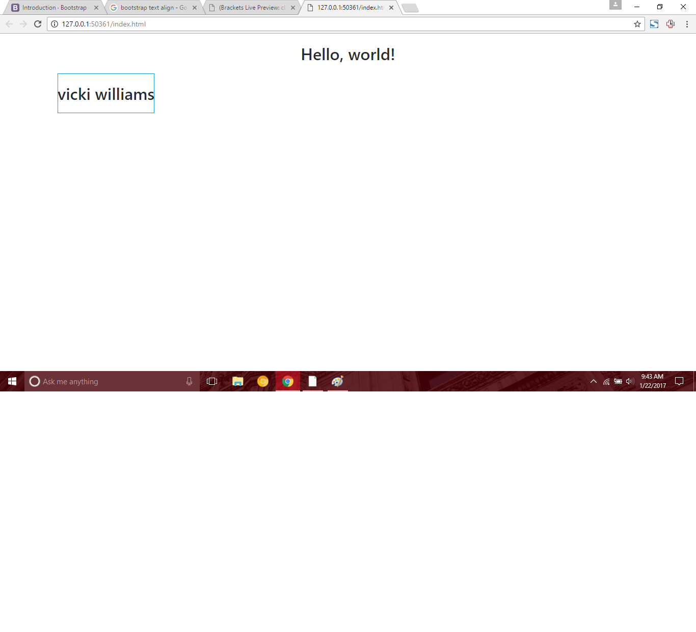
But when making the column equal to extra small like so:
 <div class="container">
      <div class="row">
          <div class="col-xs-12 text-center">
              <h1>vicki williams</h1>
          </div>
      </div>
  </div>
Then the text-align no longer works:
Is there some bootstrap concept that I am not understanding or is this in fact a error like I think it is. I have never had this issue, as my text always has aligned in the past with xs. Any help would be greatly appreciated. Here is my complete code:
<!DOCTYPE html>
<html lang="en">
  <head>
    <!-- Required meta tags -->
    <meta charset="utf-8">
    <meta name="viewport" content="width=device-width, initial-scale=1, shrink-to-fit=no">

    <!-- Bootstrap CSS -->
    <link rel="stylesheet" href="https://maxcdn.bootstrapcdn.com/bootstrap/4.0.0-alpha.6/css/bootstrap.min.css" integrity="sha384-rwoIResjU2yc3z8GV/NPeZWAv56rSmLldC3R/AZzGRnGxQQKnKkoFVhFQhNUwEyJ" crossorigin="anonymous">
  </head>
  <body>
    <h1 class="text-center">Hello, world!</h1>

      <div class="container">
          <div class="row">
              <div class="col-xs-12 text-center">
                  <h1>vicki williams</h1>
              </div>
          </div>
      </div>

    <!-- jQuery first, then Tether, then Bootstrap JS. -->
    <script src="https://code.jquery.com/jquery-3.1.1.slim.min.js" integrity="sha384-A7FZj7v+d/sdmMqp/nOQwliLvUsJfDHW+k9Omg/a/EheAdgtzNs3hpfag6Ed950n" crossorigin="anonymous"></script>
    <script src="https://cdnjs.cloudflare.com/ajax/libs/tether/1.4.0/js/tether.min.js" integrity="sha384-DztdAPBWPRXSA/3eYEEUWrWCy7G5KFbe8fFjk5JAIxUYHKkDx6Qin1DkWx51bBrb" crossorigin="anonymous"></script>
    <script src="https://maxcdn.bootstrapcdn.com/bootstrap/4.0.0-alpha.6/js/bootstrap.min.js" integrity="sha384-vBWWzlZJ8ea9aCX4pEW3rVHjgjt7zpkNpZk+02D9phzyeVkE+jo0ieGizqPLForn" crossorigin="anonymous"></script>
  </body>
</html>
Html Solutions
Solution 1 - Html
col-xs-* have been dropped in Bootstrap 4 in favor of col-*.
Replace col-xs-12 with col-12 and it will work as expected.
Also note col-xs-offset-{n} were replaced by offset-{n} in v4.
Solution 2 - Html
I just wondered, why col-xs-6 did not work for me but then I found the answer in the Bootstrap 4 documentation. The class prefix for extra small devices is now col- while in the previous versions it was col-xs.
https://getbootstrap.com/docs/4.1/layout/grid/#grid-options
Bootstrap 4 dropped all col-xs-* classes, so use col-* instead. For example col-xs-6 replaced by col-6.
Solution 3 - Html
They dropped XS because Bootstrap is considered a mobile-first development tool. It's default is considered xs and so doesn't need to be defined.
Solution 4 - Html
In Bootstrap 4.3, col-xs-{value} is replaced by col-{value}
There is no change in sm, md, lg, xl remains the same.
.col-{value}
.col-sm-{value}
.col-md-{value}
.col-lg-{value}
.col-xl-{value}
Solution 5 - Html
you could do this, if you want to use the old syntax (or don't want to rewrite every template)
@for $i from 1 through $grid-columns {
  @include media-breakpoint-up(xs) {
    .col-xs-#{$i} {
      @include make-col-ready();
      @include make-col($i);
    }
  }
}
Solution 6 - Html
If you want to apply an extra small class in Bootstrap 4,you need to use col-. important thing to know is that col-xs- is dropped in Bootstrap4