Can media queries resize based on a div element instead of the screen?
CssMedia QueriesCss Problem Overview
I would like to use media queries to resize elements based on the size of a div element they are in. I cannot use the screen size as the div is just used like a widget within the webpage, and its size can vary.
Update
Looks like there is work being done on this now: https://github.com/ResponsiveImagesCG/cq-demos
Css Solutions
Solution 1 - Css
After nearly a decade of work — with proposals, proofs-of-concept, discussions and other contributions by the broader web developer community — the CSS Working Group has finally laid some of the groundwork needed for container queries to be written into a future edition of the CSS Containment spec! For more details on how such a feature might work and be used, check out Miriam Suzanne's extensive explainer.
Hopefully it won't be much longer before we see a robust cross-browser implementation of such a system. It's been a grueling wait, but I'm glad that it's no longer something we simply have to accept as an insurmountable limitation of CSS due to cyclic dependencies or infinite loops or what have you (these are still a potential issue in some aspects of the proposed design, but I have faith that the CSSWG will find a way).
Media queries aren't designed to work based on elements in a page. They are designed to work based on devices or media types (hence why they are called media queries). width, height, and other dimension-based media features all refer to the dimensions of either the viewport or the device's screen in screen-based media. They cannot be used to refer to a certain element on a page.
If you need to apply styles depending on the size of a certain div element on your page, you'll have to use JavaScript to observe changes in the size of that div element instead of media queries.
Alternatively, with more modern layout techniques introduced since the original publication of this answer such as flexbox and standards such as custom properties, you may not need media or element queries after all. Djave provides an example.
Solution 2 - Css
I've just created a javascript shim to achieve this goal. Take a look if you want, it's a proof-of-concept, but take care: it's a early version and still needs some work.
Solution 3 - Css
A Media Query inside of an iframe can function as an element query. I've successfully implement this. The idea came from a recent post about Responsive Ads by Zurb. No Javascript!
Solution 4 - Css
From a layout perspective, it is possible using modern techniques.
Its made up (I believe) by Heydon Pickering. He details the process here: http://www.heydonworks.com/article/the-flexbox-holy-albatross
Chris Coyier picks it up and works through a demo of it here: https://css-tricks.com/putting-the-flexbox-albatross-to-real-use/
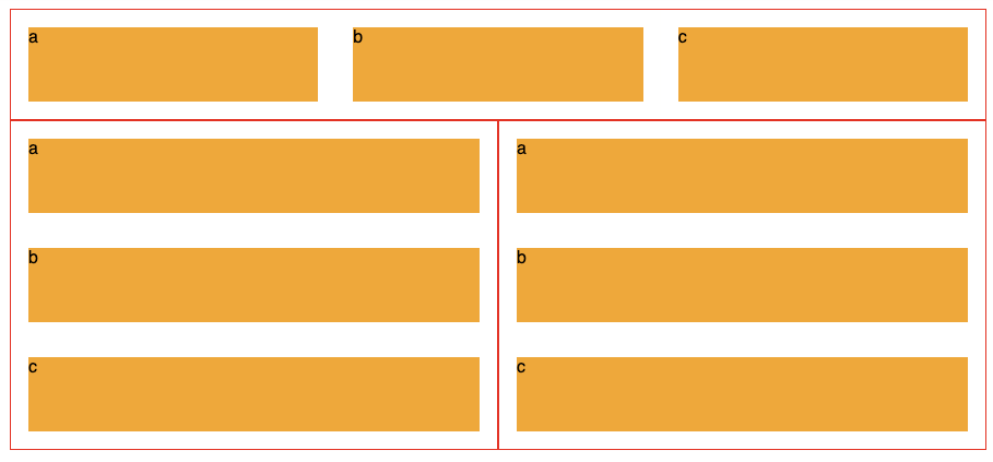
To restate the issue, below we see 3 of the same component, each made up of three orange divs labelled a, b and c.
The second two's blocks display vertically, because they are limited on horizontal room, while the top components 3 blocks are laid out horizontally.
It uses the flex-basis CSS property and CSS Variables to create this effect.
.panel{
  display: flex;
  flex-wrap: wrap;
  border: 1px solid #f00;
  $breakpoint: 600px;
  --multiplier: calc( #{$breakpoint} - 100%);
  .element{
    min-width: 33%;
    max-width: 100%;
    flex-grow: 1;
    flex-basis: calc( var(--multiplier) * 999 );
  }
}
Heydon's article is 1000 words explaining it in detail, and I'd highly recommend reading it.
Update 2021/22
As mentioned in other answers, container queries are coming. There is a full spec for it, and its usage is detailed on MDN:
https://developer.mozilla.org/en-US/docs/Web/CSS/CSS_Container_Queries
and there is a polyfill to get browsers that don't yet support it up to speed:
https://github.com/GoogleChromeLabs/container-query-polyfill
There is a nice little overview video of it here:
Solution 5 - Css
This is currently not possible with CSS alone as @BoltClock wrote in the accepted answer, but you can work around that by using JavaScript.
I created a container query (aka element query) polyfill to solve this kind of issue. It works a bit different than other scripts, so you don’t have to edit the HTML code of your elements. All you have to do is include the script and use it in your CSS like so:
.element:container(width > 99px) {
	/* If its container is at least 100px wide */
}
Solution 6 - Css
I ran into the same problem a couple of years ago and funded the development of a plugin to help me in my work. I've released the plugin as open-source so others can benefit from it as well, and you can grab it on Github: https://github.com/eqcss/eqcss
There are a few ways we could apply different responsive styles based on what we can know about an element on the page. Here are a few element queries that the EQCSS plugin will let you write in CSS:
@element 'div' and (condition) {
  $this {
    /* Do something to the 'div' that meets the condition */
  }
  .other {
    /* Also apply this CSS to .other when 'div' meets this condition */
  }
}
So what conditions are supported for responsive styles with EQCSS?
Weight Queries
- min-width in
px - min-width in
% - max-width in
px - max-width in
%
Height Queries
- min-height in
px - min-height in
% - max-height in
px - max-height in
%
Count Queries
- min-characters
- max-characters
- min-lines
- max-lines
- min-children
- max-children
Special Selectors
Inside EQCSS element queries you can also use three special selectors that allow you to more specifically apply your styles:
$this(the element(s) matching the query)$parent(the parent element(s) of the element(s) matching the query)$root(the root element of the document,<html>)
Element queries allow you to compose your layout out of individually responsive design modules, each with a bit of 'self-awareness' of how they are being displayed on the page.
With EQCSS you can design one widget to look good from 150px wide all the way up to 1000px wide, then you can confidently drop that widget into any sidebar in any page using any template (on any site) and
Solution 7 - Css
The question is very vague. As BoltClock says, media queries only know the dimensions of the device. However, you can use media queries in combination with descender selectors to perform adjustments.
.wide_container { width: 50em }

.narrow_container { width: 20em }

.my_element { border: 1px solid }

@media (max-width: 30em) {
	.wide_container .my_element {
		color: blue;
	}

	.narrow_container .my_element {
		color: red;
	}
}

@media (max-width: 50em) {
	.wide_container .my_element {
		color: orange;
	}

	.narrow_container .my_element {
		color: green;
	}
}
The only other solution requires JS.
Solution 8 - Css
The only way I can think that you can accomplish what you want purely with css, is to use a fluid container for your widget. If your container's width is a percentage of the screen then you can use media queries to style depending on your container's width, as you will now know for each screen's dimensions what is your container's dimensions. For example, let's say you decide to make your container's 50% of the screen width. Then for a screen width of 1200px you know that your container is 600px
.myContainer {
  width: 50%;
}

/* you know know that your container is 600px
 * so you style accordingly
*/
@media (max-width: 1200px) {
  /* your css for 600px container */
}
Solution 9 - Css
I was also thinking of media queries, but then I found this:
- http://www.mademyday.de/css-height-equals-width-with-pure-css.html
- https://stackoverflow.com/questions/1495407/maintain-the-aspect-ratio-of-a-div-with-css
Just create a wrapper <div> with a percentage value for padding-bottom, like this:
div {
  width: 100%;
  padding-bottom: 75%;
  background:gold; /** <-- For the demo **/
}
<div></div>
It will result in a <div> with height equal to 75% of the width of its container (a 4:3 aspect ratio).
This technique can also be coupled with media queries and a bit of ad hoc knowledge about page layout for even more finer-grained control.
It's enough for my needs. Which might be enough for your needs too.
Solution 10 - Css
You can use the ResizeObserver API. It's still in it's early days so it's not supported by all browsers yet (but there several polyfills that can help you with that).
This API allows you to attach an event listener when resizing a DOM element.
Solution 11 - Css
For mine I did it by setting the div's max width, hence for small widget won't get affected and the large widget is resized due to the max-width style.
  // assuming your widget class is "widget"
  .widget {
    max-width: 100%;
    height: auto;
  }