Button border with corner radius in Swift UI
IosSwiftSwiftuiIos Problem Overview
I'm trying to set a rounded border to a button but the border of the button is not correct.
Code:
Button(action: {
        print("sign up bin tapped")
}) {
    Text("SIGN UP")
     .frame(minWidth: 0, maxWidth: .infinity)
      .font(.system(size: 18))
      .padding()
      .foregroundColor(.white)
 }
  .border(Color.white, width: 2)
  .cornerRadius(25)
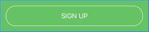
Output:
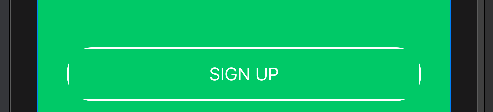
As you can see the border at corner are cut-off.
Any suggestion what am I doing wrong?
Ios Solutions
Solution 1 - Ios
Try it like this: Instead of setting the cornerRadius to the Button use an overlay for the inside View:
Edit: If you have a background for the button you also need to apply the cornerRadius to the background.
    Button(action: {
        print("sign up bin tapped")
    }) {
        Text("SIGN UP")
            .frame(minWidth: 0, maxWidth: .infinity)
            .font(.system(size: 18))
            .padding()
            .foregroundColor(.white)
            .overlay(
                RoundedRectangle(cornerRadius: 25)
                    .stroke(Color.white, lineWidth: 2)
        )
    }
    .background(Color.yellow) // If you have this
    .cornerRadius(25)         // You also need the cornerRadius here
Works for me. Let me know if it helps!
Solution 2 - Ios
Updated for Swift 5 & iOS 13.4+ with Press States!
None of the examples worked for buttons with both dark and white background colors as well as none of them had press state updates, so I built this LargeButton view that you can see below. Hope this helps, should be pretty simple to use!
Example Photos
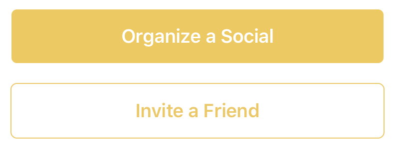
Example Use
// White button with green border.
LargeButton(title: "Invite a Friend",
            backgroundColor: Color.white,
            foregroundColor: Color.green) {
                        print("Hello World")
                    }

// Yellow button without a border
LargeButton(title: "Invite a Friend",
            backgroundColor: Color.yellow) {
                        print("Hello World")
                    }
Code
struct LargeButtonStyle: ButtonStyle {

    let backgroundColor: Color
    let foregroundColor: Color
    let isDisabled: Bool

    func makeBody(configuration: Self.Configuration) -> some View {
        let currentForegroundColor = isDisabled || configuration.isPressed ? foregroundColor.opacity(0.3) : foregroundColor
        return configuration.label
            .padding()
            .foregroundColor(currentForegroundColor)
            .background(isDisabled || configuration.isPressed ? backgroundColor.opacity(0.3) : backgroundColor)
            // This is the key part, we are using both an overlay as well as cornerRadius
            .cornerRadius(6)
            .overlay(
                RoundedRectangle(cornerRadius: 6)
                    .stroke(currentForegroundColor, lineWidth: 1)
        )
            .padding([.top, .bottom], 10)
            .font(Font.system(size: 19, weight: .semibold))
    }
}

struct LargeButton: View {

    private static let buttonHorizontalMargins: CGFloat = 20

    var backgroundColor: Color
    var foregroundColor: Color

    private let title: String
    private let action: () -> Void

    // It would be nice to make this into a binding.
    private let disabled: Bool

    init(title: String,
         disabled: Bool = false,
         backgroundColor: Color = Color.green,
         foregroundColor: Color = Color.white,
         action: @escaping () -> Void) {
        self.backgroundColor = backgroundColor
        self.foregroundColor = foregroundColor
        self.title = title
        self.action = action
        self.disabled = disabled
    }

    var body: some View {
        HStack {
            Spacer(minLength: LargeButton.buttonHorizontalMargins)
            Button(action:self.action) {
                Text(self.title)
                    .frame(maxWidth:.infinity)
            }
            .buttonStyle(LargeButtonStyle(backgroundColor: backgroundColor,
                                          foregroundColor: foregroundColor,
                                          isDisabled: disabled))
                .disabled(self.disabled)
            Spacer(minLength: LargeButton.buttonHorizontalMargins)
        }
        .frame(maxWidth:.infinity)
    }
}
Solution 3 - Ios
Official .bordered modifier support in iOS 15+
Buttons now have baked in border styling support using the .buttonStyle(.bordered) modifier. I would suggest using the corner radius Apple provides for these buttons for the best platform-specific styling. We can change the color to be consistent with the system styles for buttons and tint the background as well as text using the .tint modifier:
Button("Add") { ... }
.buttonStyle(.bordered)
.tint(.green)
You can make the tint color more prominent (bolder) using .controlProminence and control the size using .controlSize:
Button("food") { ... }
.tint(.red)
.buttonStyle(.bordered)
.controlSize(.small) // .large, .medium or .small
.buttonStyle(.borderedProminent)

You can also use this modifier on parent Views of Buttons and toggle lighter color schemes using .accentColor in child Buttons:
ScrollView {
    LazyVStack {
        Button("Test Button 1") { ... }
        .buttonStyle(.borderedProminent)
        .keyboardShortcut(.defaultAction) // Tapping `Return` key actions this button

        Button("Test Button 2") { ... }
        .tint(.accentColor)
    }
}
.buttonStyle(.bordered)
.controlSize(.large)
Advice
Apple for some reason doesn't like single-line bordered buttons which is why the .border() modifier was deprecated in Xcode 12. With this change, I suggest developers avoid creating single-line bordered buttons because they now are not preferred in Apple's Human Interface Guidelines. Using prominent buttons everywhere also violates HIG.
Extra NOTE: Apple's .bordered style provides the standard platform style across device types. In addition, the Button responds to Dark Mode dynamically and scales its size with Dynamic Type (native accessibility support).
Solution 4 - Ios
Swift 5 & iOS 14 – Borders also react when pressed
struct PrimaryButtonStyle: ButtonStyle {
    func makeBody(configuration: Configuration) -> some View {
        configuration.label
            .padding(5)
            .foregroundColor(configuration.isPressed ? Color.red.opacity(0.5) : .red)
            .overlay(
                RoundedRectangle(cornerRadius: 8)
                    .stroke(configuration.isPressed ? Color.red.opacity(0.5) : .red, lineWidth: 1.5)
            )
     }
}
How to use
Button("Hide") {
    print("tapped")
}.buttonStyle(PrimaryButtonStyle())
https://i.stack.imgur.com/i47sB.png">borders also react when pressed
Solution 5 - Ios
Xcode 11.4.1
                            Button(action: self.action) {
                                Text("Button Name")
                                    .font(.system(size: 15))
                                    .fontWeight(.bold)
                                    .foregroundColor(.white)
                                    .padding(10)
                                    .background(Color.darkGray)
                                    .cornerRadius(10)
                            }
                            .buttonStyle(PlainButtonStyle())
There isn't a need to add an overlay. You can substitute padding modifier with frame modifier. The action is a non return method outside of the body variable.
Right specifically for @MinonWeerasinghe:
Button(action: self.action) {
            Text("Button Name")
                .font(.system(size: 15))
                .fontWeight(.bold)
                .foregroundColor(.black)
                .padding(10)
                .background(RoundedRectangle(cornerRadius: 10).stroke().foregroundColor(Color.red))
                .cornerRadius(10)
        }
        .buttonStyle(PlainButtonStyle())
Solution 6 - Ios
Add third argument:
.border(Color.white, width: 2, cornerRadius: 25)
using this simple extension:
extension View {
    func border(_ color: Color, width: CGFloat, cornerRadius: CGFloat) -> some View {
        overlay(RoundedRectangle(cornerRadius: cornerRadius).stroke(color, lineWidth: width))
    }
}
Solution 7 - Ios
You can try this:
var body: some View {
        ZStack {
            Color.green
            .edgesIgnoringSafeArea(.all)

            HStack {
            Button(action: {
                    print("sign up bin tapped")
            }){
                HStack {
                    Text("SIGN UP")
                        .font(.system(size: 18))
                    }
                .frame(minWidth: 0, maxWidth: 300)
                .padding()
                .foregroundColor(.white)
                .overlay(
                    RoundedRectangle(cornerRadius: 40)
                        .stroke(Color.white, lineWidth: 2)
                )

                }
            }
        }
    }
I also did not set the maxWidth to .infinity because it means the button will fill the width of your container view.
The result will be :
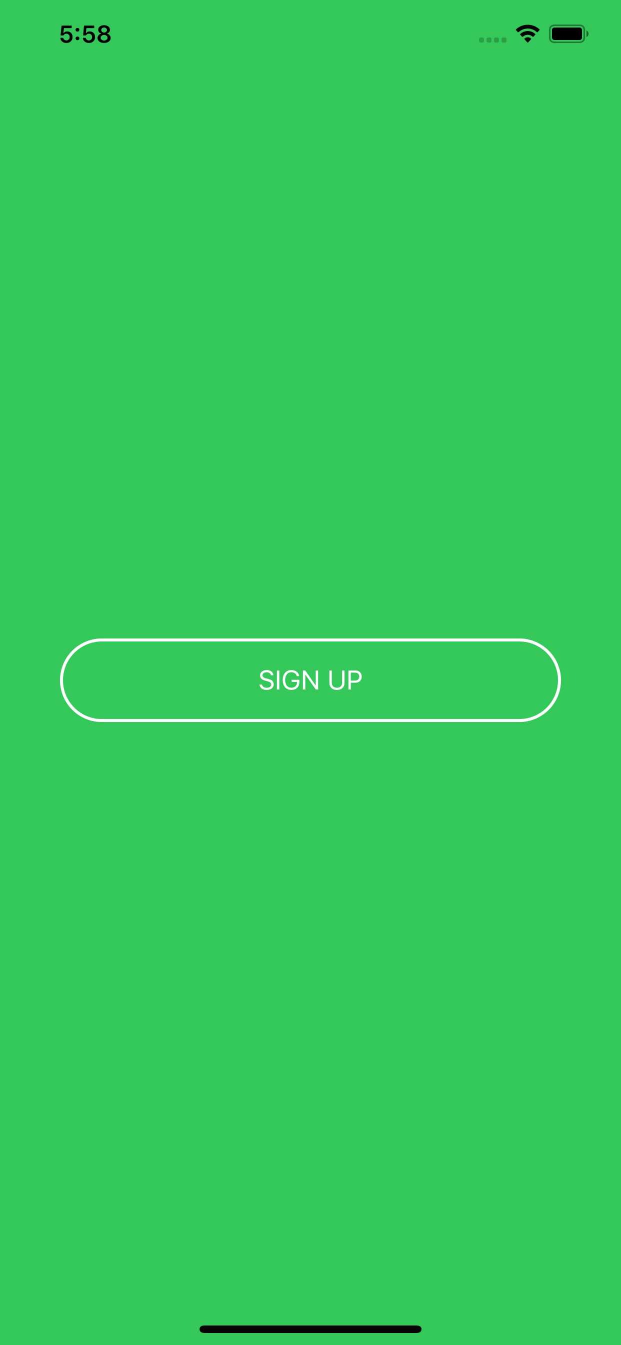
Hope it helps :)
Solution 8 - Ios
> This worked for me
Button(action: {
  print("Exit the onboarding")
}) {
HStack (spacing: 8) {
  Text("NEXT")
  .foregroundColor(Color("ColorAccentOppBlack"))
}
.padding(.horizontal, 16)
.padding(.vertical, 10)
.foregroundColor(Color("ColorYellowButton"))
.background(
   Capsule().strokeBorder(Color("ColorYellowButton"), lineWidth: 1.25)
 )
}
.accentColor(Color("ColorYellowButton"))
Solution 9 - Ios
You should use Capsule. This is built-in into SwiftUI. It takes care of rounded corners. Full implementation is here https://redflowerinc.com/how-to-implement-rounded-corners-for-buttons-in-swiftui/
public struct ButtonStyling : ButtonStyle {
	public var type: ButtonType
	public init(type: ButtonType = .light) {
		self.type = type
	}
	public func makeBody(configuration: Configuration) -> some View {
		configuration.label.foregroundColor(Color.white)
			.padding(EdgeInsets(top: 12,
								   leading: 12,
								   bottom: 12,
								   trailing: 12))
			   .background(AnyView(Capsule().fill(Color.purple)))
			   .overlay(RoundedRectangle(cornerRadius: 0).stroke(Color.gray, lineWidth: 0))
	}
}
Solution 10 - Ios
Wonder how to add button border with color gradient and corner radius Here's how..
  Button(action: {self.isCreateAccountTapped = true},label: {Text("Create an Account")
.foregroundColor(Color("TextThemeColor36"))}
 )
.frame(height: 44)
.frame(width: 166)
.background(Color.clear)
.cornerRadius(8)
.overlay(RoundedRectangle(cornerRadius: 10)
.stroke(LinearGradient(gradient: Gradient(colors: [Color("BtnGradientClr1"),Color("BtnGradientClr2"),Color("BtnGradientClr3")]), startPoint: .leading, endPoint: .trailing)))