Browsers scrollbar is under my fixed div
CssCss PositionCss Problem Overview
i have a fixed header with 100% width.
#header {
background: #2e2e2e;
width: 100%;
z-index: 999;
position: fixed;
}
browsers scrollbar is under my fixed div. How to fix that?
Css Solutions
Solution 1 - Css
its because the overflow-x: hidden; in base.css line number 9
body {
    color: #444444;
    font: 13px/20px Arial,Helvetica,sans-serif;
    overflow-x: hidden; // remove this
}
Solution 2 - Css
This can be solved by adding overflow of body
from
overflow:auto;
to
overflow:auto;
overflow:initial;
If your scroll is set on body, if its structured as body > wrapper > header (with fixed position), content so on
below is your solution
note: this will work only on body but not on div container with scroll. you can also work with z-index to get it to work, but you will be specifying z-index to stack other elements in order to get it right.
Hope this helps..:)
Solution 3 - Css
The issue isn't with overflow-x on the body tag. It's because of overflow-x andoverflow-y on the html tag. Once I removed this from the HTML tag, I could put whatever overflow I wanted on my body.
This happens when:
overflow-xis set to eitherauto,hidden,overflow, orscrolloverflow-yis set to eitherauto,hidden,-webkit-paged-x, or-webkit-paged-y
It doesn't have to be an explicit call to overflow-x or overflow-y, as overflow sets both of them.
I'm on Chrome 67 using Windows 10.
Solution 4 - Css
A css hack (i finally found a way) for this with not much explanation made quickly - the first floated element is. I think to understand the principle how it works from the code below.
Update: And there is an issue for mobile browsers see below to assess whether or not youre ok with it.
<div style="position: fixed;top: 0;width: 100%;left: 0;z-index: 100000;height: 200px;background: #f00;">

<div id="aaaaa" style="display: block;float:right;color: #000;overflow-y:scroll;min-height:20px;top: -100px;background: #0f0;border: 1px solid #0f0;"></div>
<div id="bbbb" style="display: block;position:relative;color: #000;overflow:hidden;min-height:20px;background: #f0f;border: 1px solid #00f;">sdfasdf sdfas s as as fasd fasd fasdfasd fasd asdf asd fasdf sadf asdf asdf asdf sad fasdf asdf asdf asd fasdf asdf asdf asd fsad sad sfd

        <div style="width: 100%;height: 20px;background: #5ff"></div>

</div>
And final code, nearly the same with things you want see visible and working
<div style="position: fixed;top: 0;width: 100%;left: 0;z-index: 100000;height: 0px;overflow:visible;background: #f00;">

<div id="aaaaa" style="display: block;float:right;color: #000;overflow-y:scroll;visibility:hidden;min-height:20px;top: -100px;background: #0f0;border: 1px solid #0f0;"></div>
<div id="bbbb" style="display: block;position:relative;color: #000;overflow:hidden;min-height:20px;background: #f0f;border: 1px solid #00f;">sdfasdf sdfas s as as fasd fasd fasdfasd fasd asdf asd fasdf sadf asdf asdf asdf sad fasdf asdf asdf asd fasdf asdf asdf asd fsad sad sfd

        <div style="width: 100%;height: 20px;background: #5ff"></div>

</div>
What's important it works with mobile and desktop browsers. Actually for the moment i tested mobile on windows edge when my computer changed into tablet mode and then desktop one. The code works then all the time. To check is whether or not this works with :before instead of div id="aaaa" to make it more css pure and additional divs intependent.
Update: it doesn't work well with before for Edge browser doesn't change the scrollbar when entering the tablet mode.
If you encounter problems with hidden contents in bbbb element try not to position: absolute/fixed elements in the bbbb container.
I haven't tested it yet for all situations and browsers.
Update: the issue mentioned somewhere on the top of this answer - yet on mobile browsers scrollbar is covered because the scrollbar is dynamic - it appears only when your scrolling and you know it is not part of any containers. The scrollbar probably is pretty thin on all browsers, so you should decide what to do with it. Maybe a little 5 pixels margin or so?
Solution 5 - Css
Set a z-index on the container that is the parent for your header and your content.
Solution 6 - Css
remove height:100% in html tag
Solution 7 - Css
I had this issue, my scrollbar was under my fixed header and I solved this after I removed from my html tag height: 100%; and I added other proprieties to be sure I have the same result. None of the other solutions helped me. I hope this helps someone.
Solution 8 - Css
The way I solved this problem was setting a scroll bar's width and then setting a 100% width to the navbar minus the scroll bar's width.
Like this:
.main-container::-webkit-scrollbar {
  width: 8px;
}

.navbar{
    display: flex;
    position: fixed;
    width: calc(100% - 8px);
    height: 8rem;
    z-index: 5000;
}
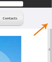
This is how it looks like

Solution 9 - Css
clip-path property can help you.
You need to put your header inside the scrollable content though, but it doesn't matter since it has a fixed position. Then, if you apply clip-path: inset(0 0 0 0); to the container it will clip out everything outside this rectangle.
function toggle() {
  content.classList.toggle('clip');
}
#container {
  overflow-y: auto;
  width: 300px;
  height: 100px;
  padding: 0;
}
#fixed {
  position: fixed;
  left: 0;
  top: 0;
  width: 350px;
  height: 50px;
  background: blue;
}
#content {
  height: 1000px;
  width: 100%;
  background: yellow;
}
#content.clip {
  clip-path: inset(0 0 0 0);
}
<div id="container">
  <div id="content">
    <div id="fixed"></div>
  </div>
</div>
<button onclick="toggle()">toggle clip-path</button>
Solution 10 - Css
Had same problem in react app.
Moved overflow-y: scroll style from #root to body selector. It solved issue for me.
Solution 11 - Css
This can be solved using 2 ways as below:
1.First caculate the scrollbarWidth=el.offsetWidth - el.clientWidth
2.Set fixed div left=scrollbarWidth
Solution 12 - Css
put margin-right: 0px; on topNavBar works for me