Border style do not work with sticky position element
HtmlCssHtml Problem Overview
I don't know why my border style do not work with position: sticky; attribute. I would like to set border styles on my sticky table header. But I don't want to use the transparent background colour. How can I achieve it? Here are sample codes for my problem and JSFiddle Link
#wrapper {
  width: 400px;
  height: 200px;
  overflow: auto;
}

table {
  width: 100%;
  text-align: center;
  border-collapse: collapse;
}

table tr th,
table tr td {
  border: 2px solid;
}

table thead th {
  position: -webkit-sticky;
  position: sticky;
  top: 0;
  background-color: #edecec;
}
<div id="wrapper">
  <table>
    <thead>
      <tr>
        <th>A</th>
        <th>B</th>
        <th>C</th>
        <th>D</th>
        <th>E</th>
      </tr>
    </thead>
    <tr>
      <td>1</td>
      <td>1</td>
      <td>1</td>
      <td>1</td>
      <td>1</td>
    </tr>
    <tr>
      <td>2</td>
      <td>2</td>
      <td>2</td>
      <td>2</td>
      <td>2</td>
    </tr>
    <tr>
      <td>3</td>
      <td>3</td>
      <td>3</td>
      <td>3</td>
      <td>3</td>
    </tr>
    <tr>
      <td>4</td>
      <td>4</td>
      <td>4</td>
      <td>4</td>
      <td>4</td>
    </tr>
    <tr>
      <td>5</td>
      <td>5</td>
      <td>5</td>
      <td>5</td>
      <td>5</td>
    </tr>
    <tr>
      <td>6</td>
      <td>6</td>
      <td>6</td>
      <td>6</td>
      <td>6</td>
    </tr>
    <tr>
      <td>7</td>
      <td>7</td>
      <td>7</td>
      <td>7</td>
      <td>7</td>
    </tr>
    <tr>
      <td>8</td>
      <td>8</td>
      <td>8</td>
      <td>8</td>
      <td>8</td>
    </tr>
    <tr>
      <td>9</td>
      <td>9</td>
      <td>9</td>
      <td>9</td>
      <td>9</td>
    </tr>
    <tbody>
    </tbody>
  </table>
</div>
Below are screenshots for what I want and who do not clear enough my question.
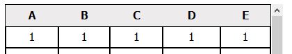
You can see inline border styles of th do not work (remove position attribute of css and you will see boders around.).
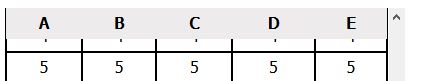
After scroll down a little. You will see all border-styles were gone.
Html Solutions
Solution 1 - Html
The problem occurs because of the use of border-collapse: collapse. When browsers collapse the borders, the top and bottom border on the <th> must be getting applied to surrounding elements—the top border to the <table> and the bottom border to the following <tr>.
If you use border-collapse: separate and fashion your borders to sit on one side, the borders will truly attach to the <th>, stay fixed as expected, and appear collapsed.
Here are example styles that can be applied to your HTML snippet.
#wrapper {
  width: 400px;
  height: 200px;
  overflow: auto;
}

table {
  width: 100%;
  text-align: center;
  border-collapse: separate; /* Don't collapse */
  border-spacing: 0;
}

table th {
  /* Apply both top and bottom borders to the <th> */
  border-top: 2px solid;
  border-bottom: 2px solid;
  border-right: 2px solid;
}

table td {
  /* For cells, apply the border to one of each side only (right but not left, bottom but not top) */
  border-bottom: 2px solid;
  border-right: 2px solid;
}

table th:first-child,
table td:first-child {
  /* Apply a left border on the first <td> or <th> in a row */
  border-left: 2px solid;
}

table thead th {
  position: sticky;
  top: 0;
  background-color: #edecec;
}
Solution 2 - Html
You need to use box-shadow property instead of border-top/border-bottom. Additionally you need to delete top/bottom borders for the head and first row of table.
#wrapper {
  width: 400px;
  height: 200px;
  overflow: auto;
}

table {
  width: 100%;
  text-align: center;
  border-collapse: collapse;
}

table tr th,
table tr td {
  border: 2px solid;
}

table thead th {
  position: -webkit-sticky;
  position: sticky;
  top: 0;
  background-color: #edecec;
}


/* here is the trick */

table tbody:nth-of-type(1) tr:nth-of-type(1) td {
  border-top: none !important;
}

table thead th {
  border-top: none !important;
  border-bottom: none !important;
  box-shadow: inset 0 2px 0 #000000, inset 0 -2px 0 #000000;
  padding: 2px 0;
}


/* and one small fix for weird FF behavior, described in https://stackoverflow.com/questions/7517127/ */

table thead th {
  background-clip: padding-box
}
<body>
  <div id="wrapper">
    <table>
      <thead>
        <tr>
          <th>A</th>
          <th>B</th>
          <th>C</th>
          <th>D</th>
          <th>E</th>
        </tr>
      </thead>
      <tbody>
        <tr>
          <td>1</td>
          <td>1</td>
          <td>1</td>
          <td>1</td>
          <td>1</td>
        </tr>
        <tr>
          <td>2</td>
          <td>2</td>
          <td>2</td>
          <td>2</td>
          <td>2</td>
        </tr>
        <tr>
          <td>3</td>
          <td>3</td>
          <td>3</td>
          <td>3</td>
          <td>3</td>
        </tr>
        <tr>
          <td>4</td>
          <td>4</td>
          <td>4</td>
          <td>4</td>
          <td>4</td>
        </tr>
        <tr>
          <td>5</td>
          <td>5</td>
          <td>5</td>
          <td>5</td>
          <td>5</td>
        </tr>
        <tr>
          <td>6</td>
          <td>6</td>
          <td>6</td>
          <td>6</td>
          <td>6</td>
        </tr>
        <tr>
          <td>7</td>
          <td>7</td>
          <td>7</td>
          <td>7</td>
          <td>7</td>
        </tr>
        <tr>
          <td>8</td>
          <td>8</td>
          <td>8</td>
          <td>8</td>
          <td>8</td>
        </tr>
        <tr>
          <td>9</td>
          <td>9</td>
          <td>9</td>
          <td>9</td>
          <td>9</td>
        </tr>
      </tbody>
    </table>
  </div>
</body>
Solution 3 - Html
Because sticky positioning fluctuates between relative and fixed, the only way I can think to circumvent this out-of-box would be take advantage of psuedo classes.
I'm sure there's a more elegant manner to accomplish this but I would just alter the :after and :before psuedo classes to provide the border with absolute positioning.
#wrapper {
  width: 400px;
  height: 200px;
  overflow: auto;
}

table {
  width: 100%;
  text-align: center;
  border-collapse: collapse;
}

table tr th,
table tr td {
  border: 2px solid;
}

table thead th {
  position: -webkit-sticky;
  position: sticky;
  top: -1px;
  background-color: #edecec;
}
th:after,
th:before {
  content: '';
  position: absolute;
  left: 0;
  width: 100%;
}
th:before {
  top: 0;
  border-top: 3px solid blue;
}
th:after {
  bottom: 0;
  border-bottom: 3px solid blue;
}
<div id="wrapper">
  <table>
    <thead>
      <tr>
        <th>A</th>
        <th>B</th>
        <th>C</th>
        <th>D</th>
        <th>E</th>
      </tr>
    </thead>
    <tr>
      <td>1</td>
      <td>1</td>
      <td>1</td>
      <td>1</td>
      <td>1</td>
    </tr>
    <tr>
      <td>2</td>
      <td>2</td>
      <td>2</td>
      <td>2</td>
      <td>2</td>
    </tr>
    <tr>
      <td>3</td>
      <td>3</td>
      <td>3</td>
      <td>3</td>
      <td>3</td>
    </tr>
    <tr>
      <td>4</td>
      <td>4</td>
      <td>4</td>
      <td>4</td>
      <td>4</td>
    </tr>
    <tr>
      <td>5</td>
      <td>5</td>
      <td>5</td>
      <td>5</td>
      <td>5</td>
    </tr>
    <tr>
      <td>6</td>
      <td>6</td>
      <td>6</td>
      <td>6</td>
      <td>6</td>
    </tr>
    <tr>
      <td>7</td>
      <td>7</td>
      <td>7</td>
      <td>7</td>
      <td>7</td>
    </tr>
    <tr>
      <td>8</td>
      <td>8</td>
      <td>8</td>
      <td>8</td>
      <td>8</td>
    </tr>
    <tr>
      <td>9</td>
      <td>9</td>
      <td>9</td>
      <td>9</td>
      <td>9</td>
    </tr>
    <tr>
      <td>9</td>
      <td>9</td>
      <td>9</td>
      <td>9</td>
      <td>9</td>
    </tr>
    <tr>
      <td>9</td>
      <td>9</td>
      <td>9</td>
      <td>9</td>
      <td>9</td>
    </tr>
    <tr>
      <td>9</td>
      <td>9</td>
      <td>9</td>
      <td>9</td>
      <td>9</td>
    </tr>
    <tr>
      <td>9</td>
      <td>9</td>
      <td>9</td>
      <td>9</td>
      <td>9</td>
    </tr>
    <tr>
      <td>9</td>
      <td>9</td>
      <td>9</td>
      <td>9</td>
      <td>9</td>
    </tr>
    <tr>
      <td>9</td>
      <td>9</td>
      <td>9</td>
      <td>9</td>
      <td>9</td>
    </tr>
    <tr>
      <td>9</td>
      <td>9</td>
      <td>9</td>
      <td>9</td>
      <td>9</td>
    </tr>
    <tr>
      <td>9</td>
      <td>9</td>
      <td>9</td>
      <td>9</td>
      <td>9</td>
    </tr>
    <tr>
      <td>9</td>
      <td>9</td>
      <td>9</td>
      <td>9</td>
      <td>9</td>
    </tr>
    <tr>
      <td>9</td>
      <td>9</td>
      <td>9</td>
      <td>9</td>
      <td>9</td>
    </tr>
    <tr>
      <td>9</td>
      <td>9</td>
      <td>9</td>
      <td>9</td>
      <td>9</td>
    </tr>
    <tr>
      <td>9</td>
      <td>9</td>
      <td>9</td>
      <td>9</td>
      <td>9</td>
    </tr>
    <tr>
      <td>9</td>
      <td>9</td>
      <td>9</td>
      <td>9</td>
      <td>9</td>
    </tr>
    <tr>
      <td>9</td>
      <td>9</td>
      <td>9</td>
      <td>9</td>
      <td>9</td>
    </tr>
    <tr>
      <td>9</td>
      <td>9</td>
      <td>9</td>
      <td>9</td>
      <td>9</td>
    </tr>
    <tr>
      <td>9</td>
      <td>9</td>
      <td>9</td>
      <td>9</td>
      <td>9</td>
    </tr>
    <tr>
      <td>9</td>
      <td>9</td>
      <td>9</td>
      <td>9</td>
      <td>9</td>
    </tr>
    <tr>
      <td>9</td>
      <td>9</td>
      <td>9</td>
      <td>9</td>
      <td>9</td>
    </tr>
    <tr>
      <td>9</td>
      <td>9</td>
      <td>9</td>
      <td>9</td>
      <td>9</td>
    </tr>
    <tr>
      <td>9</td>
      <td>9</td>
      <td>9</td>
      <td>9</td>
      <td>9</td>
    </tr>
    <tbody>
    </tbody>
  </table>
</div>
Solution 4 - Html
<td style="position: sticky;
           top: 0;
           left: 0;
           right: 0;
           padding: 4px 3px;
           background-color: #d3d3d3;
           box-shadow: inset 0 1px 0 black, inset 0 -1px 0 black;">
</td>
use this 100% worked
Solution 5 - Html
Use ::after pseudo selector to emulate, lets say, right border
Example:
th::after {
  content: '';
  position: absolute;
  top: 0;
  right: 0;
  height: 100%;
  border-right: 1px solid #e7e7e7;
}
Solution 6 - Html
Now I can set the border styles with psuedo classes as user @soulshined suggested. Belows are css changes to work and here is JSFiddle Link. Already tested on chrome and firefox.
#wrapper {
  width: 400px;
  height: 200px;
  overflow: auto;
  padding: 1px;
}

table {
  width: 100%;
  text-align: center;
  border-collapse: collapse;
}
table tr th {
  border: 1px solid green;
}
table tr th:first-child {
  border-left: 1px solid green;
}
table tr td {
  border: 1px solid green;
}

table thead th {
  position: -webkit-sticky;
  position: sticky;
  top: 0;
  background-color: #edecec;
}

th::before {
  content: '';
  position: absolute;
  left: 0;
  width: 100%;
  height: 100%;
  border-right: 1px solid green;
  display: block;
  top : 1px;
}

th::after {
  content: '';
  position: absolute;
  left: 0;
  width: 100%;
  height: 100%;
  border-bottom: 1px solid green;
  border-top: 1px solid green;
  display: block;
  top : -1px;
}
Solution 7 - Html
Tried some of the existing answers, but as comments have mentioned, they result in a one pixel gap between the borders.
Made a workaround, though it requires JavaScript. It places a <div> in each <th>, on resize it fits the <div> to the <th>. The <th> border is then instead applied to the <div>.
Note that as of writing this, position: sticky is not working in Chromium on <thead>, it works in Firefox. However, the position: sticky related CSS does not affect the page, if the JavaScript is not executed.
Click Run code snippet to see if it works, in your browser.
<script src="https://code.jquery.com/jquery-3.4.1.min.js"></script>

<table>
    <thead>
        <tr>
            <th>A</th>
            <th>B</th>
            <th>C</th>
            <th>D</th>
        </tr>
    </thead>
    <tbody>
        <tr><td>1</td><td>2</td><td>3</td><td>4</td></tr>
        <tr><td>1</td><td>2</td><td>3</td><td>4</td></tr>
        <tr><td>1</td><td>2</td><td>3</td><td>4</td></tr>
        <tr><td>1</td><td>2</td><td>3</td><td>4</td></tr>

        <tr><td>1</td><td>2</td><td>3</td><td>4</td></tr>
        <tr><td>1</td><td>2</td><td>3</td><td>4</td></tr>
        <tr><td>1</td><td>2</td><td>3</td><td>4</td></tr>
        <tr><td>1</td><td>2</td><td>3</td><td>4</td></tr>

        <tr><td>1</td><td>2</td><td>3</td><td>4</td></tr>
        <tr><td>1</td><td>2</td><td>3</td><td>4</td></tr>
        <tr><td>1</td><td>2</td><td>3</td><td>4</td></tr>
        <tr><td>1</td><td>2</td><td>3</td><td>4</td></tr>

        <tr><td>1</td><td>2</td><td>3</td><td>4</td></tr>
        <tr><td>1</td><td>2</td><td>3</td><td>4</td></tr>
        <tr><td>1</td><td>2</td><td>3</td><td>4</td></tr>
        <tr><td>1</td><td>2</td><td>3</td><td>4</td></tr>
    </tbody>
</table>
table { width: 100%; border-collapse: collapse; }
th {
    text-align: left;
}

th, td {
    padding: 12px 20px;

    border: 1px solid rgba(0, 0, 0, 0.125);
}

table thead {
    position: sticky;
    top: 0;

    background: #FFF;
}

/* Used as a workaround for position: sticky not rendering the border */
thead th div {
    width: 30px;
    margin: 0 -20px; /* -20px to negate the 20px from the padding */
    position: absolute;
    top: 0;
    bottom: 0;
    z-index: -1;

    border-right: 1px solid rgba(0, 0, 0, 0.125);
    border-bottom: 1px solid rgba(0, 0, 0, 0.125);
}
function onResize() {
    $("thead th div").each(function () {
        var width = $(this).parent().outerWidth() - 2; // -2 * border-width
        $(this).css("width", width + "px");
    });
}

$("thead th").each(function () {
    $(this).append($("<div>"));
});

$(window).on("resize", onResize);
onResize();
Wrap the previous JavaScript in the following, to limit it to Firefox.
if (navigator.userAgent.toLowerCase().indexOf("firefox") > -1) {
    // ...
}
Screenshot (Firefox 71):
Solution 8 - Html
This is, I believe the simplest answer.
The accepted answer don't provide a solution for a 1px border.
Note: this is a work around, so don't gripe me.
If you remove the border-top from the table header, the table has nothing to collapse, so no space is created to see through to the underlying cells. Replace the border-top with a border of the same style in a holding DIV.
css:
table thead tr:nth-child(1) th {
  position: sticky;
  border-top:0;
}

.table_holder {
  border-top:1px solid black;
}
html:
<div id="table_holder">
  <table> ... </table>
</div>
Solution 9 - Html
- sticky with header border visible
html{
    padding: 0px;
    margin: 0px;
}
body{
    padding: 0px;
    margin: 0px;
    width:100%;
}

 th,td{
     padding:10px;
     border: 0.1px solid #e8e0e0;
     padding-right:10px;
 }
 th{
     text-align: center;
    background: #f3f3f3;
    background-clip: padding-box;
 }


thead th:first-child {
  left: 0;
  z-index: 1;
}
tbody th:first-child  {
   text-align: center;
  position: -webkit-sticky; /* for Safari */
  position: sticky;
  left: 0;

}
tbody th,thead th:first-child  {
/* display:flex; */
/* text-align: center;
align-items: center;
align-self: center; */
    width:30px;

    min-width: 30px;
    max-width: 30px;
    word-break: break-all;
}
.fixed_header{
    width: 100%;
    /* height: 500px; */
    table-layout: fixed;
    border-collapse: collapse;
}
/* .fixed_header tbody{
  overflow: auto;

} */

/* fixed header */
thead th {
    /* for Safari */
 text-align: center;
  position: -webkit-sticky;
   position: sticky;

  top: 0;


}

.fixed_header th, .fixed_header td {
    padding:10px;
  /* text-align: left; */
  width: 90px;
}

.fixed_header td{
    /* padding:10px; */
/* word-break: break-all; */
/* max-width: 200px; */
}
.table_container{
/* position: fixed; */
position: relative;
width:100% ;
min-height: 500px;
overflow: auto;
background:cornsilk;
}
 <table class="fixed_header">
                <thead>
                  <tr>
                   <th></th>
                    <th>Col 1</th>
                    <th>Col 2</th>
                    <th>Col 3</th>
                    <th>Col 4</th>
                    <th>Col 5</th>
                          <th>Col 1</th>
                    <th>Col 2</th>
                    <th>Col 3</th>
                    <th>Col 4</th>
                    <th>Col 5</th>
                          <th>Col 1</th>
                    <th>Col 2</th>
                    <th>Col 3</th>
                    <th>Col 4</th>
                    <th>Col 5</th>
                          <th>Col 1</th>
                    <th>Col 2</th>
                    <th>Col 3</th>
                    <th>Col 4</th>
                    <th>Col 5</th>
                  </tr>
                </thead>
                <tbody>
                  <tr>
                    <th>1</th>
                    <td>row 1-1</td>
                    <td>row 1-2</td>
                    <td>row 1-3</td>
                    <td>row 1-4</td>
                    <td>row 1-1</td>
                    <td>row 1-2</td>
                    <td>row 1-3</td>
                    <td>row 1-4</td>
                    <td>row 1-1</td>
                    <td>row 1-2</td>
                    <td>row 1-3</td>
                    <td>row 1-4</td>
                    <td>row 1-1</td>
                    <td>row 1-2</td>
                    <td>row 1-3</td>
                    <td>row 1-4</td>
                    <td>row 1-1</td>
                    <td>row 1-2</td>
                    <td>row 1-3</td>
                    <td>row 1-4</td>
                </tr>

                </tbody>
              </table>
            </div>
Solution 10 - Html
How about replacing border with outline? I dare to say that especially for table elements the outline acts almost the same as border. I know it is not out of the box model etc. but visually is identical here. Try this:
table tr th,
table tr td {
  border: 0;
  outline: 2px solid;
}
Bear in mind, outline is always rendered around the whole element, there is nothing like outline-left, so it is not silver bullet. See outline on MDN for further details.
UPDATE: Well I overlooked one detail, the outline is not properly aligned with tbody borders. You have to eiter swap border and outline for the whole table or use transform and nudge the thead, but perhaps it is not good way to go (it depends, of course).
Solution 11 - Html
<style>
thead{
    position: sticky;
    z-index: 2;
    top: 0;
    background-color: white;
};

table {
    border-collapse: separate;
}
</style>
<table cellspacing="0">
    <!--...-->
</table>
Solution 12 - Html
Use table thead th instead of table thead.
This is demo. https://jsfiddle.net/nhatphamcdn/9dhqchtu/