Bootstrap with jQuery Validation Plugin
Twitter BootstrapJquery ValidateTwitter Bootstrap-3Twitter Bootstrap Problem Overview
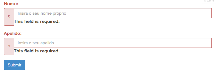
I am trying to add validation to my form with jQuery Validation Plugin, but I'm having a problem where the plugin puts the error messages when I'm using input groups.
$('form').validate({
    rules: {
        firstname: {
            minlength: 3,
            maxlength: 15,
            required: true
        },
        lastname: {
            minlength: 3,
            maxlength: 15,
            required: true
        }
    },
    highlight: function(element) {
        $(element).closest('.form-group').addClass('has-error');
    },
    unhighlight: function(element) {
        $(element).closest('.form-group').removeClass('has-error');
    }
});
My code: http://jsfiddle.net/hTPY7/4/
Twitter Bootstrap Solutions
Solution 1 - Twitter Bootstrap
for total compatibility with twitter bootstrap 3, I need to override some plugins methods:
// override jquery validate plugin defaults
$.validator.setDefaults({
    highlight: function(element) {
        $(element).closest('.form-group').addClass('has-error');
    },
    unhighlight: function(element) {
        $(element).closest('.form-group').removeClass('has-error');
    },
    errorElement: 'span',
    errorClass: 'help-block',
    errorPlacement: function(error, element) {
        if(element.parent('.input-group').length) {
            error.insertAfter(element.parent());
        } else {
            error.insertAfter(element);
        }
    }
});
See Example: http://jsfiddle.net/mapb_1990/hTPY7/7/
Solution 2 - Twitter Bootstrap
For full compatibility with Bootstrap 3 I added support for input-group, radio and checkbox, that was missing in the other solutions.
Update 10/20/2017: Inspected suggestions of the other answers and added additional support for special markup of radio-inline, better error placement for a group of radios or checkboxes and added support for a custom .novalidation class to prevent validation of controls. Hope this helps and thanks for the suggestions.
After including the validation plugin add the following call:
$.validator.setDefaults({
	errorElement: "span",
	errorClass: "help-block",
	highlight: function (element, errorClass, validClass) {
		// Only validation controls
		if (!$(element).hasClass('novalidation')) {
            $(element).closest('.form-group').removeClass('has-success').addClass('has-error');
		}
	},
	unhighlight: function (element, errorClass, validClass) {
		// Only validation controls
		if (!$(element).hasClass('novalidation')) {
            $(element).closest('.form-group').removeClass('has-error').addClass('has-success');
		}
	},
	errorPlacement: function (error, element) {
		if (element.parent('.input-group').length) {
			error.insertAfter(element.parent());
        }
        else if (element.prop('type') === 'radio' && element.parent('.radio-inline').length) {
            error.insertAfter(element.parent().parent());
        }
        else if (element.prop('type') === 'checkbox' || element.prop('type') === 'radio') {
            error.appendTo(element.parent().parent());
        }
        else {
			error.insertAfter(element);
		}
	}
});
This works for all Bootstrap 3 form classes. If you use a horizontal form you have to use the following markup. This ensures that the help-block text respects the validation states ("has-error", ...) of the form-group.
<div class="form-group">
    <div class="col-lg-12">
        <div class="checkbox">
            <label id="LabelConfirm" for="CheckBoxConfirm">
                <input type="checkbox" name="CheckBoxConfirm" id="CheckBoxConfirm" required="required" />
                I have read all the information
            </label>
        </div>
    </div>
</div>
Solution 3 - Twitter Bootstrap
I use forms designed only with Twitter Bootstrap 3. I set defaults functions for validor and run only validate method with rules. I use Icons from FontAweSome, but you can use Glyphicons as in doc example.
jQuery.validator.setDefaults({
    highlight: function (element, errorClass, validClass) {
        if (element.type === "radio") {
            this.findByName(element.name).addClass(errorClass).removeClass(validClass);
        } else {
            $(element).closest('.form-group').removeClass('has-success has-feedback').addClass('has-error has-feedback');
            $(element).closest('.form-group').find('i.fa').remove();
            $(element).closest('.form-group').append('<i class="fa fa-exclamation fa-lg form-control-feedback"></i>');
        }
    },
    unhighlight: function (element, errorClass, validClass) {
        if (element.type === "radio") {
            this.findByName(element.name).removeClass(errorClass).addClass(validClass);
        } else {
            $(element).closest('.form-group').removeClass('has-error has-feedback').addClass('has-success has-feedback');
            $(element).closest('.form-group').find('i.fa').remove();
            $(element).closest('.form-group').append('<i class="fa fa-check fa-lg form-control-feedback"></i>');
        }
    }
});
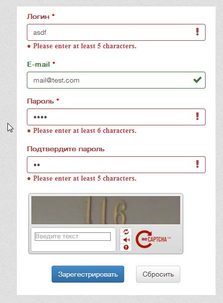
Done. After run validate function:
$("#default-register-user").validate({
    rules: {
        'login': {
            required: true,
            minlength: 5,
            maxlength: 20
        },
        'email': {
            required: true,
            email: true,
            minlength: 5,
            maxlength: 100
        },
        'password': {
            required: true,
            minlength: 6,
            maxlength: 25
        },
        'confirmpassword': {
            required: true,
            minlength: 5,
            maxlength: 25,
            equalTo: "#password"
        }
    }
});
Solution 4 - Twitter Bootstrap
Adding onto Miguel Borges answer above you can give the user that green success feedback by adding the following line to in the highlight/unhighlight code block.
    highlight: function(element) {
        $(element).closest('.form-group').removeClass('has-success').addClass('has-error');
    },
    unhighlight: function(element) {
        $(element).closest('.form-group').removeClass('has-error').addClass('has-success');
    }
Solution 5 - Twitter Bootstrap
this is the solution you need, you can use the errorPlacement method to override where to put the error message
$('form').validate({
    rules: {
        firstname: {
            minlength: 3,
            maxlength: 15,
            required: true
        },
        lastname: {
            minlength: 3,
            maxlength: 15,
            required: true
        }
    },
    errorPlacement: function(error, element) {
        error.insertAfter('.form-group'); //So i putted it after the .form-group so it will not include to your append/prepend group.
    },
    highlight: function(element) {
        $(element).closest('.form-group').addClass('has-error');
    },
    unhighlight: function(element) {
        $(element).closest('.form-group').removeClass('has-error');
    }
});
it's works for me like magic. Cheers
Solution 6 - Twitter Bootstrap
for bootstrap 4 this work with me good
    $.validator.setDefaults({
    highlight: function(element) {
        $(element).closest('.form-group').find(".form-control:first").addClass('is-invalid');
    },
    unhighlight: function(element) {
        $(element).closest('.form-group').find(".form-control:first").removeClass('is-invalid');
        $(element).closest('.form-group').find(".form-control:first").addClass('is-valid');

    },
    errorElement: 'span',
    errorClass: 'invalid-feedback',
    errorPlacement: function(error, element) {
        if(element.parent('.input-group').length) {
            error.insertAfter(element.parent());
        } else {
            error.insertAfter(element);
        }
    }
});
hope it will help !
Solution 7 - Twitter Bootstrap
Here is what I use when adding validation to form:
// Adding validation to form.
        $(form).validate({
            rules: {
                title: {
                    required: true,
                    minlength: 3,
                },
                server: {
                    ipAddress: true,
                    required: true
                }
            },
            highlight: function(element) {
                $(element).closest('.form-group').removeClass('has-success').addClass('has-error');
            },
            success: function(element) {
                $(element).closest('.form-group').removeClass('has-error').addClass('has-success');
            },
            errorClass: 'help-block'
        });
This worked for me for Bootstrap 3 styling when using the jquery validation library.
Solution 8 - Twitter Bootstrap
I used this for radio's:
    if (element.prop("type") === "checkbox" || element.prop("type") === "radio") {
        error.appendTo(element.parent().parent());
    }
    else if (element.parent(".input-group").length) {
        error.insertAfter(element.parent());
    }
    else {
        error.insertAfter(element);
    }
this way the error is displayed under last radio option.
Solution 9 - Twitter Bootstrap
I know this question is for Bootstrap 3, but as some Bootstrap 4 related question are redirected to this one as duplicates, here's the snippet Bootstrap 4-compatible:
$.validator.setDefaults({
    highlight: function(element) {
        $(element).closest('.form-group').addClass('has-danger');
    },
    unhighlight: function(element) {
        $(element).closest('.form-group').removeClass('has-danger');
    },
    errorElement: 'small',
    errorClass: 'form-control-feedback d-block',
    errorPlacement: function(error, element) {
        if(element.parent('.input-group').length) {
            error.insertAfter(element.parent());
        } else if(element.prop('type') === 'checkbox') {
            error.appendTo(element.parent().parent().parent());
        } else if(element.prop('type') === 'radio') {
            error.appendTo(element.parent().parent().parent());
        } else {
            error.insertAfter(element);
        }
    },
});
The few differences are:
- The use of class
has-dangerinstead ofhas-error - Better error positioning radios and checkboxes
Solution 10 - Twitter Bootstrap
For the bootstrap 4 beta were some big changes between the alpha and beta versions of bootstrap (and also bootstrap 3), esp. in regards to form validation.
First, to place the icons correctly you'll need to add styling which equates to what was in bootstrap 3 and no longer in bootstrap 4 beta...here's what I'm using
.fa.valid-feedback,
.fa.invalid-feedback {
    position: absolute;
    right: 25px;
    margin-top: -50px;
    z-index: 2;
    display: block;
    pointer-events: none;
}

.fa.valid-feedback {
    margin-top: -28px;
}
The classes have also changed as the beta uses the 'state' of the control rather than classes which your posted code doesn't reflect, so your above code may not work. Anyway, you'll need to add 'was-validated' class to the form either in the success or highlight/unhighlight callbacks
$(element).closest('form').addClass('was-validated');
I would also recommend using the new element and classes for form control help text
errorElement: 'small',
errorClass: 'form-text invalid-feedback',
Solution 11 - Twitter Bootstrap
This makes up the fields
 $("#form_questionario").validate({
                debug: false,
                errorElement: "span",
                errorClass: "help-block",
                highlight: function (element, errorClass, validClass) {
                    $(element).closest('.form-group').addClass('has-error');
                },
                unhighlight: function (element, errorClass, validClass) {
                    $(element).closest('.form-group').removeClass('has-error');
                },
                errorPlacement: function (error, element) {
                    if (element.parent('.input-group').length || element.prop('type') === 'checkbox' || element.prop('type') === 'radio') {
                        error.insertBefore(element.parent());
                    } else {
                        error.insertAfter(element);
                    }
                },
                // Specify the validation rules
                rules: {
                        'campo1[]': 'required',
                        'campo2[]': 'required',
                        'campo3[]': 'required',
                        'campo4[]': 'required',
                        'campo5[]': 'required'
                        },

                submitHandler: function (form) {
                    form.submit();
                }
            });
Solution 12 - Twitter Bootstrap
add radio-inline fix to this https://stackoverflow.com/a/18754780/966181
$.validator.setDefaults({
    highlight: function(element) {
        $(element).closest('.form-group').addClass('has-error');
    },
    unhighlight: function(element) {
        $(element).closest('.form-group').removeClass('has-error');
    },
    errorElement: 'span',
    errorClass: 'help-block',
    errorPlacement: function(error, element) {
        if(element.parent('.input-group').length) {
            error.insertAfter(element.parent());
        } else if (element.parent('.radio-inline').length) {
            error.insertAfter(element.parent().parent());
        } else {
            error.insertAfter(element);
        }
    }
});
Solution 13 - Twitter Bootstrap
DARK_DIESEL's answer worked great for me; here's the code for anyone who wants the equivalent using glyphicons:
jQuery.validator.setDefaults({
    highlight: function (element, errorClass, validClass) {
        if (element.type === "radio") {
            this.findByName(element.name).addClass(errorClass).removeClass(validClass);
        } else {
            $(element).closest('.form-group').removeClass('has-success has-feedback').addClass('has-error has-feedback');
            $(element).closest('.form-group').find('span.glyphicon').remove();
            $(element).closest('.form-group').append('<span class="glyphicon glyphicon-remove form-control-feedback" aria-hidden="true"></span>');
        }
    },
    unhighlight: function (element, errorClass, validClass) {
        if (element.type === "radio") {
            this.findByName(element.name).removeClass(errorClass).addClass(validClass);
        } else {
            $(element).closest('.form-group').removeClass('has-error has-feedback').addClass('has-success has-feedback');
            $(element).closest('.form-group').find('span.glyphicon').remove();
            $(element).closest('.form-group').append('<span class="glyphicon glyphicon-ok form-control-feedback" aria-hidden="true"></span>');
        }
    }
});
Solution 14 - Twitter Bootstrap
Try using this sample code. Using the Jquery validation plugin and additional methods. This is the working code for my project. Hope this helps you
//jquery validation booking page

	// Wait for the DOM to be ready
$(function() {
  // Initialize form validation on the registration form.
  // It has the name attribute "registration"
  $("form[name='book']").validate({
	  //on key up validation
	  onkeyup: function(element) {
      $(element).valid();
    },
    // Specify validation rules
    rules: {
      // The key name on the left side is the name attribute
      // of an input field. Validation rules are defined
      // on the right side
      fname: {
        required: true,
        lettersonly: true
        },
      lname:{
        required: true,
        lettersonly: true
        },
      email: {
        required: true,
        // Specify that email should be validated
        // by the built-in "email" rule
        email: true
      },
      password: {
        required: true,
        minlength: 5
      }
    },
    // Specify validation error messages
    messages: {
      fname: {
      required:"Please enter your firstname",
      lettersonly:"Letters allowed only"
      },
      lname: {
      required:"Please enter your lastname",
      lettersonly:"Letters allowed only"
      },
      email: "Please enter a valid email address"
    },
    // Make sure the form is submitted to the destination defined
    // in the "action" attribute of the form when valid
    submitHandler: function(form) {
      form.submit();
    }
  });
});
.error {
  color: red;
  margin-left: 5px;
  font-size:15px;
}
<script src="design/bootstrap-3.3.7-dist/js/jquery.validate.js"></script>
<script src="design/bootstrap-3.3.7-dist/js/additional-methods.js"></script>

<form name="book" id="book" action="" method="post">

    <div class="row form-group">
        <div class="col-md-6 ">
            <label class="" for="fname">First Name</label>
            <input type="text" name="fname" id="fname" class="form-control" placeholder="First Name">
        </div>
        <div class="col-md-6">
            <label class="" for="lname">Last Name</label>
            <input type="text" name="lname" id="lname" class="form-control" placeholder="Last Name">
        </div>
    </div>

    <div class="row form-group">
        <div class="col-md-6 ">
            <label class="" for="date">Date</label>
            <input type="text" id="date" class="form-control datepicker px-2" placeholder="Date of visit">
        </div>
        <div class="col-md-6">
            <label class="" for="email">Email</label>
            <input type="email" name="email" id="email" class="form-control" placeholder="Email">
        </div>
    </div>

    <div class="row form-group">
        <div class="col-md-12">
            <label class="" for="treatment">Service You Want</label>
            <select name="treatment" id="treatment" class="form-control">
                <option value="">Hair Cut</option>
                <option value="">Hair Coloring</option>
                <option value="">Perms and Curls</option>
                <option value="">Hair Conditioning</option>
                <option value="">Manicure</option>
                <option value="">Pedicure</option>
                <option value="">Nails Extension</option>
                <option value="">Nail Design</option>
                <option value="">Waxing Eyebrows</option>
                <option value="">Waxing Hands/Legs</option>
                <option value="">Full Face Waxing</option>
                <option value="">Full Body/Body Parts Wax</option>
            </select>
        </div>
    </div>

    <div class="row form-group">
        <div class="col-md-12">
            <label class="" for="note">Notes</label>
            <textarea name="note" id="note" cols="30" rows="5" class="form-control" placeholder="Write your notes or questions here..."></textarea>
        </div>
    </div>

    <div class="row form-group">
        <div class="col-md-12">
            <center><input type="submit" value="Book Now" class="btn btn-primary btn-lg"></center>
        </div>
    </div>

</form>
Solution 15 - Twitter Bootstrap
Another option is placing an error container outside of your form group ahead of time. The validator will then use it if necessary.
<div class="form-group">
  <label class="control-label" for="new-task-due-date">When is the task due?</label>
  <div class="input-group date datepicker">
    <input type="text" id="new-task-due-date" class="required form-control date" name="dueDate" />
    <span class="input-group-addon">
      <span class="glyphicon glyphicon-calendar"></span>
    </span>
  </div>
  <label for="new-task-due-date" class="has-error control-label" style="display: none;"></label>
</div>