Bootstrap combining rows (rowspan)
Twitter BootstrapBootstrap GridTwitter Bootstrap Problem Overview
I am testing Twitter Bootstrap and got stuck with basic scaffolding with rows. I revisited their documentation number of times and I can see nesting columns where you can basically nest columns within a column but I cannot locate the capability of combining rows into one and have it aligned with column next to the uncombined rows.
Below picture should illustrate what I want to accomplish.

The only workaround solution I came across is using tables but I don't like this idea as my view is that the responsiveness wouldn't work with the use of tables.
Does anyone have any elegant solution to this? Most of the web layout I do will need fine level of flexibility so it will be great if I could pick up something useful here.
Twitter Bootstrap Solutions
Solution 1 - Twitter Bootstrap
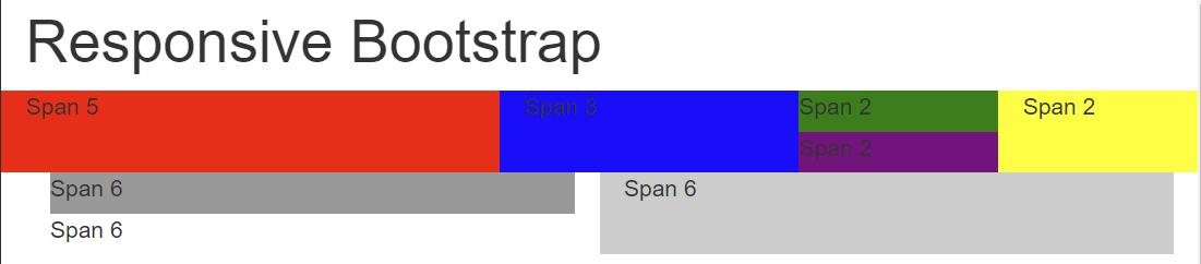
Divs stack vertically by default, so there is no need for special handling of "rows" within a column.
div {
  height:50px;
}
.short-div {
  height:25px;
}
<link href="https://maxcdn.bootstrapcdn.com/bootstrap/3.3.6/css/bootstrap.min.css" rel="stylesheet" />

<div class="container">
  <h1>Responsive Bootstrap</h1>
  <div class="row">
    <div class="col-lg-5 col-md-5 col-sm-5 col-xs-5" style="background-color:red;">Span 5</div>
    <div class="col-lg-3 col-md-3 col-sm-3 col-xs-3" style="background-color:blue">Span 3</div>
    <div class="col-lg-2 col-md-2 col-sm-3 col-xs-2" style="padding:0px">
      <div class="short-div" style="background-color:green">Span 2</div>
      <div class="short-div" style="background-color:purple">Span 2</div>
    </div>
    <div class="col-lg-2 col-md-2 col-sm-3 col-xs-2" style="background-color:yellow">Span 2</div>
  </div>
</div>
<div class="container-fluid">
  <div class="row-fluid">
    <div class="col-lg-6 col-md-6 col-sm-6 col-xs-6">
      <div class="short-div" style="background-color:#999">Span 6</div>
      <div class="short-div">Span 6</div>
    </div>
    <div class="col-lg-6 col-md-6 col-sm-6 col-xs-6" style="background-color:#ccc">Span 6</div>
  </div>
</div>
Output:
Here's the fiddle.
Solution 2 - Twitter Bootstrap
You should use bootstrap column nesting.
See Bootstrap 3 or Bootstrap 4:
<div class="row">
    <div class="col-md-5">Span 5</div>
    <div class="col-md-3">Span 3<br />second line</div>
    <div class="col-md-2">
        <div class="row">
            <div class="col-md-12">Span 2</div>
        </div>
        <div class="row">
            <div class="col-md-12">Span 2</div>
        </div>
    </div>
    <div class="col-md-2">Span 2</div>
</div>
<div class="row">
    <div class="col-md-6">
        <div class="row">
            <div class="col-md-12">Span 6</div>
            <div class="col-md-12">Span 6</div>
        </div>
    </div>
    <div class="col-md-6">Span 6</div>
</div>
http://jsfiddle.net/DRanJ/125/
(In Fiddle screen, enlarge your test screen to see the result, because I'm using col-md-*, then responsive stacks columns)
Note: I am not sure that BS2 allows columns nesting, but in the answer of Paul Keister, the columns nesting is not used. You should use it and avoid to reinvente css while bootstrap do well.
The columns height are auto, if you add a second line (like I do in my example), column height adapt itself.
Solution 3 - Twitter Bootstrap
Note: This was for Bootstrap 2 (relevant when the question was asked).
You can accomplish this by using row-fluid to make a fluid (percentage) based row inside an existing block.
<div class="row">
   <div class="span5">span5</div>
   <div class="span3">span3</div>
   <div class="span2">
      <div class="row-fluid">
         <div class="span12">span2</div>
         <div class="span12">span2</div>
      </div>
   </div>
   <div class="span2">span2</div>
</div>
<div class="row">
   <div class="span6">
      <div class="row-fluid">
         <div class="span12">span6</div>
         <div class="span12">span6</div>
      </div>
   </div>
   <div class="span6">span6</div>
</div>
Here's a JSFiddle example.
I did notice that there was an odd left margin that appears (or does not appear) for the spans inside of the row-fluid after the first one. This can be fixed with a small CSS tweak (it's the same CSS that is applied to the first child, expanded to those past the first child):
.row-fluid [class*="span"] {
    margin-left: 0;
}
Solution 4 - Twitter Bootstrap
Check this one. hope it will help full for you.
.row-fix { margin-bottom:20px;}

.row-fix > [class*="span"]{ height:100px; background:#f1f1f1;}

.row-fix .two-col{ background:none;}

.two-col > [class*="col"]{ height:40px; background:#ccc;}

.two-col > .col1{margin-bottom:20px;}
Solution 5 - Twitter Bootstrap
Paul's answer seems to defeat the purpose of bootstrap; that of being responsive to the viewport / screen size.
By nesting rows and columns you can achieve the same result, while retaining responsiveness.
Here is an up-to-date response to this problem;
<div class="container-fluid">
  <h1>  Responsive Nested Bootstrap </h1>
  <div class="row">
    <div class="col-md-5" style="background-color:red;">Span 5</div>
    <div class="col-md-3" style="background-color:blue;">Span 3</div>
    <div class="col-md-2">
      <div class="row">
        <div class="container" style="background-color:green;">Span 2</div>
      </div>
      <div class="row">
        <div class="container" style="background-color:purple;">Span 2</div>
      </div>
    </div>
    <div class="col-md-2" style="background-color:yellow;">Span 2</div>
  </div>

  <div class="row">
    <div class="col-md-6">
      <div class="row">
        <div class="container" style="background-color:yellow;">Span 6</div>
      </div>
      <div class="row">
        <div class="container" style="background-color:green;">Span 6</div>
      </div>
    </div>
    <div class="col-md-6" style="background-color:red;">Span 6</div>
  </div>
</div>
You can view the codepen here.
Solution 6 - Twitter Bootstrap
div {
  height:50px;
}
.short-div {
  height:25px;
}
<link href="https://maxcdn.bootstrapcdn.com/bootstrap/3.3.6/css/bootstrap.min.css" rel="stylesheet" />

<div class="container">
  <h1>Responsive Bootstrap</h1>
  <div class="row">
    <div class="col-lg-5 col-md-5 col-sm-5 col-xs-5" style="background-color:red;">Span 5</div>
    <div class="col-lg-3 col-md-3 col-sm-3 col-xs-3" style="background-color:blue">Span 3</div>
    <div class="col-lg-2 col-md-2 col-sm-3 col-xs-2" style="padding:0px">
      <div class="short-div" style="background-color:green">Span 2</div>
      <div class="short-div" style="background-color:purple">Span 2</div>
    </div>
    <div class="col-lg-2 col-md-2 col-sm-3 col-xs-2" style="background-color:yellow">Span 2</div>
  </div>
</div>
<div class="container-fluid">
  <div class="row-fluid">
    <div class="col-lg-6 col-md-6 col-sm-6 col-xs-6">
      <div class="short-div" style="background-color:#999">Span 6</div>
      <div class="short-div">Span 6</div>
    </div>
    <div class="col-lg-6 col-md-6 col-sm-6 col-xs-6" style="background-color:#ccc">Span 6</div>
  </div>
</div>