Bootstrap Carousel image doesn't align properly
JavascriptJqueryTwitter BootstrapCarouselJavascript Problem Overview
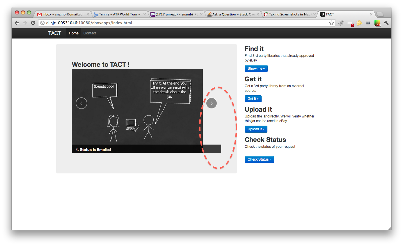
Please take a look at the following image, we are using bootstrap carousel to rotate the images. However, when the window width is large, the image doesn't align with the border properly.
But the carousel example provided by bootstrap always works fine, no matter the width of the window. Following the code.
Can someone explain why carousel is behaving differently? Is this anything to do with Image size or some bootstrap config is missing?
<section id="carousel">
<div class="hero-unit span6 columns">
<h2>Welcome to TACT !</h2>
<div id="myCarousel" class="carousel slide" >
<!-- Carousel items -->
<div class="carousel-inner">
<div class="item active" >
<img alt="" src="/eboxapps/img/3pp-1.png">
<div class="carousel-caption">
<h4>1. Need a 3rd party jar?</h4>
</div>
</div>
<div class="item">
<img alt="" src="/eboxapps/img/3pp-2.png">
<div class="carousel-caption">
<h4>2. Create Request</h4>
</div>
</div>
<div class="item">
<img alt="" src="/eboxapps/img/3pp-3.png">
<div class="carousel-caption">
<h4>3. What happens?</h4>
</div>
</div>
<div class="item">
<img alt="" src="/eboxapps/img/3pp-4.png">
<div class="carousel-caption">
<h4>4. Status is Emailed</h4>
</div>
</div>
</div>
<!-- Carousel nav -->
<a class="carousel-control left" href="#myCarousel" data-slide="prev">‹</a>
<a class="carousel-control right" href="#myCarousel" data-slide="next">›</a>
</div>
</div>
Javascript Solutions
Solution 1 - Javascript
The solution is to put this CSS code into your custom CSS file:
.carousel-inner > .item > img {
  margin: 0 auto;
}
Solution 2 - Javascript
With bootstrap 3, just add the responsive and center classes:
<img class="img-responsive center-block" src="img/....jpg" alt="First slide">
This automatically does image resizing, and centers the picture.
Edit:
With bootstrap 4, just add the img-fluid class
<img class="img-fluid" src="img/....jpg">
Solution 3 - Javascript
I faced the same problem and solved it this way:
It's possible to insert non-image content to Carousel, so we can use it.
You should first insert div.inner-item (where you will make center alignment), and then insert image inside this div.
Here is my code (Ruby):
<div id="myCarousel" class="carousel slide">
<!-- Carousel items -->
<div class="carousel-inner">
<div class="active item">
<%= image_tag "couples/1.jpg" %>
</div>
<% (2..55).each do |t|%>
<div class="item">
<div class='inner-item'>
<%= image_tag "couples/#{t}.jpg" %>
</div>
</div>
<% end -%>
</div>
<!-- Carousel nav -->
<a class="carousel-control left" href="#myCarousel" data-slide="prev">‹</a>
<a class="carousel-control right" href="#myCarousel" data-slide="next">›</a>
</div>
And my css-code(.scss):
.inner-item {
	text-align: center;
	img {
        margin: 0 auto;
    }
}
Solution 4 - Javascript
While vekozlov's answer will work in Bootstrap 3 to center your image, it will break when the carousel is scaled down: the image retains its size instead of scaling down with the carousel.
Instead, do this on the top-level carousel div:
<div id="my-carousel" class="carousel slide"
	style="max-width: 900px; margin: 0 auto">
	...
</div>
This will center the entire carousel and prevent it from growing beyond the width of your images (i.e. 900 px or whatever you want to set it to). However, when the carousel is scaled down the images scale down with it.
You should put this styling info in your CSS/LESS file, of course.
Solution 5 - Javascript
In Bootstrap 4, you can add mx-auto class to your img tag.
For instance, if your image has a width of 75%, it should look like this:
<img class="d-block w-75 mx-auto" src="image.jpg" alt="First slide">
Bootstrap will automatically translate mx-auto to:
ml-auto, .mx-auto {
    margin-left: auto !important;
}

.mr-auto, .mx-auto {
    margin-right: auto !important;
}
Solution 6 - Javascript
Does your images have exactly a 460px width as the span6 ? In my case, with different image sizes, I put a height attribute on my images to be sure they are all the same height and the carousel don't resize between images.
In your case, try to set a height so the ratio between this height and the width of your carousel-inner div is the same as the aspectRatio of your images
Solution 7 - Javascript
It could have something to do with your styles. In my case, I am using a link within the parent "item" div, so I had to change my stylesheet to say the following:
.carousel .item a > img {
  display: block;
  line-height: 1;
}
under the preexisting boostrap code:
.carousel .item > img {
  display: block;
  line-height: 1;
}
and my image looks like:
<div class="active item" id="2"><a href="http://epdining.com/eats.php?place=TestRestaurant1"><img src="rimages/2.jpg"></a><div class="carousel-caption"><p>This restaurant is featured blah blah blah blah blah.</p></div></div>
Solution 8 - Javascript
I think I have a solution:
In your personal style sheet page, assign the width & height to match your image dimensions.
Create an additional separate "class" on that top div that appropriates the space with spans...(Shown below)
 		<div class="span6 columns" class="carousel">
	        <div id="myCarousel" class="carousel slide">
	            <div class="carousel-inner">
		        <div class="item active">
Without touching the bootstrap.css, in your own style sheet, call "carousel"(or whatever label you choose) to match the width and height of your original pix!
.carousel       {
            width: 320px;
            height: 200px;
}
So in my case, I am using small 320x200 images to carousel with. There is probably preset dimensions in the bootstrap.css, but I don't like changing that so I can try to stay current with future releases. Hope this helps~~
Solution 9 - Javascript
I am facing the same problem with you. Based on the hint of @thuliha, the following codes has solved my issues.
In the html file, modify as the following sample:
<img class="img-responsive center-block" src=".....png" alt="Third slide">
In the carousel.css, modify the class:
.carousel .item {
  text-align: center;
  height: 470px;
  background-color: #777;
}
Solution 10 - Javascript
Try this
    .item img{
      max-height: 300px;
      margin: auto;
    }
Solution 11 - Javascript
For the carousel, I believe all images have to be exactly the same height and width.
Also, when you refer back to the scaffolding page from bootstrap, I'm pretty sure that span16 = 940px. With this in mind, I think we can assume that if you have a
<div class="row">
     <div class="span4">
        <!--left content div guessing around 235px in width -->
     </div>
     <div class="span8">
        <!--right content div guessing around 470px in width -->
     </div>
</div>
So yes, you have to be careful when setting the spans space within a row because if the image width is to large, it will send your div over into the next "row" and that is no fun :P
http://twitter.github.com/bootstrap/scaffolding.html">Link 1
Solution 12 - Javascript
@Art L. Richards 's solution didn't work out. now in bootstrap.css, original code has become like this.
.carousel .item > img {
  display: block;
  line-height: 1;
}
@rnaka530 's code would break the fluid feature of bootstrap.
I don't have a good solution but I did fix it. I observed the bootstrap's carousel example very carefully http://twitter.github.com/bootstrap/javascript.html#carousel.
I find out that img width has to be larger than the grid width. In span9, width is up to 870px, so you have to prepare a image larger than 870px. If you have more container outside the img, as all the container has border or margin something, you can use image with smaller width.
Solution 13 - Javascript
Insert this on the css parent div class where your carousel is.
<div class="parent_div">
     <div id="myCarousel" class="carousel slide">
            <div class="carousel-inner">
              <div class="item active">
                <img src="assets/img/slider_1.png" alt="">
                <div class="carousel-caption">
                </div>
              </div>
            </div>
     </div>
</div>
CSS
.parent_div {
margin: 0 auto;
min-width: [desired width];
max-width: [desired width];
}