Bootstrap 3 - 100% height of custom div inside column
CssTwitter BootstrapCss Problem Overview
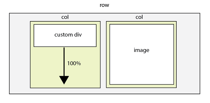
Let's say I have two columns in a row.
One contains an image using class="img-responsive" for fluid image and the other column next to has a custom div block.
My question is how to get this custom div's height 100%. Below didn't work for me.
height: auto;
max-width: 100%;
If I set fixed value in height, it won't play nicely with the column containing image as the image resizes height when the viewport size changes.
I can get the columns heights equal by doing something like the following as suggested by previous questions.
class*="col-"]{
    margin-bottom: -99999px;
    padding-bottom: 99999px;
}
.row {
    overflow: hidden;
}
But my case is slightly different that I need to use custom div inside the column that sets equal height with the image height, not the parent divs (columns).
Here is JS Fiddle
Css Solutions
Solution 1 - Css
I was just looking for a smiliar issue and I found this:
.div{
  height : 100vh;
}
more info
vw: 1/100th viewport width
vh: 1/100th viewport height
vmin: 1/100th of the smallest side
vmax: 1/100th of the largest side
Solution 2 - Css
The original question is about Bootstrap 3 and that supports IE8 and 9 so Flexbox would be the best option but it's not part of my answer due the lack of support, see http://caniuse.com/#feat=flexbox and toggle the IE box. Pretty bad, eh?
2 ways:
1. Display-table: You can muck around with turning the row into a display:table and the col- into display:table-cell. It works buuuut the limitations of tables are there, among those limitations are the push and pull and offsets won't work. Plus, I don't know where you're using this -- at what breakpoint. You should make the image full width and wrap it inside another container to put the padding on there. Also, you need to figure out the design on mobile, this is for 768px and up. When I use this, I redeclare the sizes and sometimes I stick importants on them because tables take on the width of the content inside them so having the widths declared again helps this. You will need to play around. I also use a script but you have to change the less files to use it or it won't work responsively.
DEMO: http://jsbin.com/EtUBujI/2
  .row.table-row > [class*="col-"].custom {
    background-color: lightgrey;
    text-align: center;
  }


@media (min-width: 768px) {

  img.img-fluid {width:100%;}

  .row.table-row {display:table;width:100%;margin:0 auto;}

  .row.table-row > [class*="col-"] {
    float:none;
    float:none;
    display:table-cell;
    vertical-align:top;
  }

  .row.table-row > .col-sm-11 {
    width: 91.66666666666666%;
  }
  .row.table-row > .col-sm-10 {
    width: 83.33333333333334%;
  }
  .row.table-row > .col-sm-9 {
    width: 75%;
  }
  .row.table-row > .col-sm-8 {
    width: 66.66666666666666%;
  }
  .row.table-row > .col-sm-7 {
    width: 58.333333333333336%;
  }
  .row.table-row > .col-sm-6 {
    width: 50%;
  }
  .col-sm-5 {
    width: 41.66666666666667%;
  }
  .col-sm-4 {
    width: 33.33333333333333%;
  }
  .row.table-row > .col-sm-3 {
    width: 25%;
  }
  .row.table-row > .col-sm-2 {
    width: 16.666666666666664%;
  }
  .row.table-row > .col-sm-1 {
    width: 8.333333333333332%;
  }


}
HTML
<div class="container">
    <div class="row table-row">
        <div class="col-sm-4 custom">
                100% height to make equal to ->
        </div>
        <div class="col-sm-8 image-col">
            <img src="http://placehold.it/600x400/B7AF90/FFFFFF&text=image+1" class="img-fluid">
        </div>
    </div>
</div>
2. Absolute bg div
DEMO: http://jsbin.com/aVEsUmig/2/edit
DEMO with content above and below: http://jsbin.com/aVEsUmig/3
.content {
        text-align: center;
        padding: 10px;
        background: #ccc;

}


@media (min-width:768px) {
    .my-row {
        position: relative;
        height: 100%;
        border: 1px solid red;
        overflow: hidden;
    }
    .img-fluid {
        width: 100%
    }
    .row.my-row > [class*="col-"] {
        position: relative
    }
    .background {
        position: absolute;
        padding-top: 200%;
        left: 0;
        top: 0;
        width: 100%;
        background: #ccc;
    }
    .content {
        position: relative;
        z-index: 1;
        width: 100%;
        text-align: center;
        padding: 10px;
    }

}
HTML
<div class="container">

    <div class="row my-row">

        <div class="col-sm-6">

        <div class="content">
          This is inside a relative positioned z-index: 1 div
          </div>

         <div class="background"><!--empty bg-div--></div>
        </div>

        <div class="col-sm-6 image-col">
            <img src="http://placehold.it/200x400/777777/FFFFFF&text=image+1" class="img-fluid">
        </div>

    </div>

</div>
Solution 3 - Css
You need to set the height of every parent element of the one you want the height defined.
<html style="height: 100%;">
  <body style="height: 100%;">
    <div style="height: 100%;">
      <p>
        Make this division 100% height.
      </p>
    </div>
  </body>
</html>
Solution 4 - Css
My solution was to make all the parents 100% and set a specific percentage for each row:
html, body,div[class^="container"] ,.column {
	height: 100%;
}

.row0 {height: 10%;}
.row1 {height: 40%;}
.row2 {height: 50%;}