Align two inline-blocks left and right on same line
CssHtmlCss Problem Overview
How can I align two inline-blocks so that one is left and the other is right on the same line? Why is this so hard? Is there something like LaTeX's \hfill that can consume the space between them to achieve this?
I don't want to use floats because with inline-blocks I can line up the baselines. And when the window is too small for both of them, with inline-blocks I can just change the text-align to center and they will be centered one atop another. Relative(parent) + Absolute(element) positioning has the same problems as floats do.
The HTML5:
<header>
    <h1>Title</h1>
    <nav>
        <a>A Link</a>
        <a>Another Link</a>
        <a>A Third Link</a>
    </nav>
</header>
The css:
header {
    //text-align: center; // will set in js when the nav overflows (i think)
}

h1 {
    display: inline-block;
    margin-top: 0.321em;
}

nav {
    display: inline-block;
    vertical-align: baseline;
}
Thery're right next to each other, but I want the nav on the right.

Css Solutions
Solution 1 - Css
Edit: 3 years has passed since I answered this question and I guess a more modern solution is needed, although the current one does the thing :)
1.Flexbox
It's by far the shortest and most flexible. Apply display: flex; to the parent container and adjust the placement of its children by justify-content: space-between; like this:
.header {
    display: flex;
    justify-content: space-between;
}
Can be seen online here - http://jsfiddle.net/skip405/NfeVh/1073/
Note however that flexbox support is IE10 and newer. If you need to support IE 9 or older, use the following solution:
2.You can use the text-align: justify technique here.
.header {
    background: #ccc;
    text-align: justify;

    /* ie 7*/
    *width: 100%;
    *-ms-text-justify: distribute-all-lines;
    *text-justify: distribute-all-lines;
}
 .header:after{
    content: '';
    display: inline-block;
    width: 100%;
    height: 0;
    font-size:0;
    line-height:0;
}

h1 {
    display: inline-block;
    margin-top: 0.321em;

    /* ie 7*/
    *display: inline;
    *zoom: 1;
    *text-align: left;
}

.nav {
    display: inline-block;
    vertical-align: baseline;

    /* ie 7*/
    *display: inline;
    *zoom:1;
    *text-align: right;
}
The working example can be seen here: http://jsfiddle.net/skip405/NfeVh/4/. This code works from IE7 and above
If inline-block elements in HTML are not separated with space, this solution won't work - see example http://jsfiddle.net/NfeVh/1408/ . This might be a case when you insert content with Javascript.
If we don't care about IE7 simply omit the star-hack properties. The working example using your markup is here - http://jsfiddle.net/skip405/NfeVh/5/. I just added the header:after part and justified the content.
In order to solve the issue of the extra space that is inserted with the after pseudo-element one can do a trick of setting the font-size to 0 for the parent element and resetting it back to say 14px for the child elements. The working example of this trick can be seen here: http://jsfiddle.net/skip405/NfeVh/326/
Solution 2 - Css
For both elements use
display: inline-block;
the for the 'nav' element use
float: right;
Solution 3 - Css
Taking advantage of @skip405's answer, I've made a Sass mixin for it:
@mixin inline-block-lr($container,$left,$right){
    #{$container}{
        text-align: justify;

        &:after{
            content: '';
            display: inline-block;
            width: 100%;
            height: 0;
            font-size:0;
            line-height:0;
        }
    }

    #{$left} {
        display: inline-block;
        vertical-align: middle;
    }

    #{$right} {
        display: inline-block;
        vertical-align: middle;
    }
}
It accepts 3 parameters. The container, the left and the right element. For example, to fit the question, you could use it like this:
@include inline-block-lr('header', 'h1', 'nav');
Solution 4 - Css
If you don't want to use floats, you're going to have to wrap your nav:
<header>
<h1>Title</h1>
<div id="navWrap">
<nav>
    <a>A Link</a>
    <a>Another Link</a>
    <a>A Third Link</a>
</nav>
</div>
</header>
...and add some more specific css:
header {
//text-align: center; // will set in js when the nav overflows (i think)
width:960px;/*Change as needed*/
height:75px;/*Change as needed*/
}

h1 {
display: inline-block;
margin-top: 0.321em;
}

#navWrap{
position:absolute;
top:50px; /*Change as needed*/
right:0;
}

nav {
display: inline-block;
vertical-align: baseline;
}
You may need to do a little more, but that's a start.
Solution 5 - Css
New ways to align items right:
Grid:
.header {
        display:grid;
        grid-template-columns: 1fr auto;
    }
<div class="row">
      <div class="col">left</div>
      <div class="col">
          <div class="float-right">element needs to be right aligned</div>
      </div>
</div>
Solution 6 - Css
If you're already using JavaScript to center stuff when the screen is too small (as per your comment for your header), why not just undo floats/margins with JavaScript while you're at it and use floats and margins normally.
You could even use CSS media queries to reduce the amount JavaScript you're using.
Solution 7 - Css
I think one possible solution to this is to use display: table:
.header {
  display: table;
  width: 100%;
  box-sizing: border-box;
}

.header > * {
  display: table-cell;
}

.header > *:last-child {
  text-align: right;
}

h1 {
  font-size: 32px;
}

nav {
  vertical-align: baseline;
}
JSFiddle: http://jsfiddle.net/yxxrnn7j/1/
Solution 8 - Css
give it float: right and the h1 float:left and put an element with clear:both after them.
Solution 9 - Css
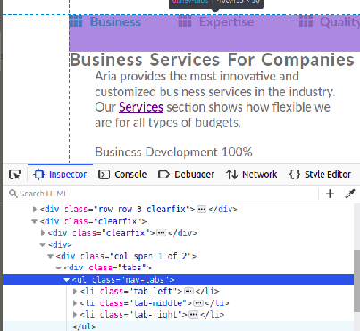
Displaying left middle and right of there parents. If you have more then 3 elements then use nth-child() for them.
HTML sample:
<body>
    <ul class="nav-tabs">
        <li><a  id="btn-tab-business" class="btn-tab nav-tab-selected"  onclick="openTab('business','btn-tab-business')"><i class="fas fa-th"></i>Business</a></li>
        <li><a  id="btn-tab-expertise" class="btn-tab" onclick="openTab('expertise', 'btn-tab-expertise')"><i class="fas fa-th"></i>Expertise</a></li>
        <li><a  id="btn-tab-quality" class="btn-tab" onclick="openTab('quality', 'btn-tab-quality')"><i class="fas fa-th"></i>Quality</a></li>
    </ul>
</body>
CSS sample:
.nav-tabs{
  position: relative;
  padding-bottom: 50px;
}

.nav-tabs li {
  display: inline-block;
  position: absolute;
  list-style: none;
}
.nav-tabs li:first-child{
  top: 0px;
  left: 0px;
}
.nav-tabs li:last-child{
  top: 0px;
  right: 0px;
}
.nav-tabs li:nth-child(2){
  top: 0px;
  left: 50%;
  transform: translate(-50%, 0%);
}